ATV assignment 2 Stitching: Placed and spaced – stitched piece 3 mug

I’ve heard mention in the music world of the difficult third album. In stitching terms this is it! I really like my two previous outcomes, they were my strong ideas. I have several more but which to choose??

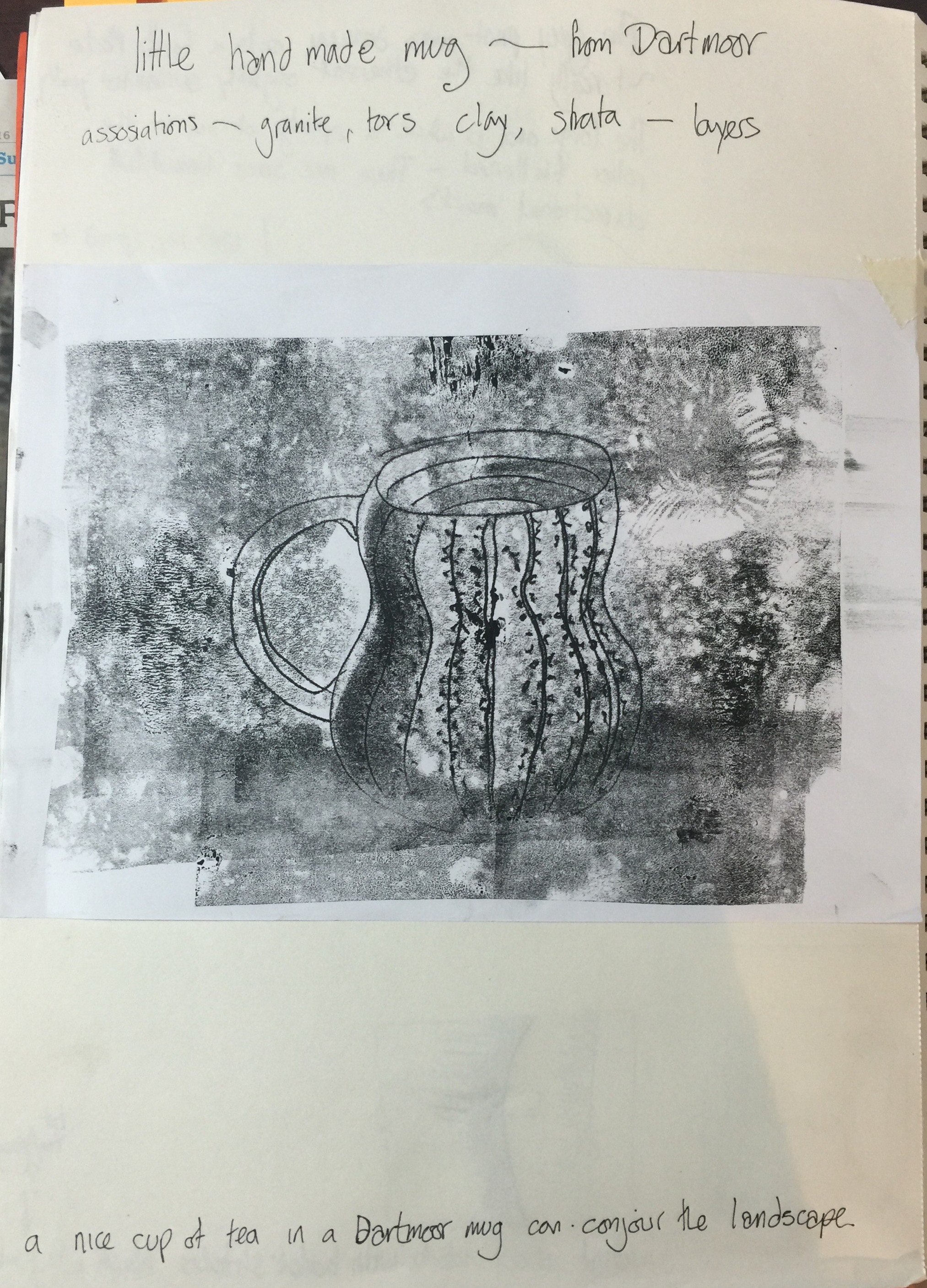
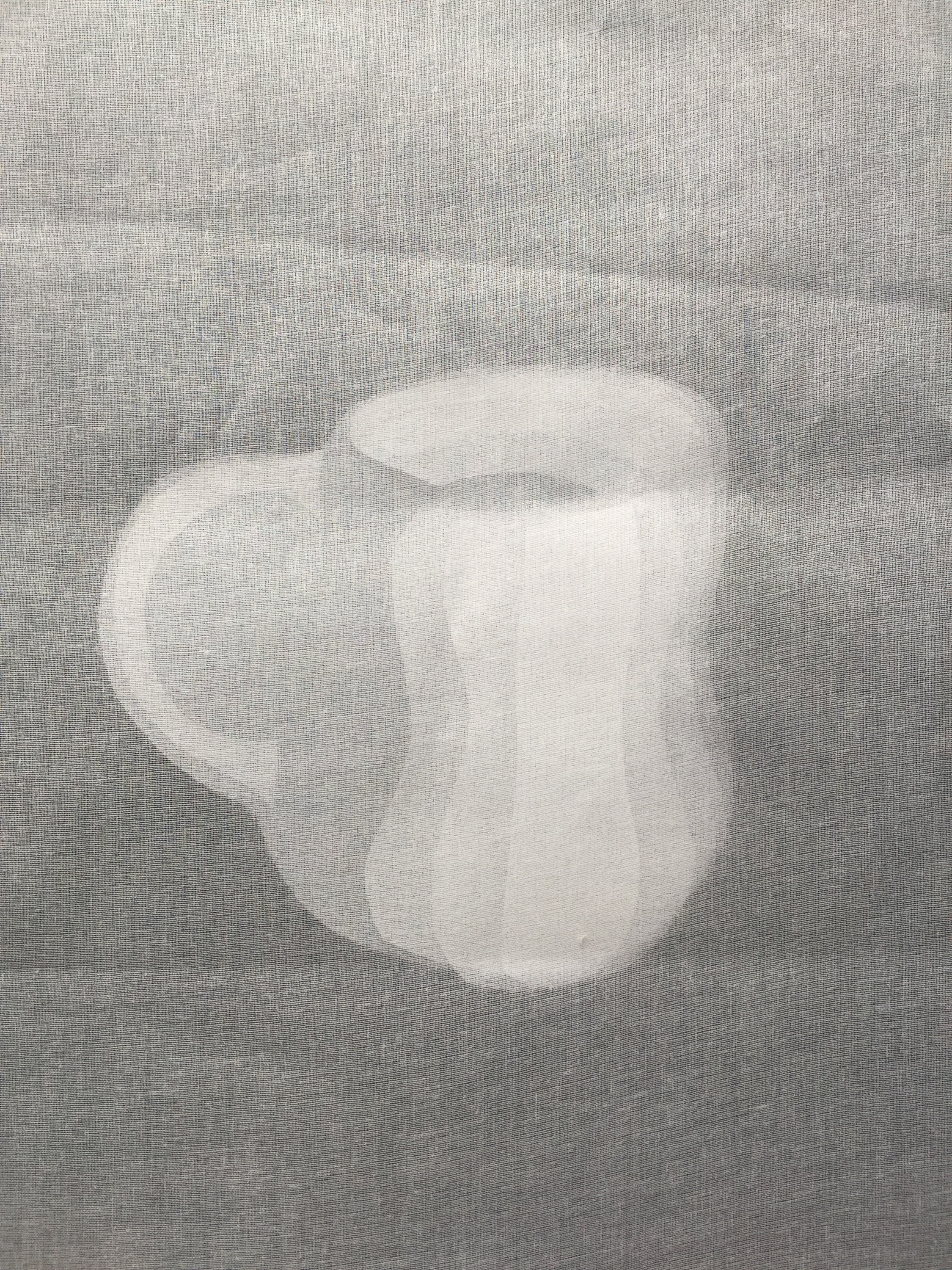
I worked through a few ideas in my sketchbook, then had a flick through my assessment one drawings and found my little Dartmoor mug scraffito/back drawing. I like the way that I developed form through shading and wondered if I could achieve this with layers of fabric.

IMG_3982-0.jpg


IMG_3959.JPG

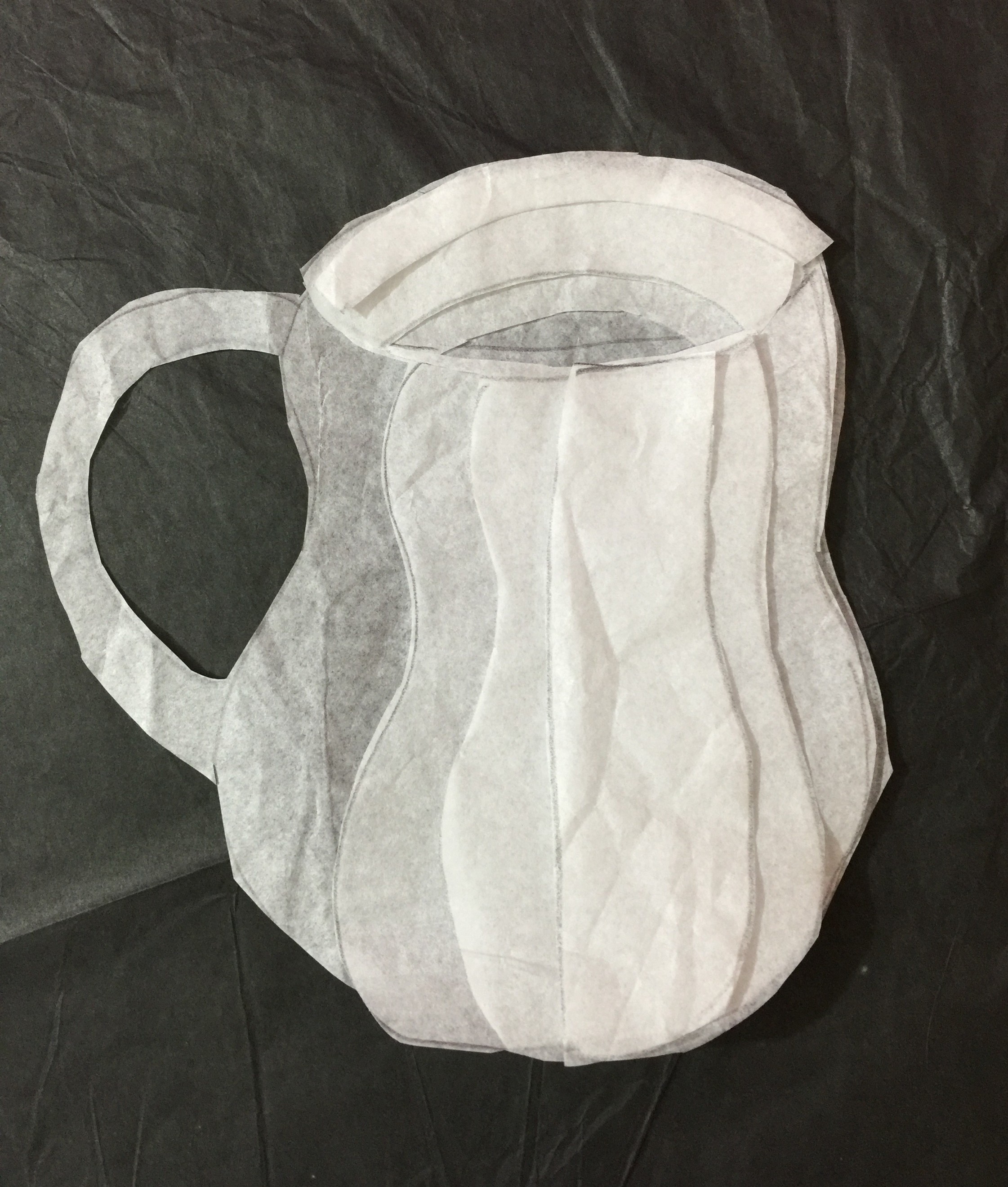
My tissue paper mock up is really effective  – so a plan was formed…

IMG_3981-0.jpg

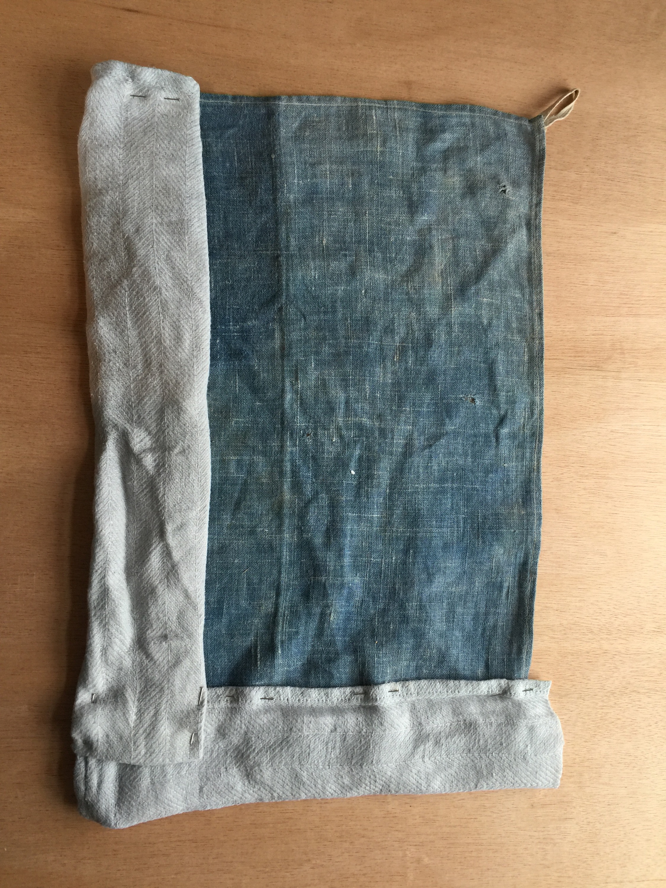
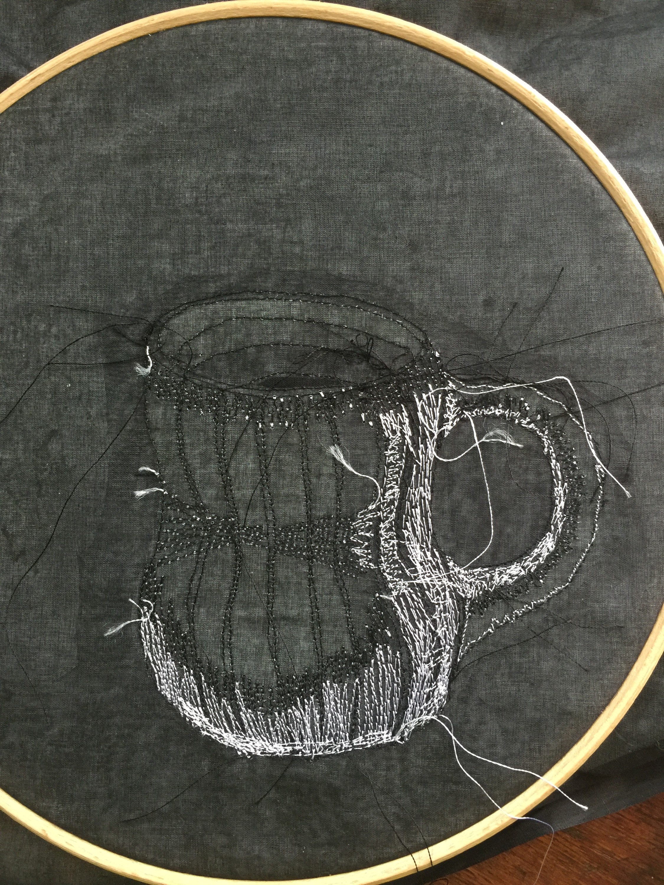
I did a two day machine embroidery course with Rosie James and thought that machine stitch would work really well to define the outline of the mug . The course was a while back so I dug out Rosie’s book Drawn to Stitch to recap the basics , and had a practice on some scrap fabric to get my sewing machine settings right.

IMG_3964.JPG IMG_3968.JPG IMG_3970.JPG IMG_3969.JPG

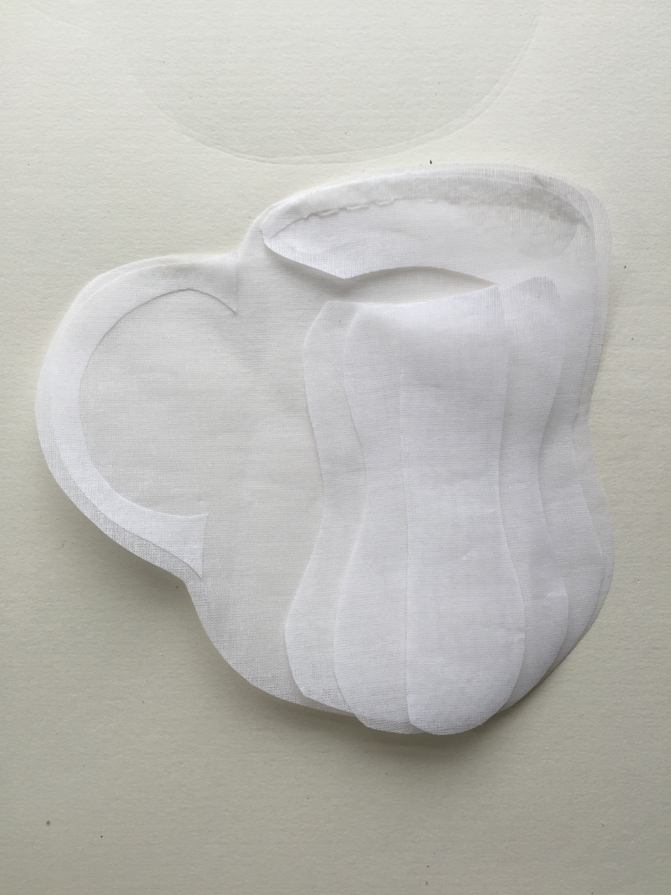
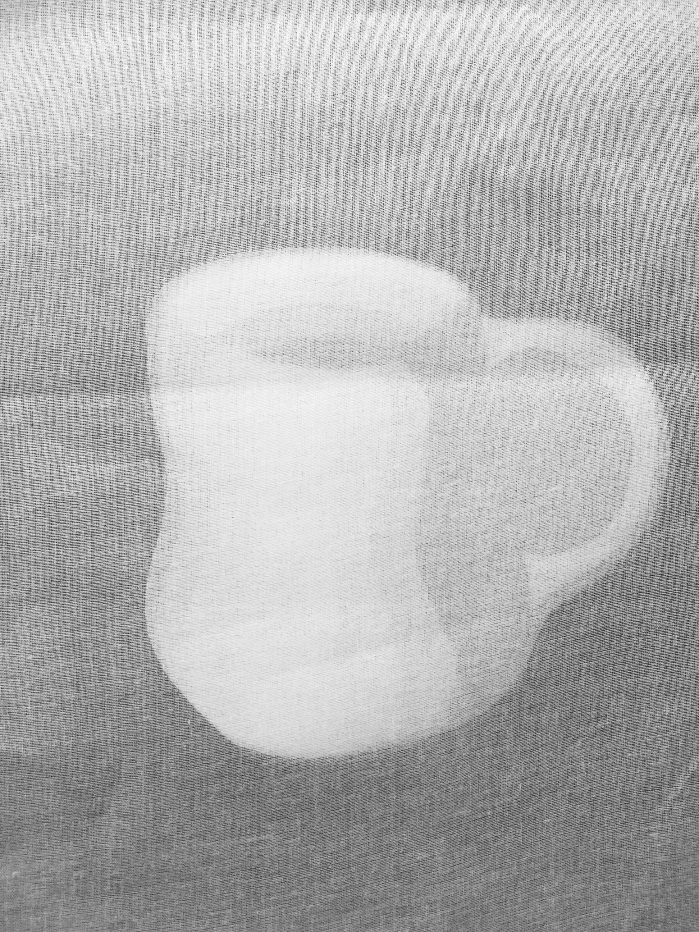
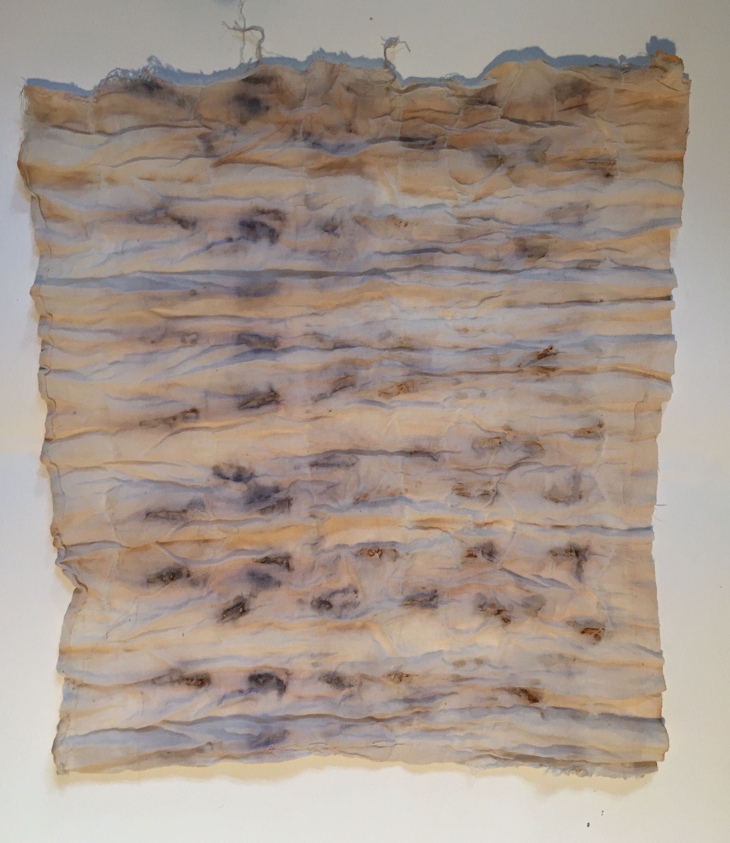
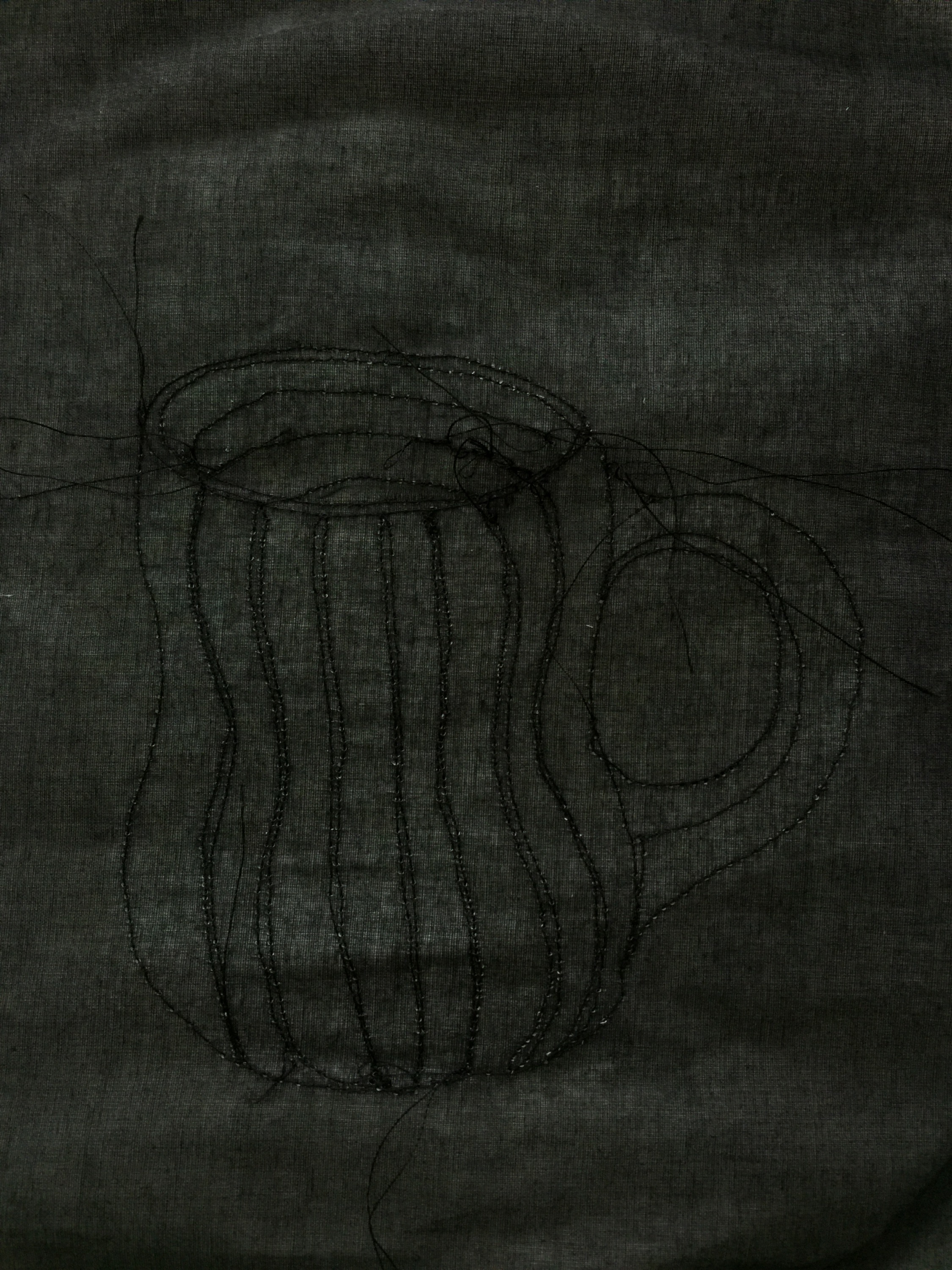
Playing around with background fabric colour, the layers stand out much more clearly on black than white, and interestingly more definition with the smallest layer on the top than the bottom.

IMG_3973.JPG

IMG_3972.JPG

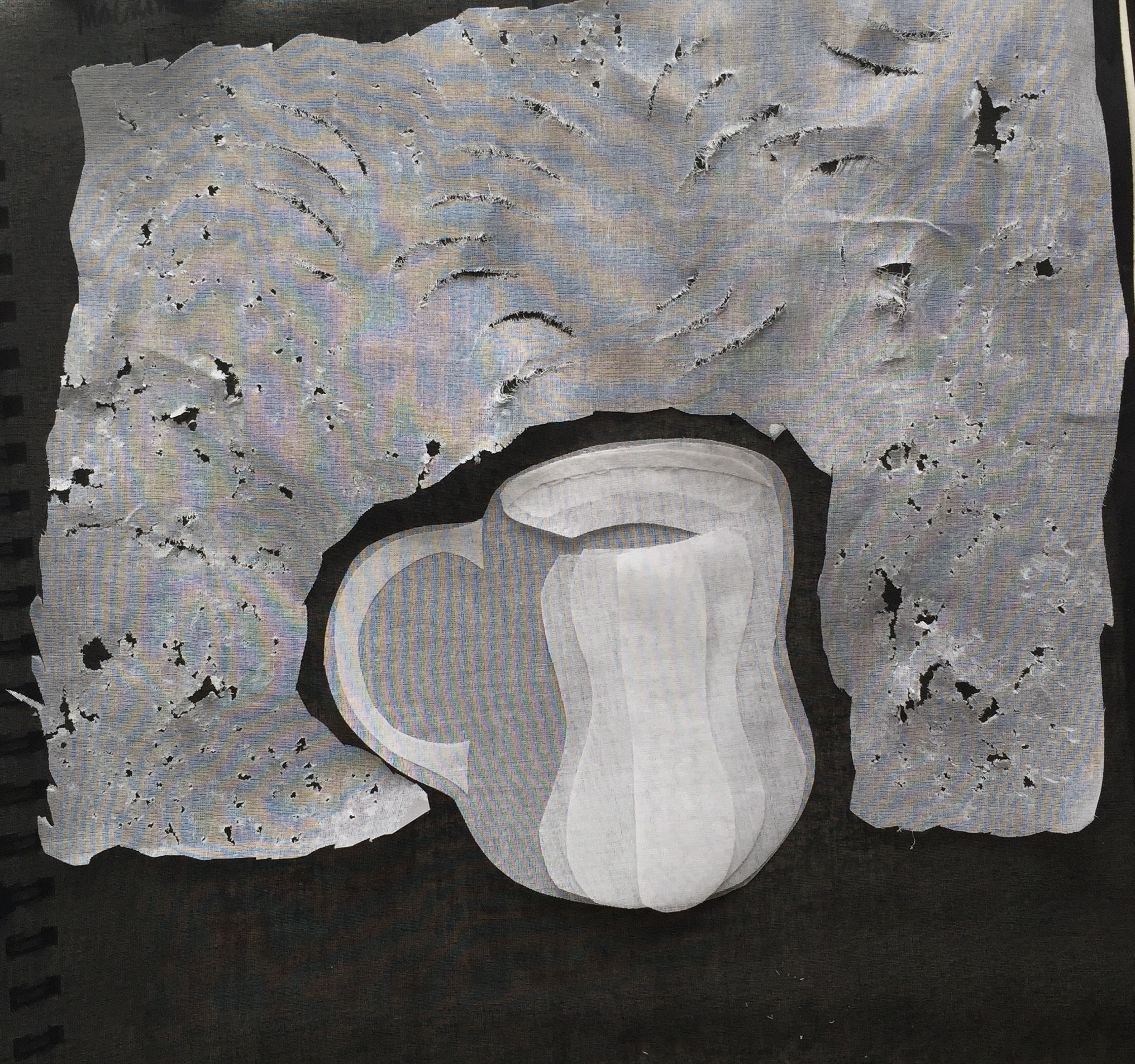
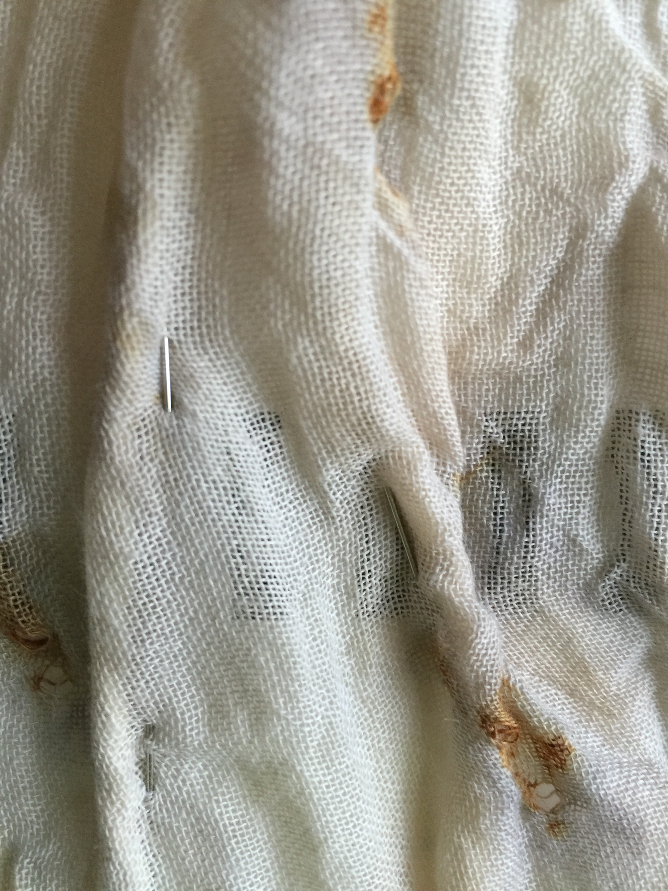
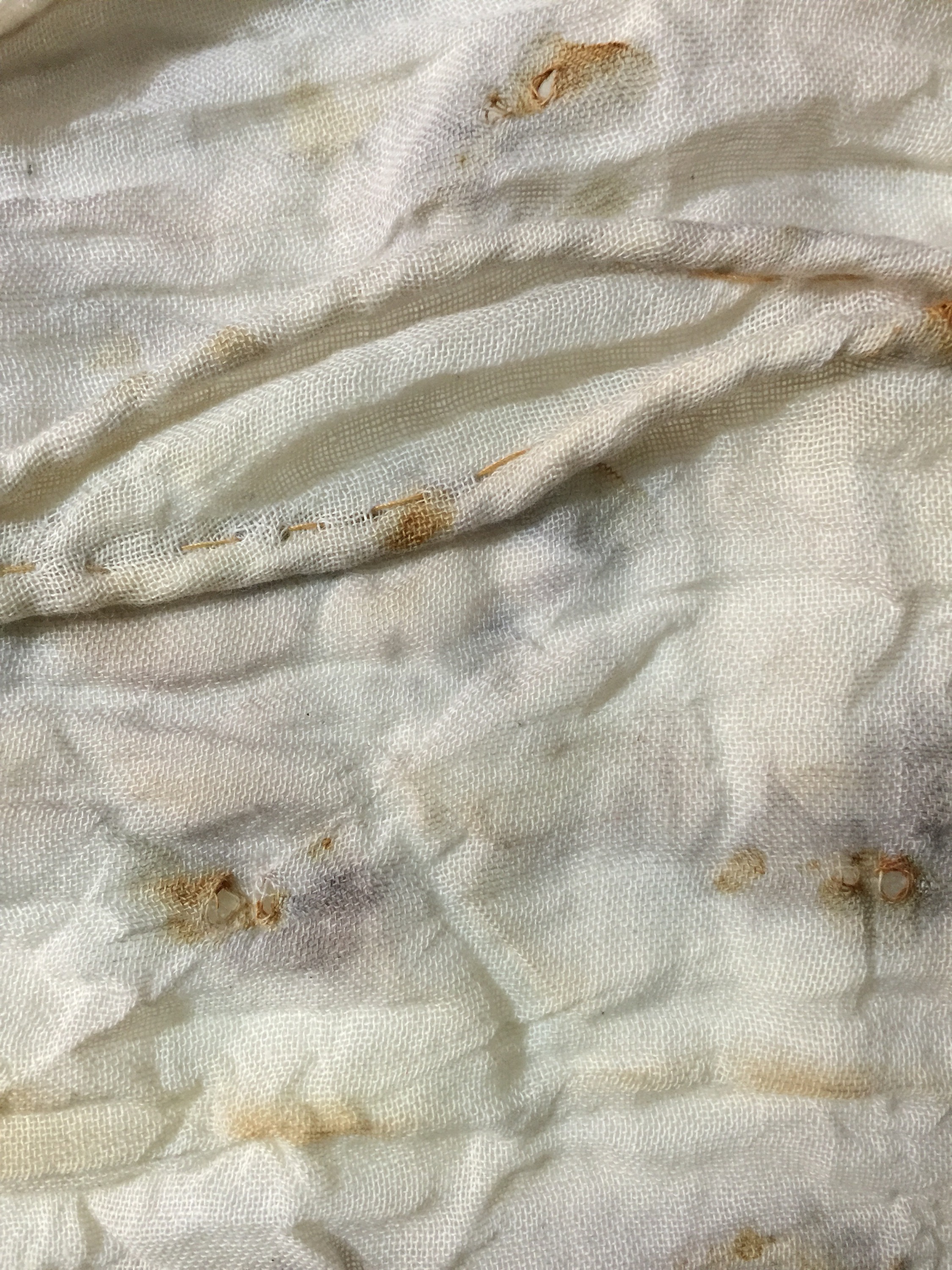
To make the ground darker (to stand the mug on rather than have it floating in air), I decided to make the air lighter by adding an extra layer. The plain fabric was to clean so I distressed it in a similar way to some of my paper samples by bashing it between two stones (handily gathered somewhere along the way!).

This was really effective , I also used a scraping technique to make the curved lines that I observed in my print.

IMG_3976.JPG

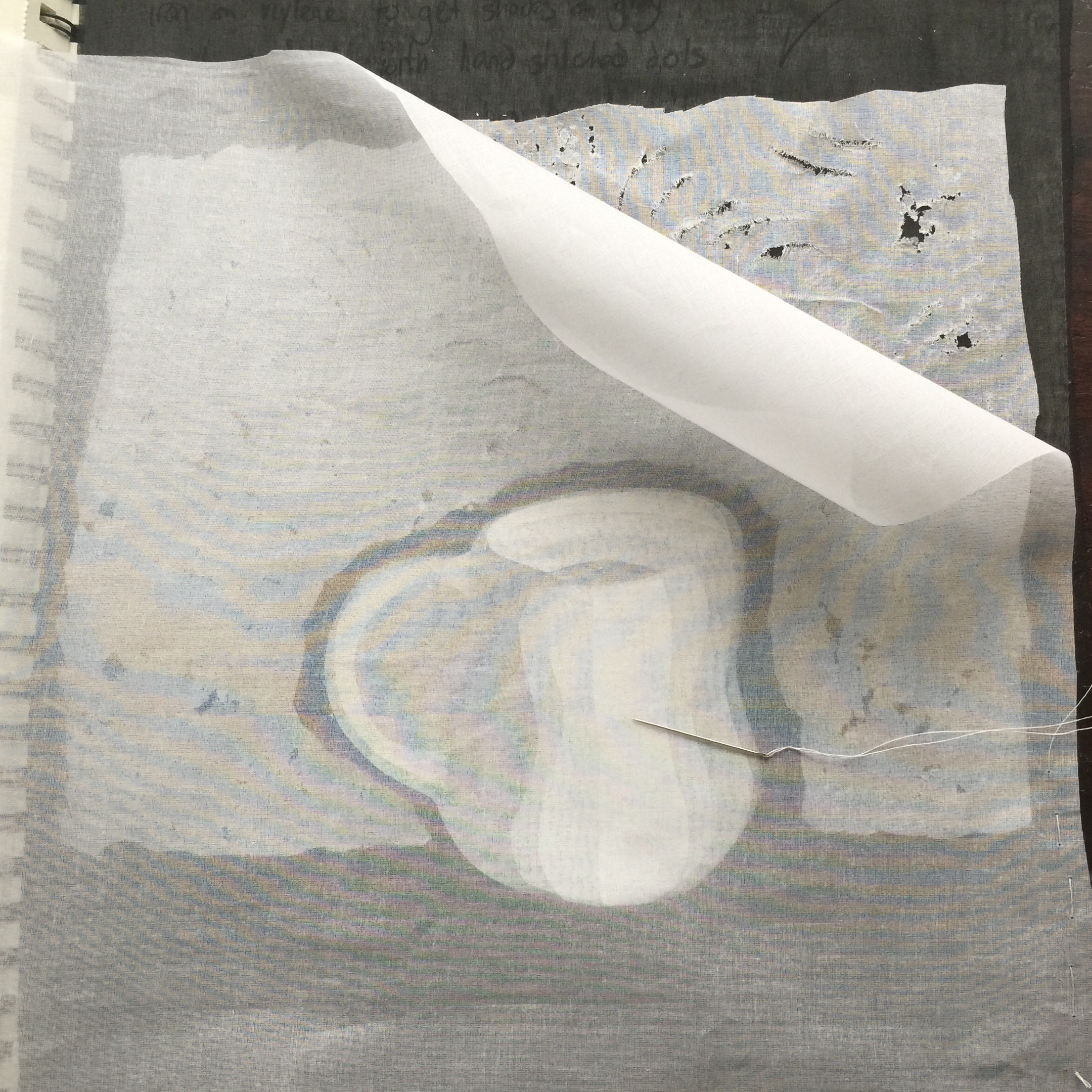
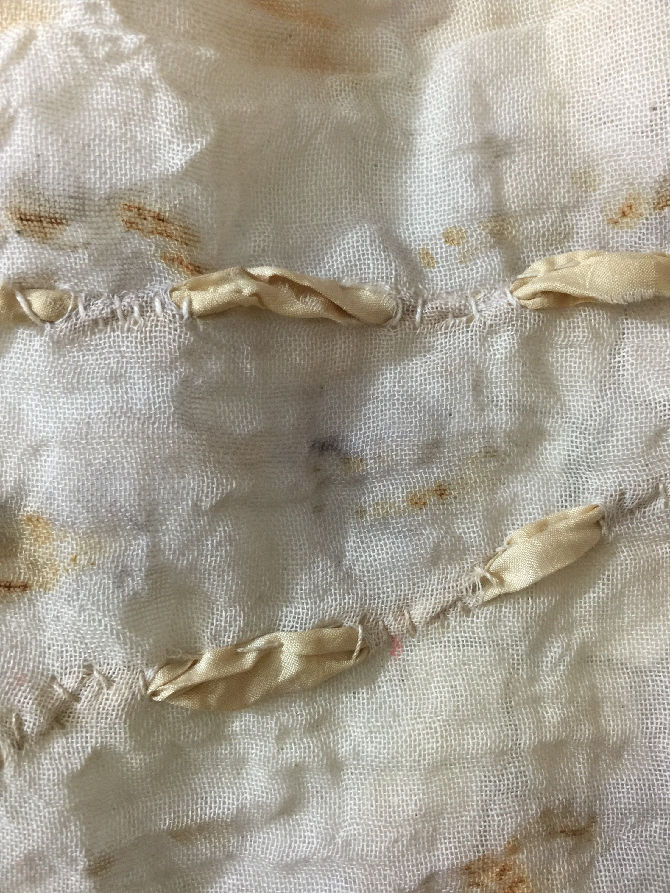
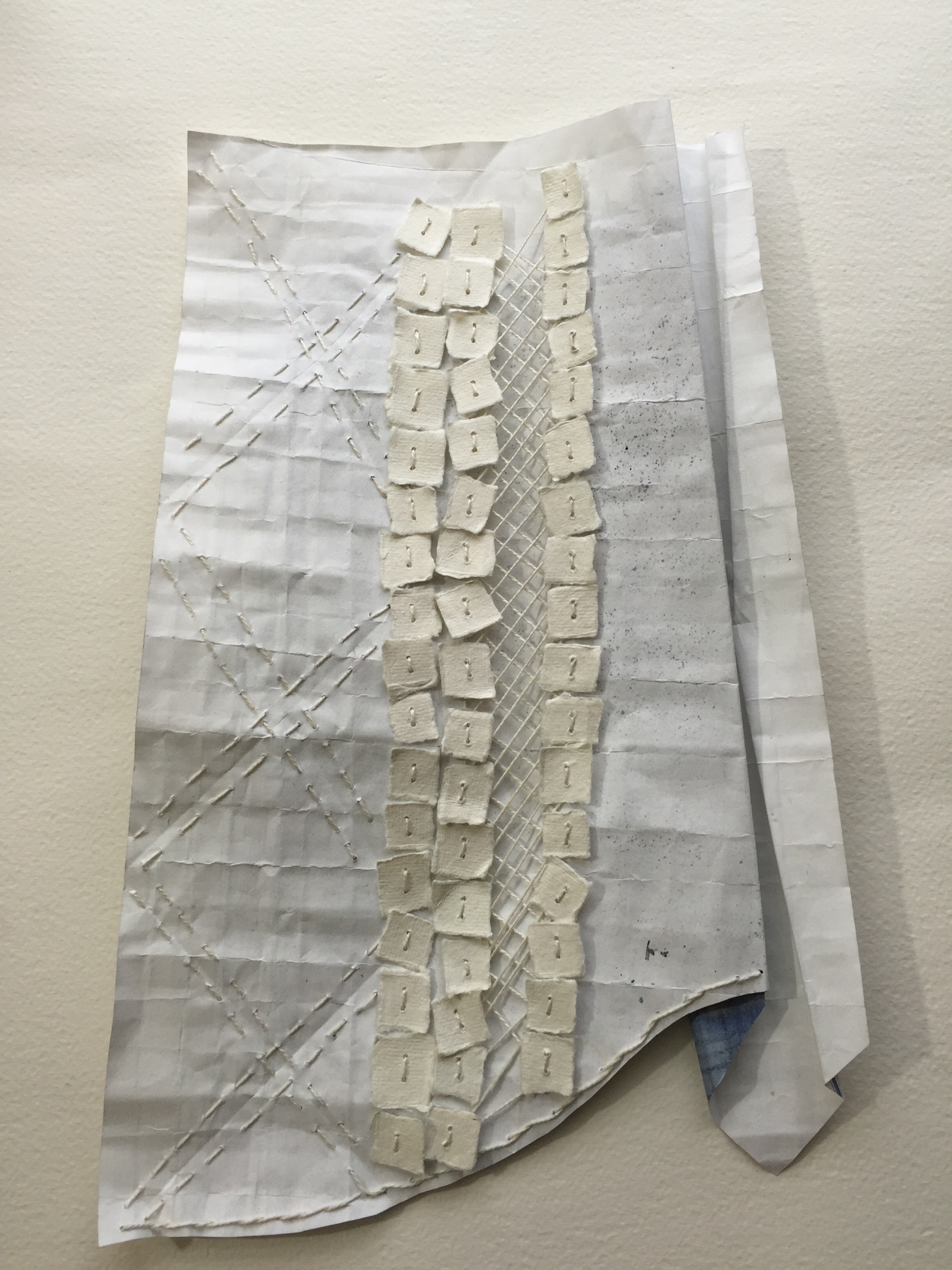
I used some tiny bits of glue peeled from that iron on paper for applique, this was to hold the layers in place while stitching, without making a solid lump of glued layers.

IMG_3980.JPG

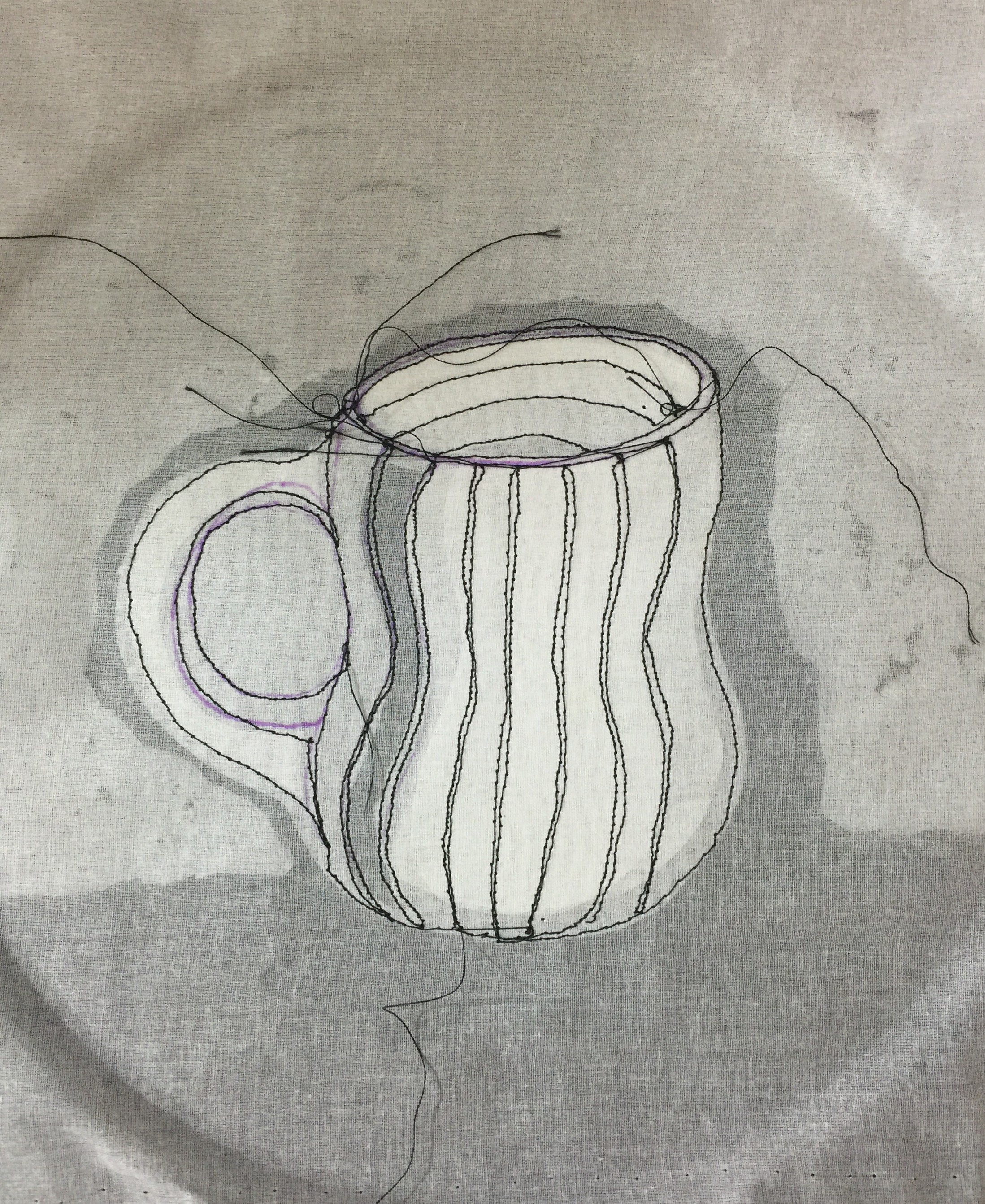
Air erasable pen was used to define a couple of the less obvious edges. I do hope it disappears! The first round of stitching seems to have gone quite well! Yay!

IMG_3986.JPG IMG_3985.JPG

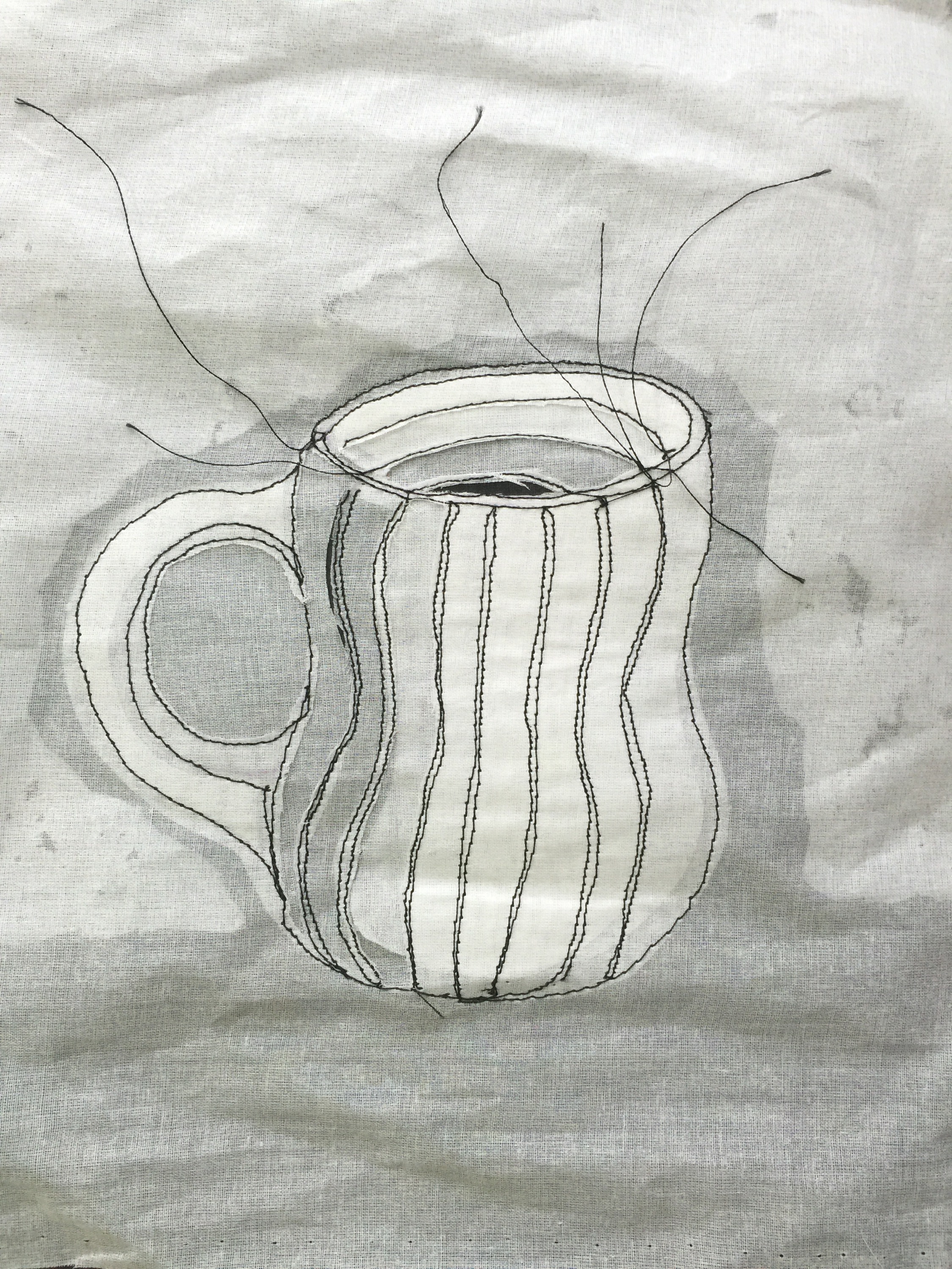
Coming back to the piece after a good sleep I decided a bit more trimming would show graduations more clearly, I also observed the black stitching on the black base layer looks rather lovely.

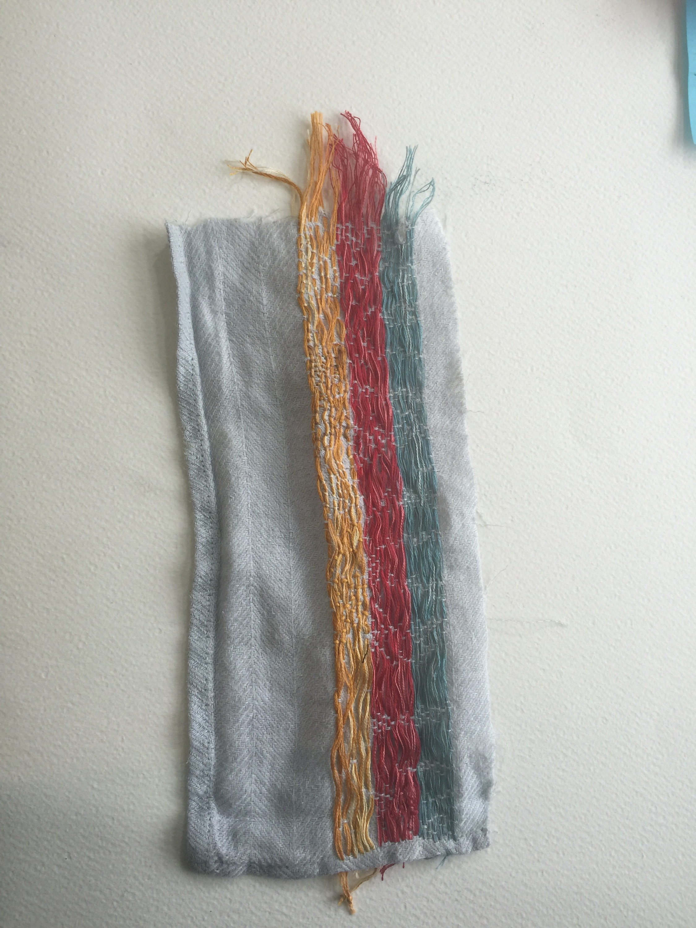
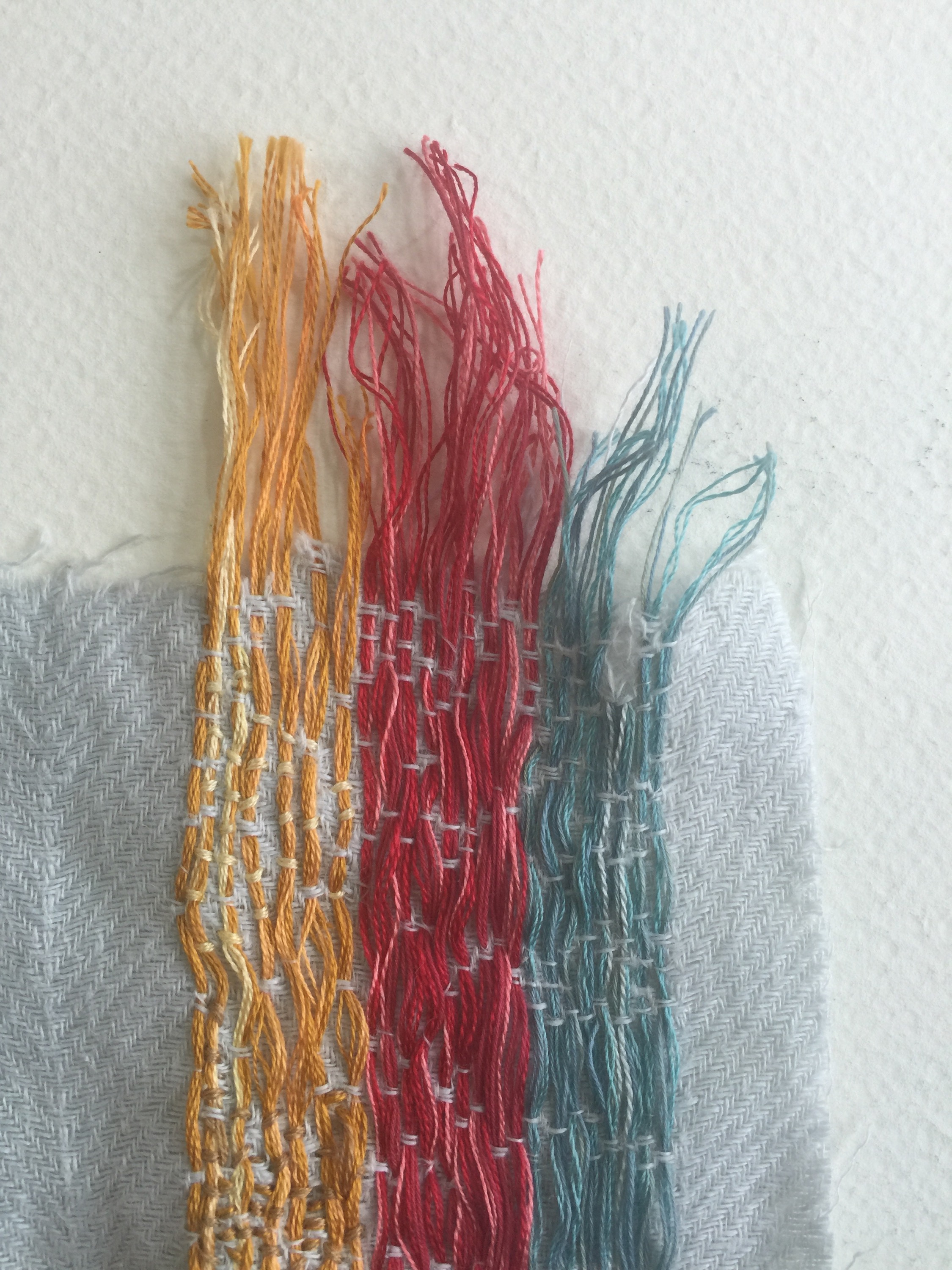
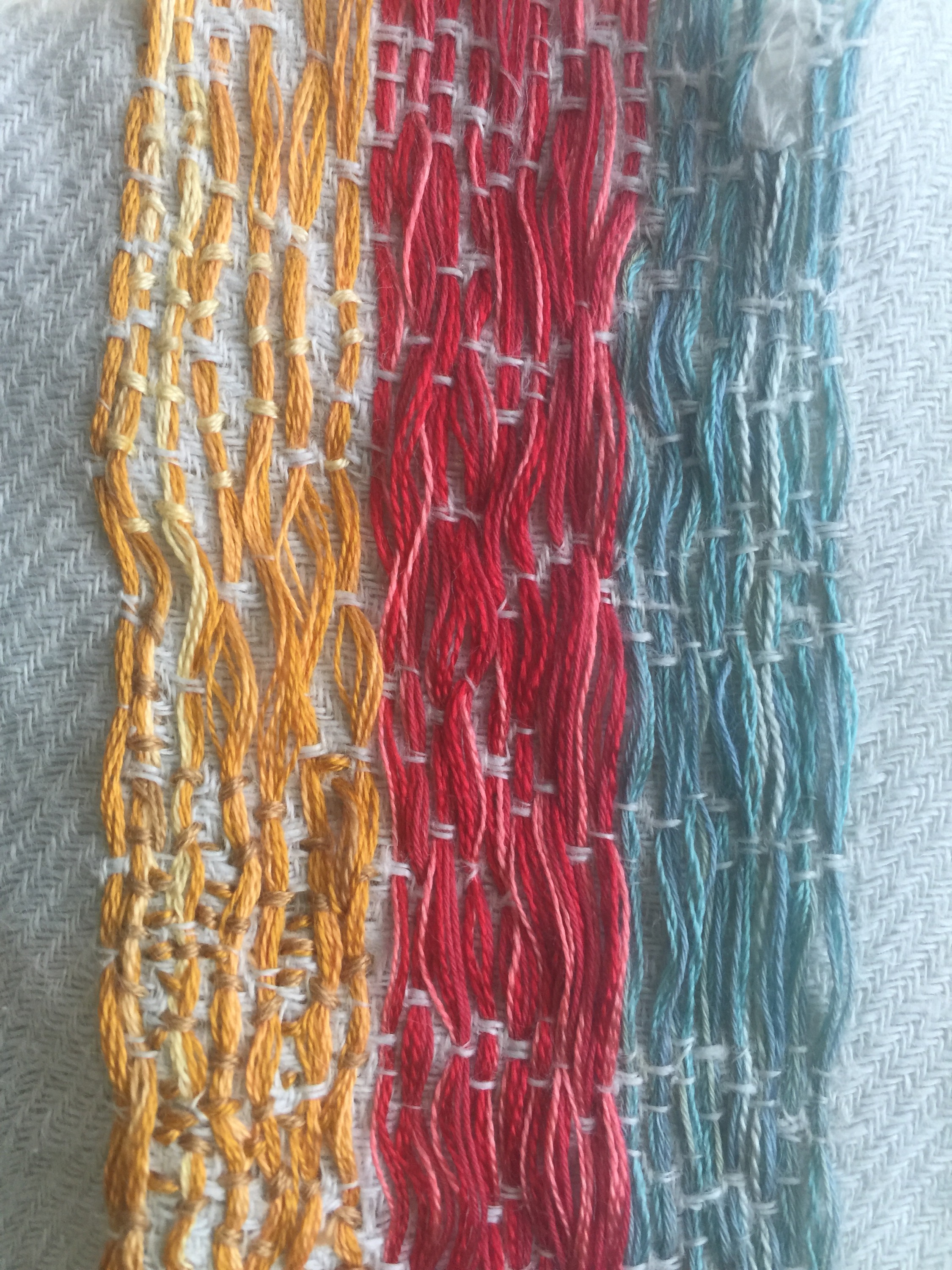
I did some experimenting on some spare fabric and discovered four tones;

white bobbin and white thread is lightest

black bobbin and white thread gives tiny dots of black

white bobbin and black thread gives broken black lines

black bobbin and black thread is darkest.

Also direction of stitching reflects light in different ways.

IMG_3989.JPGIMG_3987.JPG

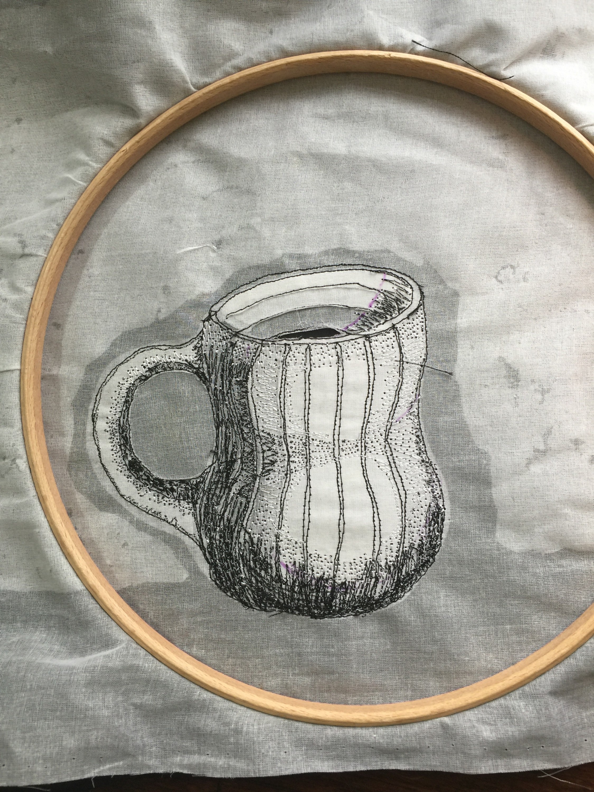
I used this to start to give form to the mug, I especially like the subtle marks of white thread with black bobbin, this gave lovely subtle shading around the waist of the mug. ( still loving the reverse)

IMG_3990.JPG

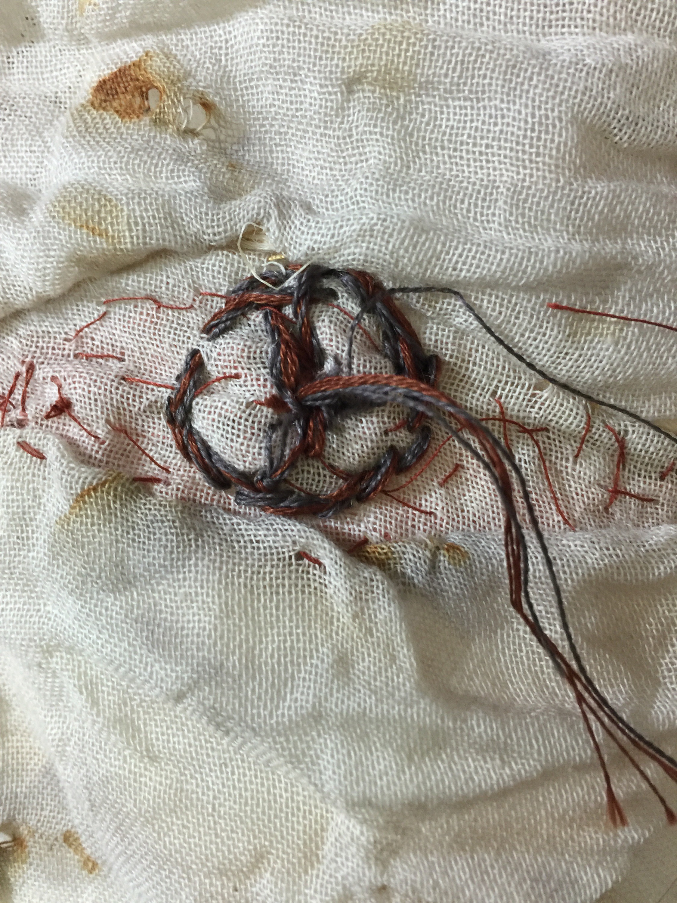
I machine stitched a thick thread on the shadow side , where the decorative line had disappeared and started to try to develop some texture in the back ground – the thick thread was successful, the background I’m not so sure about…

IMG_3991.JPG

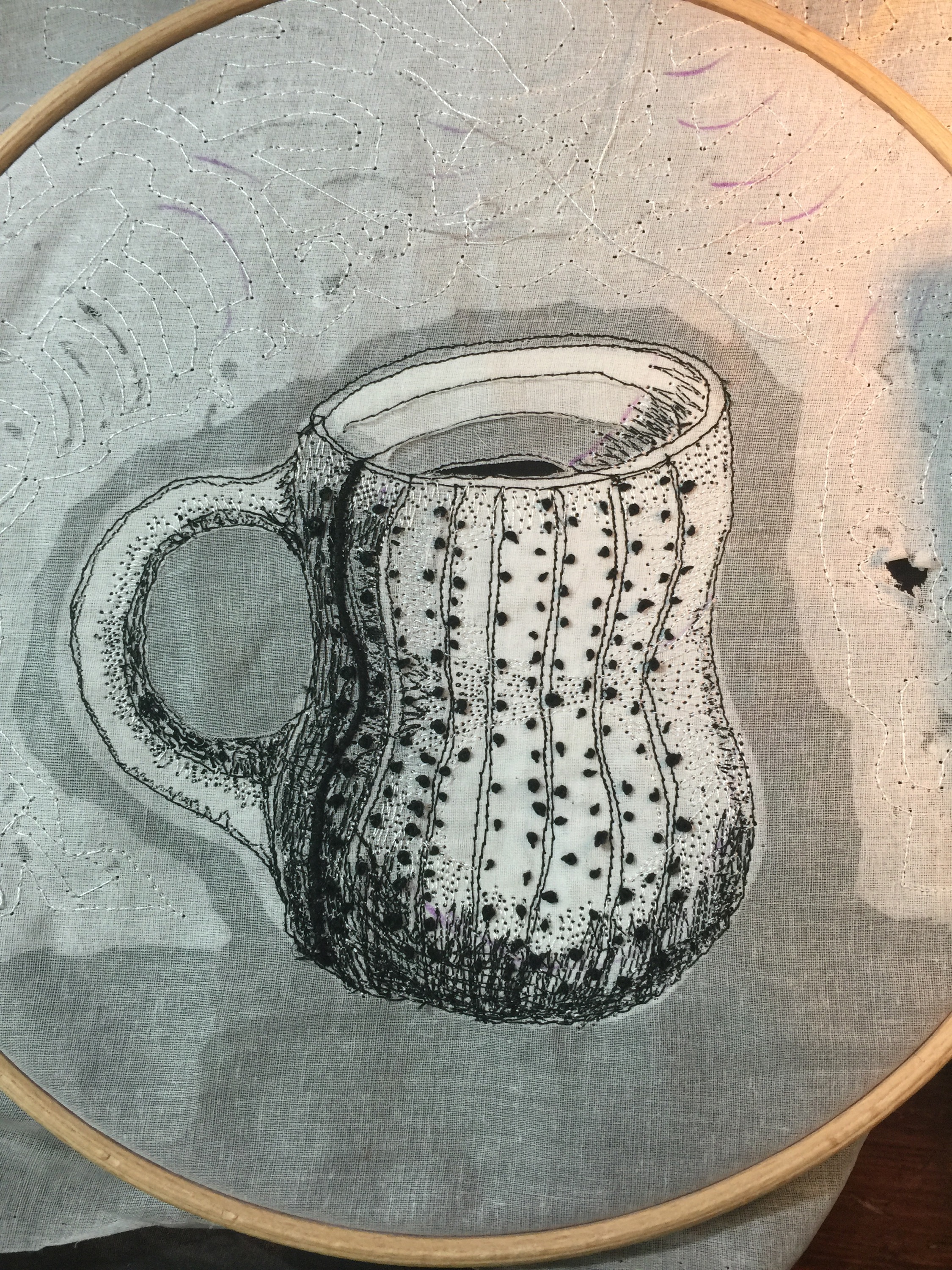
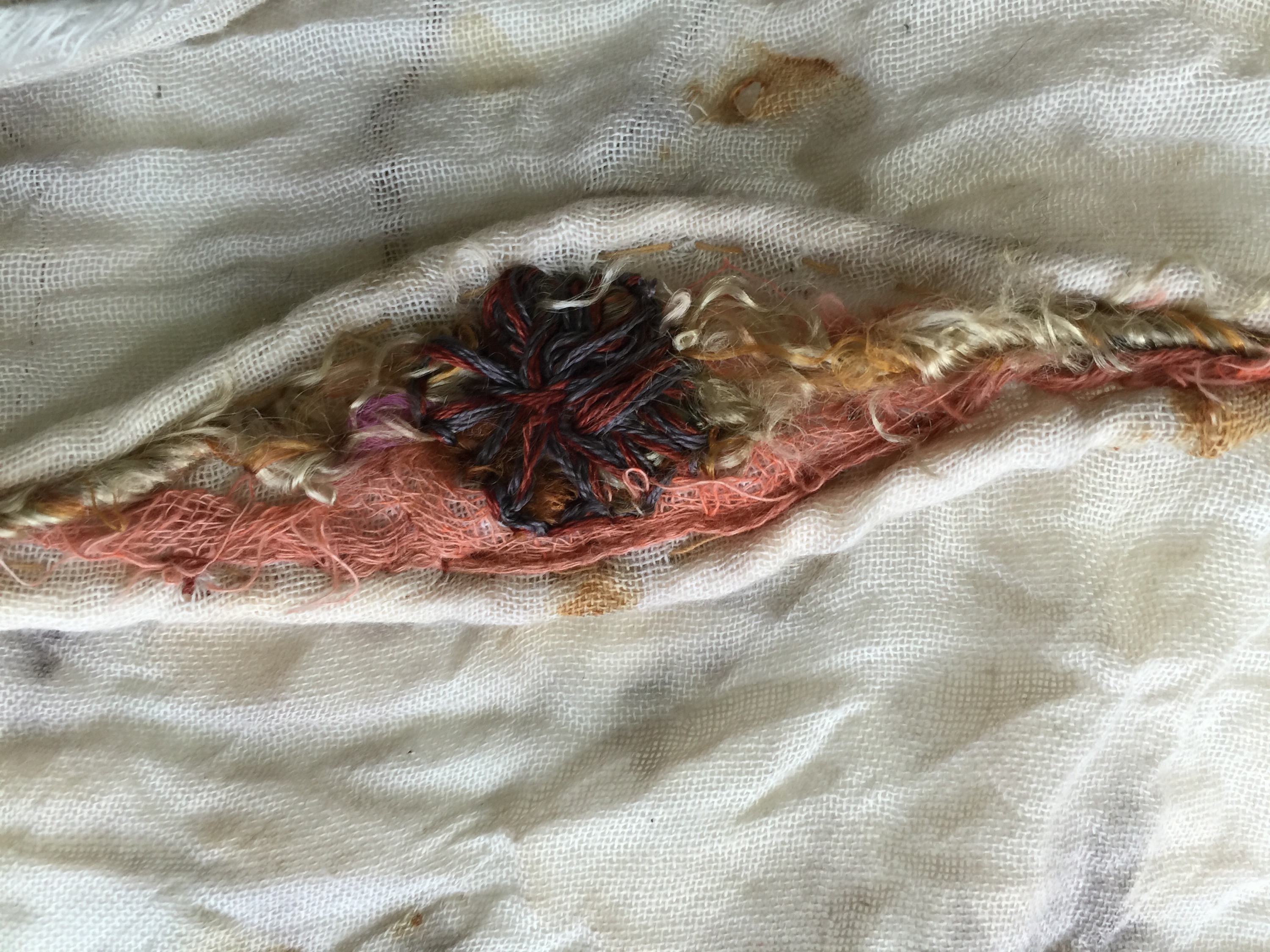
French knots were perfect to complete the mug, I’m really pleased with the form and texture.

IMG_3993.JPG

I started cutting through the background to add some texture as the stone hammered marks were a bit lost under the foreground fabric. I’m really not sure where that was going so I stopped. The course notes do state that we are not making completed works for this excercise.


Hurrah!!! third piece ready to go.


ATV assignment 2 Stitching: Placed and spaced -stitched piece 2 

IMG_3885.JPG IMG_3884.JPG IMG_3887.JPG IMG_3886.JPG

I picked up the worn linen tea towel some time ago, It is deliciously used, soft and subtly faded. It is lighter than the actual fabric of the Akha jacket, but close enough to my drawings to be suitable and exact match for some other textiles I have from the same area, I’m guessing that it is indigo dyed. The binding is part of a linen towel that I have worn to holes so it seemed time to repurpose it, it has the same aged feel. The Jacket is fabulously asymmetric, so it gave me an opportunity to play with details without feeling that I was being untrue to the Akha style. All the jacket seams are sewn by hand with beautiful caring stitches, but thread colour, or whether or not a binding finishes under or over is of the moment I think.

IMG_3898.JPG IMG_3899.JPG IMG_3900.JPG

The binding is worn and faded. Rather than choosing three colours of fabric I used toning threads and different lengths of stitch to give a rippled worn effect. I stitched the yellow band first using lighter and darker threads to emphasise worn or stained areas, I then decided that weaving under varying numbers of weft threads and leaving long or short gaps is really effective.

IMG_3907.JPG IMG_3902.JPG IMG_3908.JPG IMG_3909.JPG IMG_3901.JPG IMG_3905.JPG IMG_3906.JPG

I used different sized paper circles to develop the placement of the buttons, the little blue circle represents the little ghost button that I went with as my final idea. A darn has appeared on the binding where I hit the fabric between two bricks to distress it a little more and it disintegrated.

The meditative nature of stitching took me right inside my idea. As I reflected on my research of the Akha people I wondered about what the garment details represent – perhaps the yellow is the earth and blue the sky. Red often represents blood or people. The faded colours are a culture under threat from a changing world and political and environmental changes. My little ghost button represents the vanishing forever.

Photo-167670562d.jpg

The piece as it is, good old rule of thirds helped with placement. The centre of the trio of triangles and the centre of the ghost button are on the intersections of the thirds lines. I’m pleased with the composition. Each button uses a different technique (same but different) The heaviest buttons are earthed they get lighter as they rise then disappear.

I did not add the button thread or holes where the thread has been in the ghost button. I used pages by 53 on my ipad to represent  the crosses, and a darkened patch to show how the less faded area of the ghost button may look.

IMG_1208.PNG

I have not yet resolved this detail.


Hanging from the little tea towel tag , that I left to hang it by .

ATV assignment 2 – Stitching: Placed and spaced – stitched piece 1


Birch Bark – the eyes have it

I love the fabric as it is really…


My drawing has a rust coloured eye so I added a base layer of inktense then started to raise the texture of the bands around the tree and define the eyes by stitching sisal behind the fabric. I was delighted that this gives structure like a whale-boned under skirt. the base layer is bouncy and three dimensional.

However the proportions of the fabric have changed and the eye is no longer at my fibonacci point of focus so i added some strips of silk to extend the length. the result is like the very delicate bark layer that can be easily peeled away.

IMG_3929.JPG

I used techniques that I experimented with on my samples to build up a variety of textures. This was easier by far as fabric is so much more flexible to work with, and less brittle so stitches can be really close together. I wasn’t too concerned about making it look exactly like any one drawing, there are elements from several of my tree drawings and an essence of my love of trees. This drawing was the main inspiration.

IMG_3956.JPG

I think that I used really appropriate colours and textures.
IMG_3932.JPG  IMG_3933.JPG


IMG_3951.JPG IMG_3953.JPG IMG_3952.JPG IMG_3954.JPG

I almost like the reverse more in places, particularly the woven sari silk and the stitch s that hold the sisal twine in place. The eyes from the back look like the darns on the old Scandinavian tunic that I drew in the summer.


A little book of compositions

IMG_3935.JPG

I was looking for some-thing and found another.

A box of books I made on an evening course ages ago. They are delightful and so much more interesting than shop bought ones. So it will be a thing that I do, when appropriate , to make my own books.

Inspired by an exhibition at the Devon Guild of Craftsmen (a favourite place to visit on my Dartmoor adventures) Sketchbooks – Life Illustrated. I am going to use this book to explore composition.

IMG_3939.JPG IMG_3938.JPG  IMG_3936.JPG

The exhibition by the way was liberating! Lots of artists allowed their sketchbooks to be on show, with white gloves to protect the pages, you could flick through and properly realise that shiney work on gallery walls started somewhere, and most sketch books are not works of art. Brilliant.

ATV assignment 2 Stitching: Placed and spaced Preparation

ATV assignment 2 Stitching: Placed and spaced Preparation


I pulled the nails one by one from our ceiling joists, they were such a pretty shape that I saved them in case they came in useful…

… Then I discovered the idea of rust dying and managed to find the little nails again!  Apparently green tea contains more tannins, as I fancied a cup and wanted the fabric to stay quite light I made a brew , drank a cup and left the rolled and tied fabric to soak.

I could quite quickly see the marks develop so after a few hours I took the fabric out and left it to dry while I popped to Devon for a few days.

IMG_3889.JPG

It is very evocative of birch bark, hurrah!

I have sorted through my threads looking for suitable tones and textures, apparently I have quite a selection. Thank you my magpie tendencies.

I have started investigating composition, much helped by the book Connecting Design to Stitch by Sandra Meech.

IMG_3944.JPG

IMG_3943.JPG

IMG_3945.JPGIMG_3946.JPG

My first thoughts on compositions to use were jotted in my on the go sketch book.

I developed ideas in my A3 sketch book, I need to carefully consider use of sketch books- it think that it impedes fluid thinking , I wi would do better to work on loose sheets and bind them later.

IMG_3949.JPGIMG_3950.JPG

I found using collage to experiment with placement really useful,  quicker and gives a more realistic view than my flimsy water colour sketches.

I found a box of tangled vintage threads at a local market, there are some lovely faded threads that I think will work really well.

Assignment2 – Ex2.4 – Developed and composed samples on paper


I thought that the woven papers worked really well visually as a base substrate. I’ve  been thinking of  patchwork birch trees since my summer holiday so it was lovely to follow this idea through. Some of the paper strips were not very absorbent so the glue has separated and the paper is a little fragile – exactly like peeled birch bark. I had to handle the paper carefully and be careful about closeness of stitch holes to each other. I’m really pleased with the outcome.

The second sample is based on the Kachin skirt from Burma. During my visit to Brighton and Hove museum to draw the piece I had a chat with one of the  curators about tradition British dress and learnt of Whitework ( which needs further investigation by me) I like that the creases in the paper cast subtle shadows and that the little shell buttons are all similar but different . Not so much work in this sample but to be honest I was very very keen to move on to the fabric samples.

ATV assignment 2 Surface and Stitch research point 1 – Used materials

71
Textiles 1: A Textiles Vocabulary
Research point 1
Stitching to mend or darning could be another consideration in your translation from paper to textile. You may find that your drawings and stitched paper pieces suggest a feeling of mending or repairing and refining. Is this something you can introduce into your textile preparation and stitch work? As already suggested, you may decide to use imperfect textiles or found/recycled materials as your basetextiles rather than employing brand new unused
or virgin materials. Consider how you can work with the characteristics,imperfections or  patinas of the textiles you’re using as base materials. An element of repair may give another layer to your work.
Many textile designers and artists choose to work with found, recycled, worn or even discarded textiles and materials. Try to find an example of one such designer or artist and analyse how they select, apply and alter their chosen materials. Make some notes on this research in your learning log

Some thoughts on environmental concerns – just a few of many….

Used materials sounds so harsh! reuse, reduce, recycle,  is like a mantra in schools and society but there still seems to be a little stigma attatched, a late twentieth century mill stone around our planets neck. something that I feel very passionate about.

I would like to live in a world re-appropriating materials into something else was such a natural thing that no body would notice the difference.

Environmental expressions used as a marketing tool – a disgraceful hypocrisy.


Boro

darning,

little ghost butons

Tom of Holland