Sketch books course with Dionne Swift

I never seem to have enough time for my studies but felt that a dedicated timed  course could help kick start my sketch book use.

The course was really enjoyable and has certainly given me some ideas on how I can develop my sketch book usage. I was fun and achievable to create a full up book in a fortnight – Lots of experimentation with materials and processes and I even managed to produce some interesting images!

Most useful was the introduction to the one hole punch to add and move pages in a spiral bound sketch book. Very very handy.

ATV3- colour studies – research point 2 – digital resources for colourwork

I have had a little inspect of the suggested programmes to support colour work. The one I found immediately useful was   Adobe  colour CC . This programme is brilliant in some ways. I like that you can choose a theme for the colour selection; colourful, bright,muted, deep, dark or custom. I can see that it is useful to get an overall idea of the colour palette of an image. I may use it to help with the yarn wrap and collage exercises.

Screen Shot 2016-02-16 at 09.40.13

Mudcube

Colour halipixel

Colour hunter

CoIRD

All distracting to play with and hyperlinked so that I don’t forget them. I will revisit to update soon.


Critical thinking skills

My tutor suggested reading –  Cottrell, S. (2011) Critical thinking skills: Developing effective analysis and argument. 2nd edn. Basingstoke: Palgrave Macmillan. It seems quite a heavy read, it’s actually made me feel like a more academic student just looking at it.  I’m really excited. I don’t currently feel able to order my thoughts and express ideas effectively. I become whimsical and fly off at tangents or sometimes just time warp completely. I completely understand the skills that applying the content of this book will give me. ( a terrible sentence there for example! I know what I’m on about and someday you will too!!!)

Cottrell suggests that to gain maximum benefit from the book it is a good idea ” as you work through the book, pause to consider from time to time how that aspect of critical awareness would benefit your own study, writing or professional work.

Without making this a massive task, I intend to use this blog as a reflection space to embed the ideas in the book more deeply in my thinking. 

This could take some time…

ATV3 Colour Studies 3.2 -Translation through yarn

This was more than a little frustrating. Getting hold of a postcard of a suitable old master painting is not an easy task. At all. I looked everywhere to no avail and then entered the world of online education resources, the stuff of nightmares. Finding and image was the easy part (but still not easy) the downloading and printing (shiny new printer) was another minefield to stumble around in. Then I happily yarn wrapped, and I lost the image reference. Noooooooooo. I may have cried at several points in the process.

For future reference dragging a jpeg onto the search bar sometimes does the trick.

I settled on this Old master mostly I had to reject images for being of very entitled Lords and Ladies or impoverished servants, or naked. Or horses.

IMG_4247

Disegno and Colore
About 1640
Italian, 1591–1666
Oil on canvas
90 15/16 x 71 5/16 in. (231 x 181.1 cm)
Gemäldegalerie Alte Meister, Staatliche Kunstsammlungen Dresden
I actually thought it was nice to see a portrayal of a female artist but it’s  way more complicated than that…
img_4410.jpeg
The gentleman artist is wearing quite a sombre palette
img_4413.jpeg
The attire of artist at the easel is lighter and more flowing.
img_4412-1.jpeg
The tablecloth appears to be green but I can see rusts, golds and blue also.
I think the colour translation using yarn worked quite well. I used fine threads as they seemed to suit the fine brushwork but if I have time I will also do a wrap using chunkier yarns and fabrics.

ATV3 Colour studies 3.1 – Gouache studies

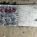
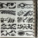
I love mixing colours. It is meditative and absorbing, and mind bendingly problem solving. I took a very analytical approach and made some colour progressions using the three main primary triads, warm, cool and earth tones. I mixed them together and with each other, I made tints and hues. I used the book Colour – A Workshop for artists and designers by David Horning.  It is full of exercises that I will continue to work through.

This became my resource to compare fabric colours to , I found it really useful to gauge which primaries to mix. this sort of became second nature after a while, but still useful to use a check.

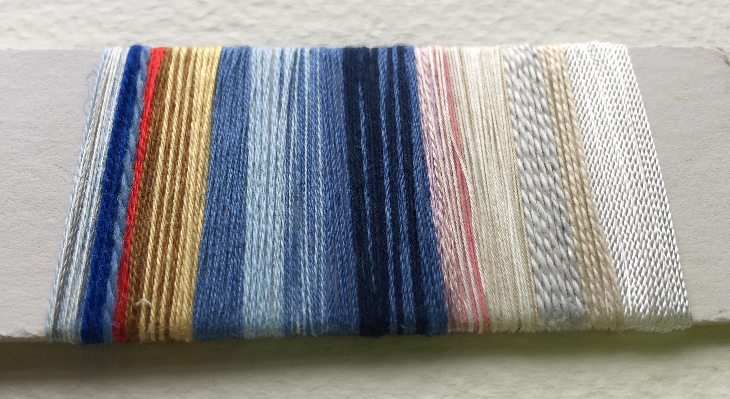
I mounted these fabrics together because they are from the same family , having cool, red, blue, yellow with paynes grey as a mix in common as predominant colours. They clearly have differences also! the orange fabric has some colours that use warm yellow. The red/blue fabric has warm blue. the trickiest colour was the dark yellow/brown in the red/blue fabric. It seemed to suffer most from drying a lighter shade. The mix I settled on for this was yellow ochre with lemon yellow.

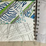
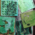
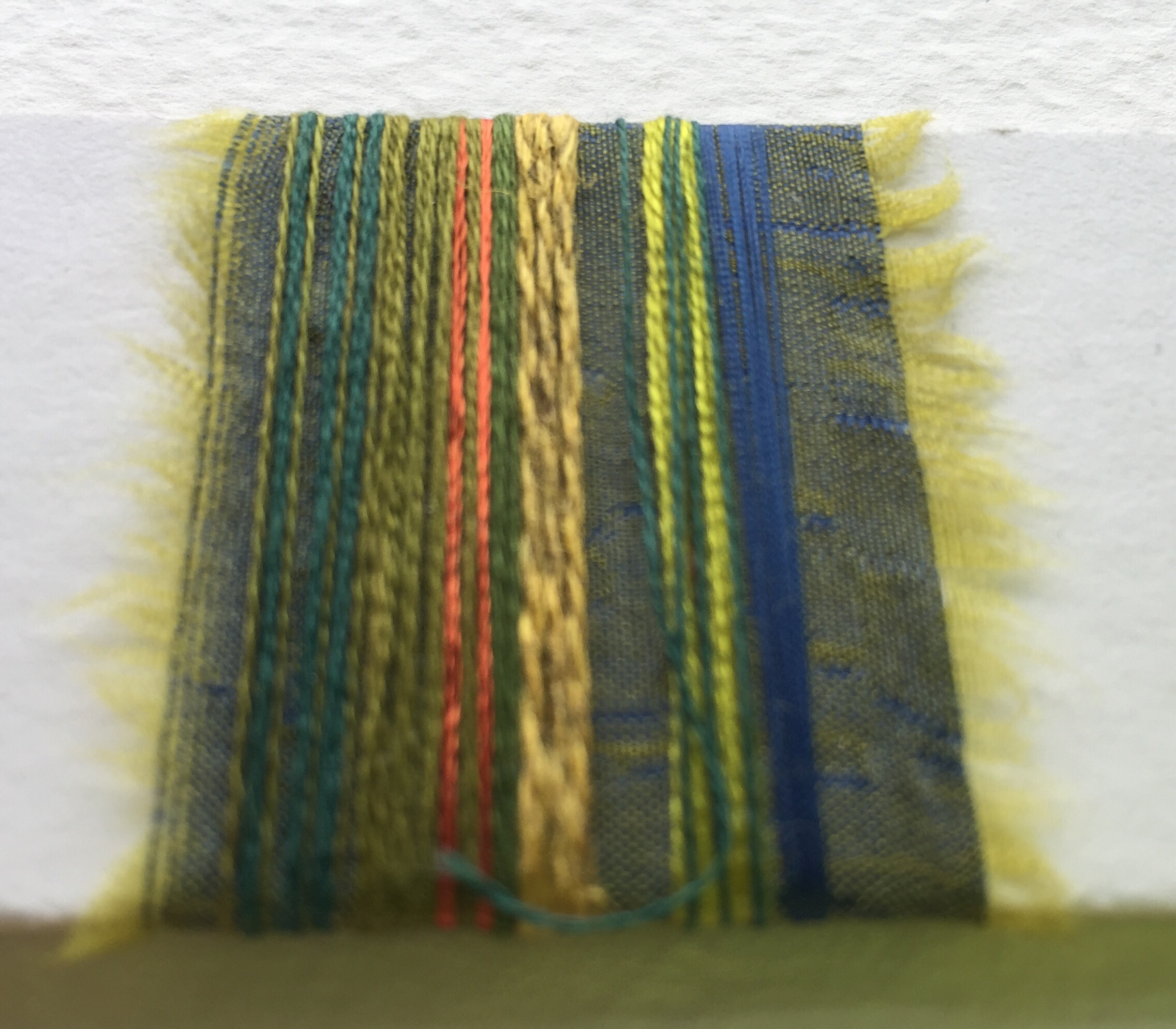
I spent a silly amount of time looking for a single photo to go on this board. The colours all my favourite landscapes ,bright skies and fresh leaves. When I practised mixing the freshest greens came from cool yellow, warm blue, this mix is dominant but there are  some cool blues in the palette too.

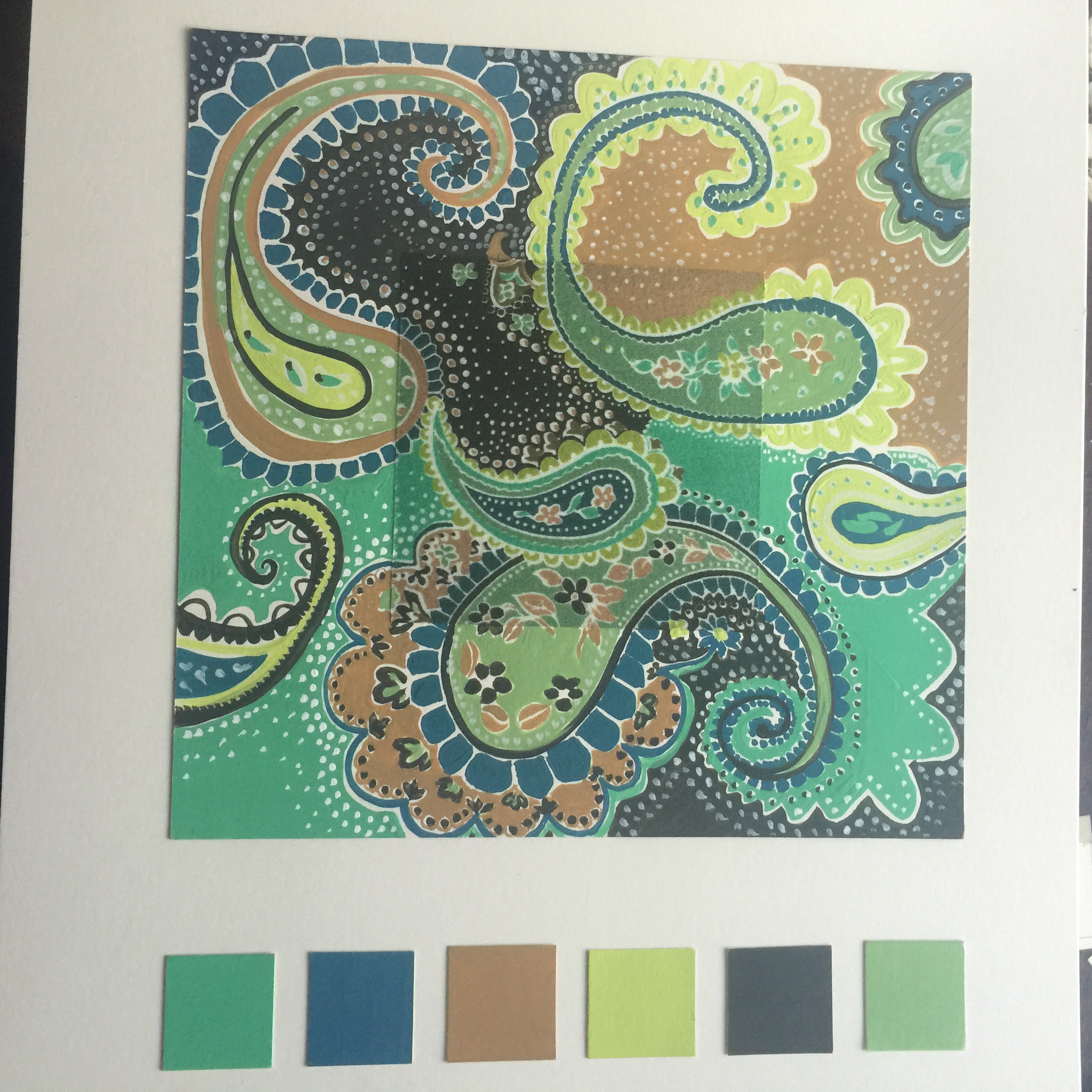
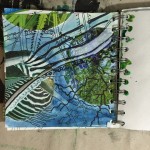
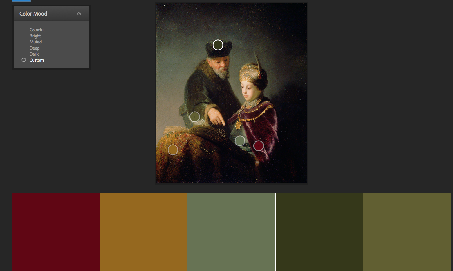
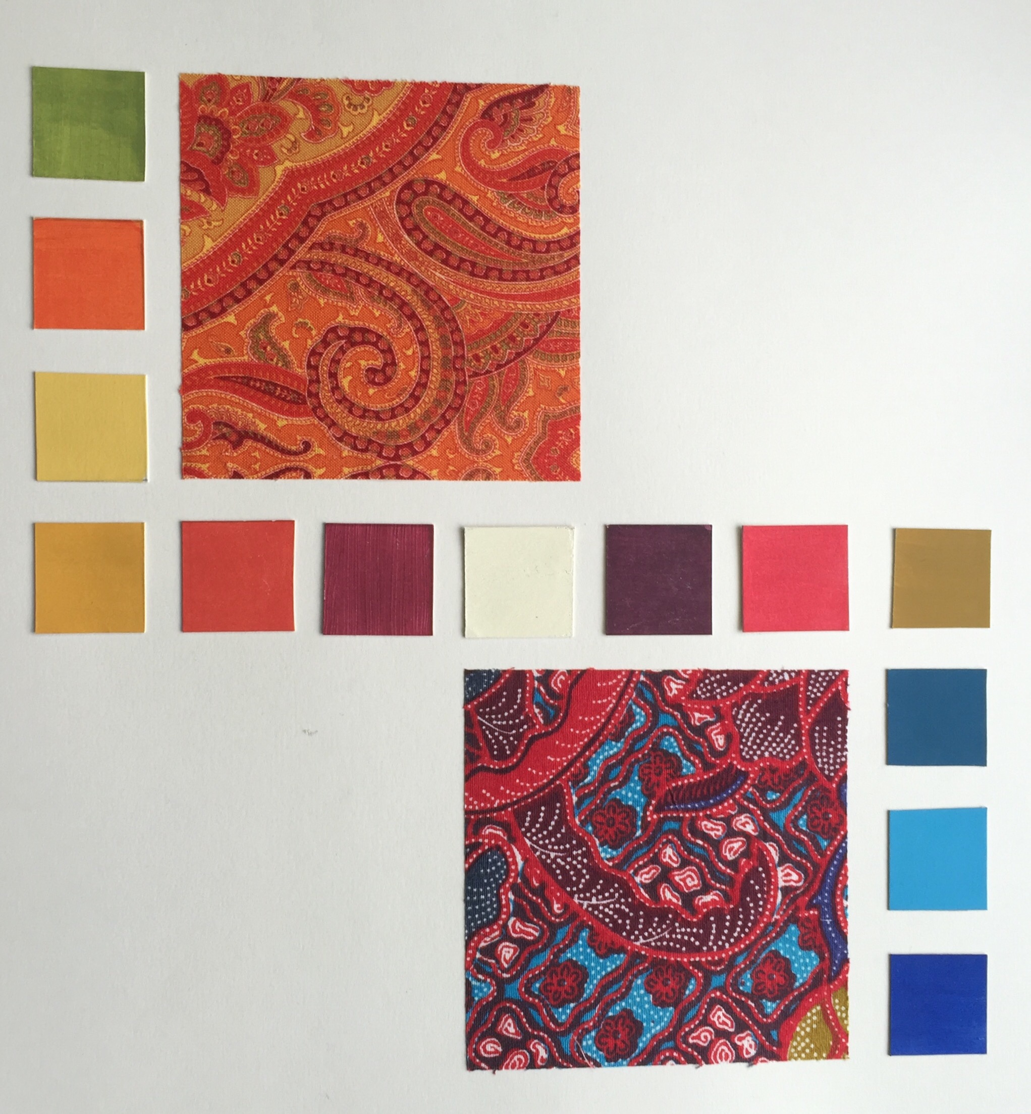
This palette relies more on Paynes grey as a mixer, I think it is my new favourite paint. the colour quality seems somehow richer and less garish .

img_4445.jpeg

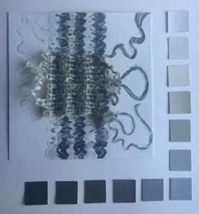
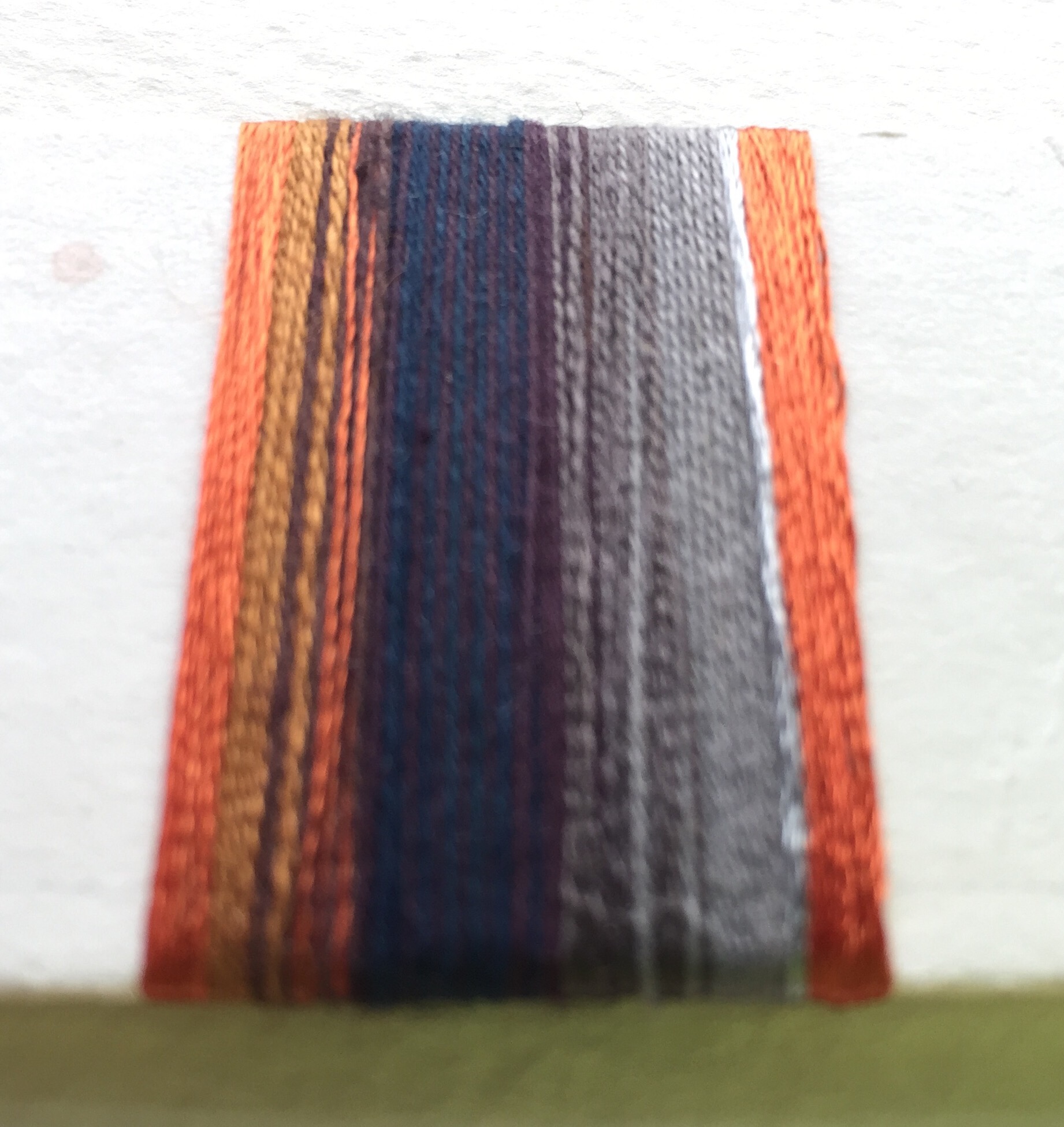
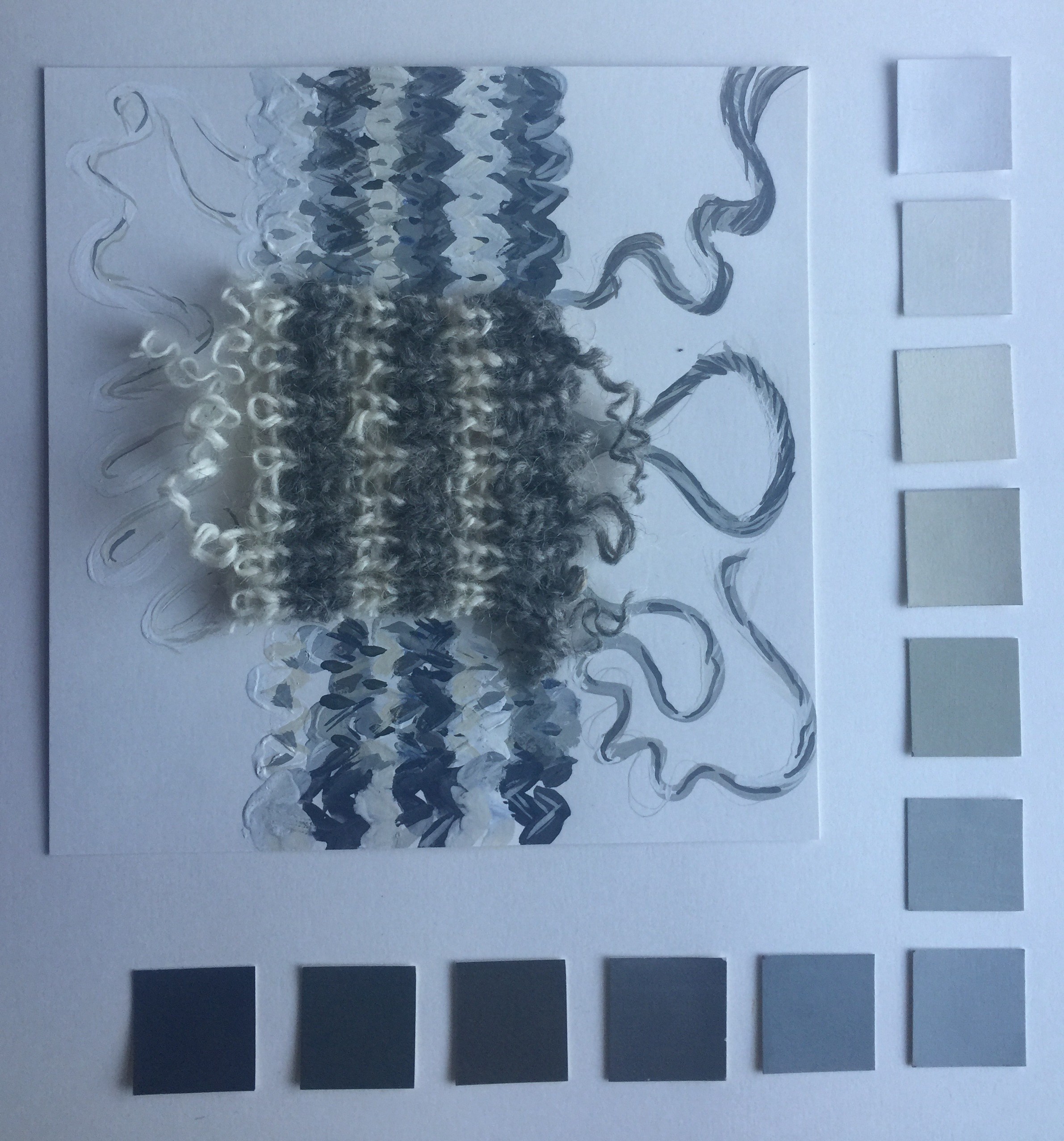
Well how much bother can a worn out grey and white sock cause? the answer is plenty!! This was by far the most complicated sample, I have honestly only touched on the range of tints and shades and tones in this little fragment. the wool is undyed and spun from sheep with many colours. The colours in the yarn are complex and then the shadows and highlights add their own nuances. I did fairly well to record a wide range but I just couldn’t work out how to portray the wonderful luminosity of the cream yarn.