ATV 4 – Yarn and linear exploration 4.1 developments


I have had one of those moments when I realise why recording processes in detail is important! One of my 30cm yarns is perfect for development into a meter length and it just took ages to realise how made it in the first place!

The materials I used were an unravelled piece of machine constructed metallic fabric. The thread is incredibly fluffy when unravelled and I had stitched it on the machine to make an interesting repeat of tight and then fluffy areas along the length – totally forgot about the machine stitching part and wondered why it was not unravelling in the same way!!

IMG_3426

I was interested in the shadows on the sleeve seam of my Akha jacket , where the fabric pulled against the stitches. Represented here on the right hand side of the drawing.


My first attempt was to stitch and stretch a strip of jersey to give an even repeat (slightly bigger than 1cm but hey, who’s measuring?) this gave a good shape but was too solid. The fluffy unravelled thread is better but it was when I realised that I could stitch onto the thread that it really worked as a yarn that really hits the brief.


img_4743.jpg

img_4744.jpg


From my drawings of the heavily embroidered back panel of the Akha jacket  and investigations into spinning newspaper ( I had used some as a drawing ground) I have developed this yarn. I used some PVA coloured with translucent Seta colour to create the coloured windows that represent the tiny applique shapes in the original embroidered panel.

OLYMPUS DIGITAL CAMERA

Akah - Ink - mixed tools

img_4745.jpg

This was from the drawing using a wing feather brush, It captures the marks really well. Simple but effective. I need to remember not to overcomplicate all the time, sometimes outcomes are better kept simple .

Save

Save

ATV 4 – Yarn and linear exploration 4.1


I have done my customary analysis of this assignment and excitedly just wanted to make yarn. I looked through all my previous drawings to find suitable lines to refer to and really just drew a blank (no pun intended) It’s not that I don’t like my drawings but my intention when making them was not to interpret the lines as yarn, and my drawing observations, at first perusal seem to have more of a leaning to other types of texture and shade.

I appreciate that this is very much part of the learning process and as my artistic intentions are clearer to me , my observations will be more appropriate. Or my textile interpretations of my drawings will be more appropriate to the marks I make. Currently they don’t seem to match so I need to take a step back and try a different approach.

I decided to just make some yarns.

It seemed important to learn to spin so with the aid of youtube and a drop spindle I gave it a go. How exciting! I can see spinning becoming very moreish, I got a great sense of achievement from making little scraps of yarn, they are varying in thickness and this because I have no practice in pulling the fibres out evenly – but they are unarguably yarn and the process is going to be so useful

img_4648.jpg

The grey yarn is two ply, creamy green is 3ply, green 2ply re-plyed??? perhaps this is 4 ply. Clearly I can be more professional about spinning and learn the spinning vocab -I am a massive fan of technical terms. For now though spinning is too exciting! I can clearly see the linear qualities, I like the fuzzy edges of the grey yarn and recalled some of the charcoal marks I made so changed to using black merino wool and silky stuff that I believe is alpaca (I have a small stash of fibres that I gathered over-excitedly at a wool show. They  didn’t all get used in my short foray into felting but somehow the labelling has become a bit mixed up)

img_4649.jpg

My inexperience has paid real dividends! the irregularity of the spin is very like the changing textures in my drawing! The thicker piece is a more even spin that I replyed to make really interesting diagonal marks.
Squashing the yarn together accentuates the charcoal texture. Of the band on my hat

.img_4650.jpg

So accidently by experimenting with making I have recreated my mark making, hurrah, result!

In this spirit I decided to play some more. I spun some newspaper and some finely shreded paper. They cast great shadows

img_4651.jpg

I explored my stuff stash and made some more random yarns – well not so random, I was considering mark making, refreshed by looking at all my drawings but not fixed on any one drawing for now. This was to enable me to be freer with experimentation.

img_4478.jpgI proved to myself that yarns can express drawn lines.I discovered techniques and materials to play with.

Stretchy jersey is fantastic in the way it rolls in on itself when cut and stretched.

Machine stitching is a super quick way of wrapping – I could experiment with different thickness’s of tread on the bobbin and rhythms of density of stitch.

Stitches show lots of potential, it’s interesting how  flat strips of fabric change shape when stitched.

I am particularly excited about the les flexible yarns and the shadows they cast.

There are many marks here but I realised that this approach is a little too random. I could happily invent and play for hours but need to stay aware of the task so a new approach is needed.


img_4577.jpgI gathered as many ‘yarns’ as I could find and looked at the structure. Many are spun but they are also wrapped, extruded, knitted, woven, twisted in different ways using different materials. I now have a pile of raw materials and a better awareness of some processes that I could use.

img_4578.jpg


I also took some time to ascribe descriptive words to each yarn, maybe this will help me relate the type of yarn to qualities of particular lines within drawings.

I feel much more prepared and will now return to my drawings with fresh perspective.

Feedback on ATV assignment 3 – Colour studies

Feedback on assignment 3 colour studiesOverall Comments

Linda it was lovely talking to you this morning during your Skype tutorial.  In this feedback document I will outline the points that came up in our conversation so you have a record of them.  Overall this was a well-executed assignment, organised and beautifully presented.   The main area of improvement you can make during your next assignment is to make better use of your online learning log.  Below I have listed the points where I suggest you develop your work.

This was the first time that I opted for a Skype tutorial. I don’t even like phones much so the idea of a video conversation was way to scary! However my irrational fear was as unfounded as I expected it to be, and I highly recommend Skype as a tutorial format. It was really lovely to meet Rebecca and put a face to the wise words from previous assessments, the OCA course whilst being fantastic in so many ways, is quite isolated and having a conversation about my work was really informative. I think that it is really valuable that the feedback was a conversation that enabled some things to be elaborated on, and others to be skimmed according to questions that arose. I was able to take notes as we were speaking so I now have a detailed list of pointers to work on and a much clearer picture of how my work is progressing –  compared to how I may have interpreted a written feedback.

I also have a greater feeling of communicating with an audience than I had before which I think will be really helpful.

Assignment 2 and 4 Assessment potential

I understand your aim is to go for the Textiles Degree and that you plan to submit your work for assessment at the end of this course. From the work you have shown in this assignment, providing you commit yourself to the course, I believe you have the potential to pass at assessment.  In order to meet all the assessment criteria, there are certain areas you will need to focus on, which I will outline in my feedback.    

Feedback on assignment

Demonstration of technical and Visual Skills, Quality of Outcome, Demonstration of Creativity

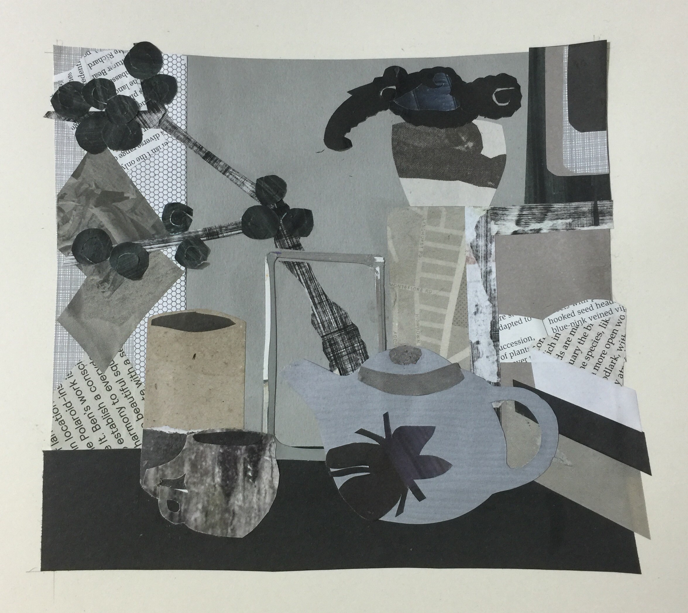
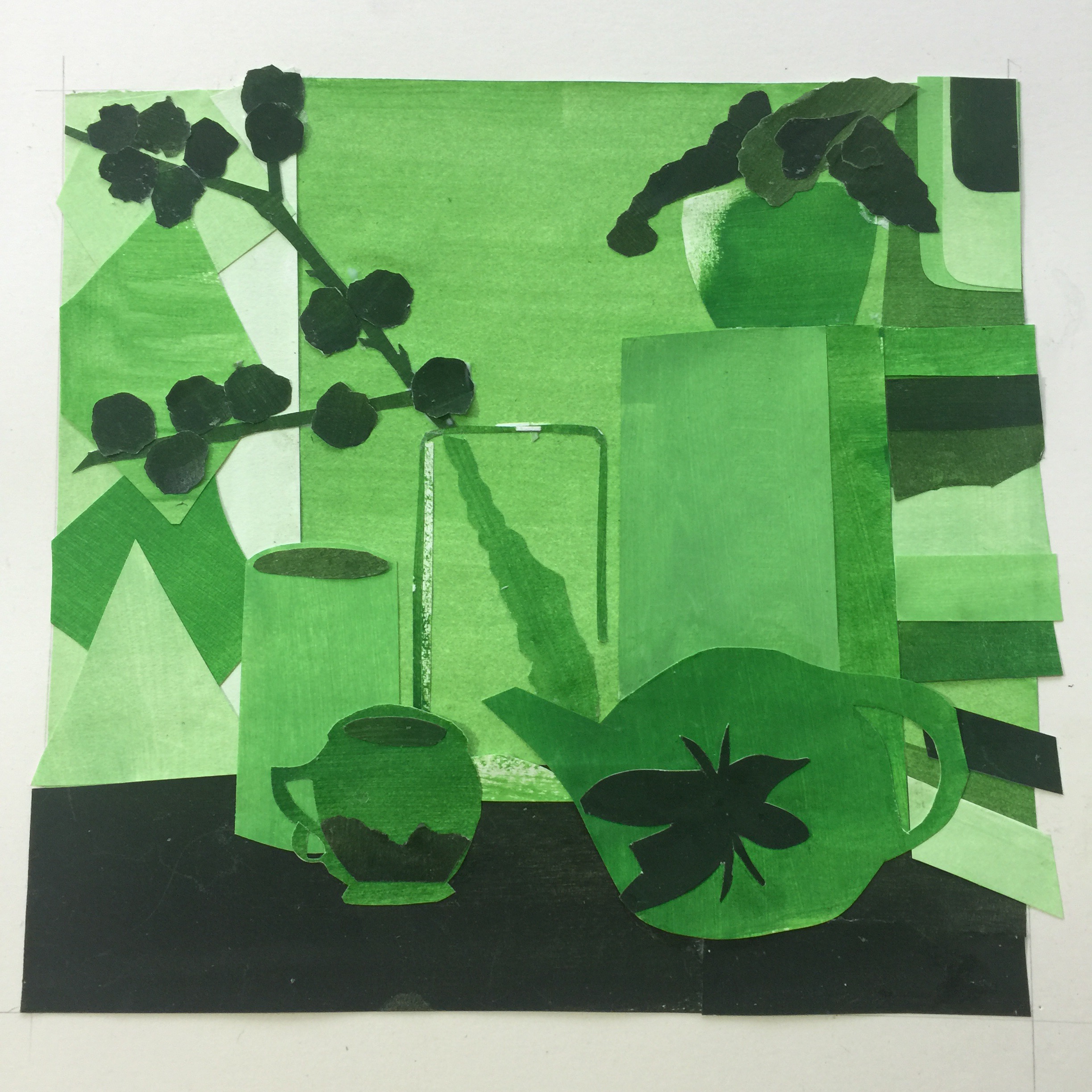
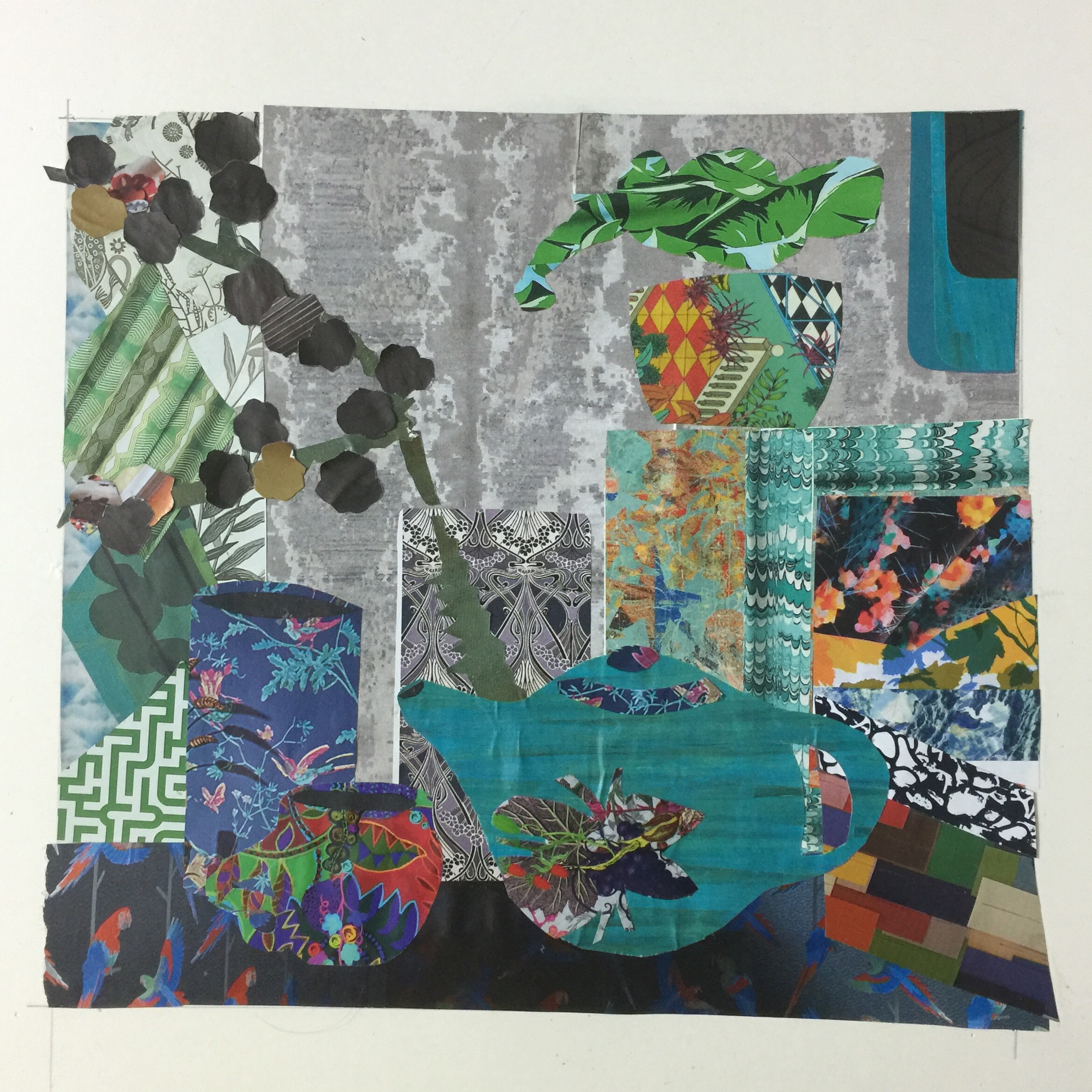
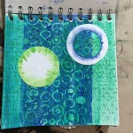
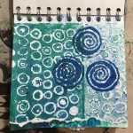
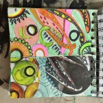
Your colour book was a pleasure to look at, expressing the depth of your study and your engagement in exploring colour.  Well done.  The only thing I think you should have done differently was to create your own painted strips for the front cover. This would demonstrate your skill in all areas of the book.

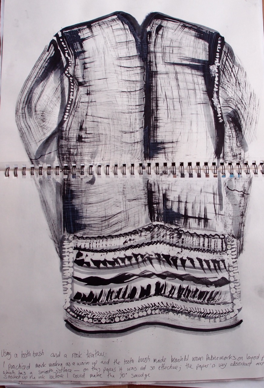
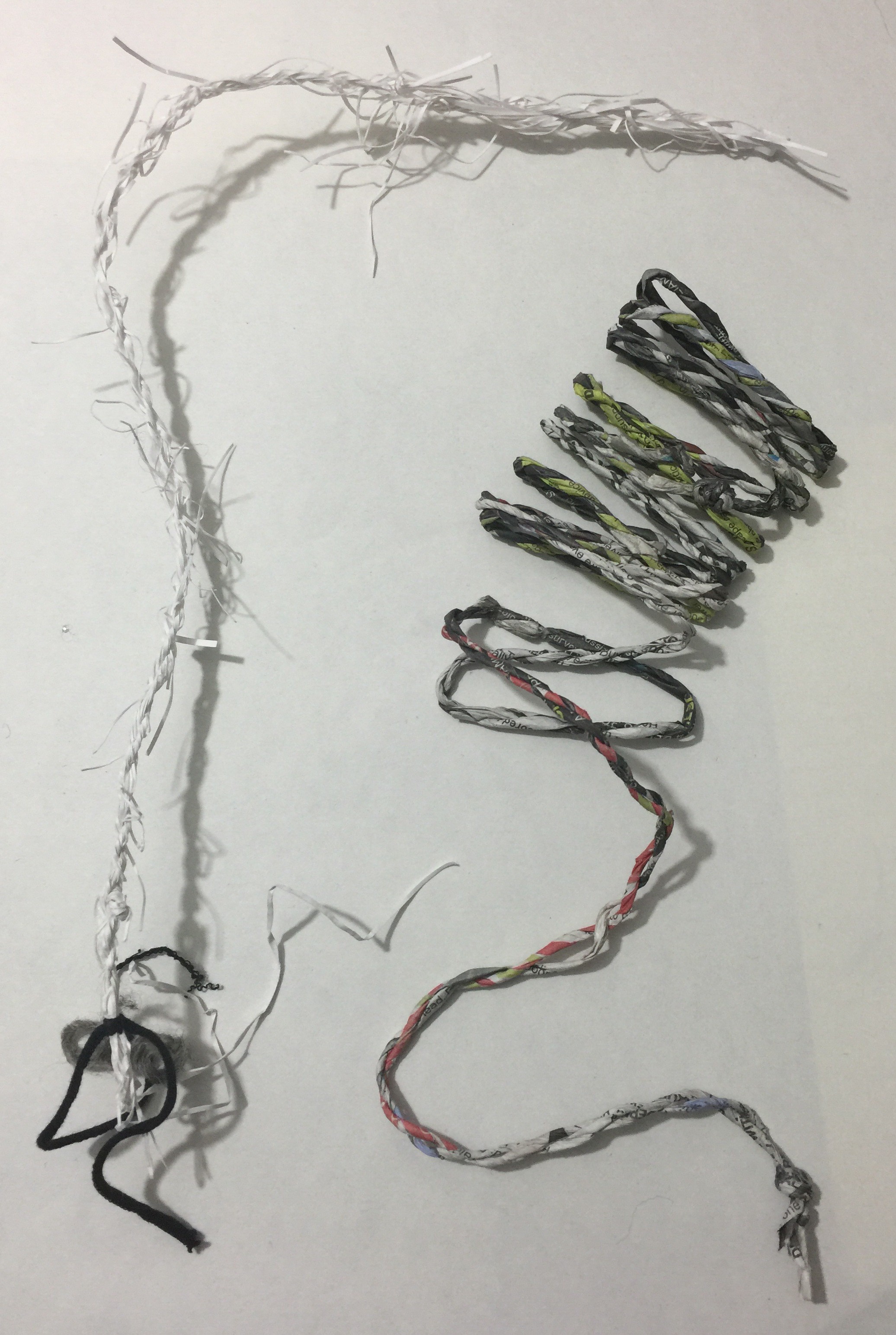
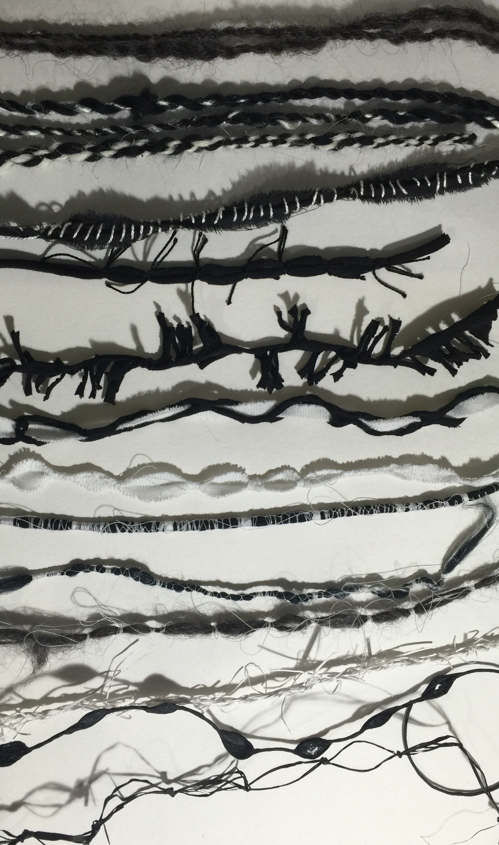
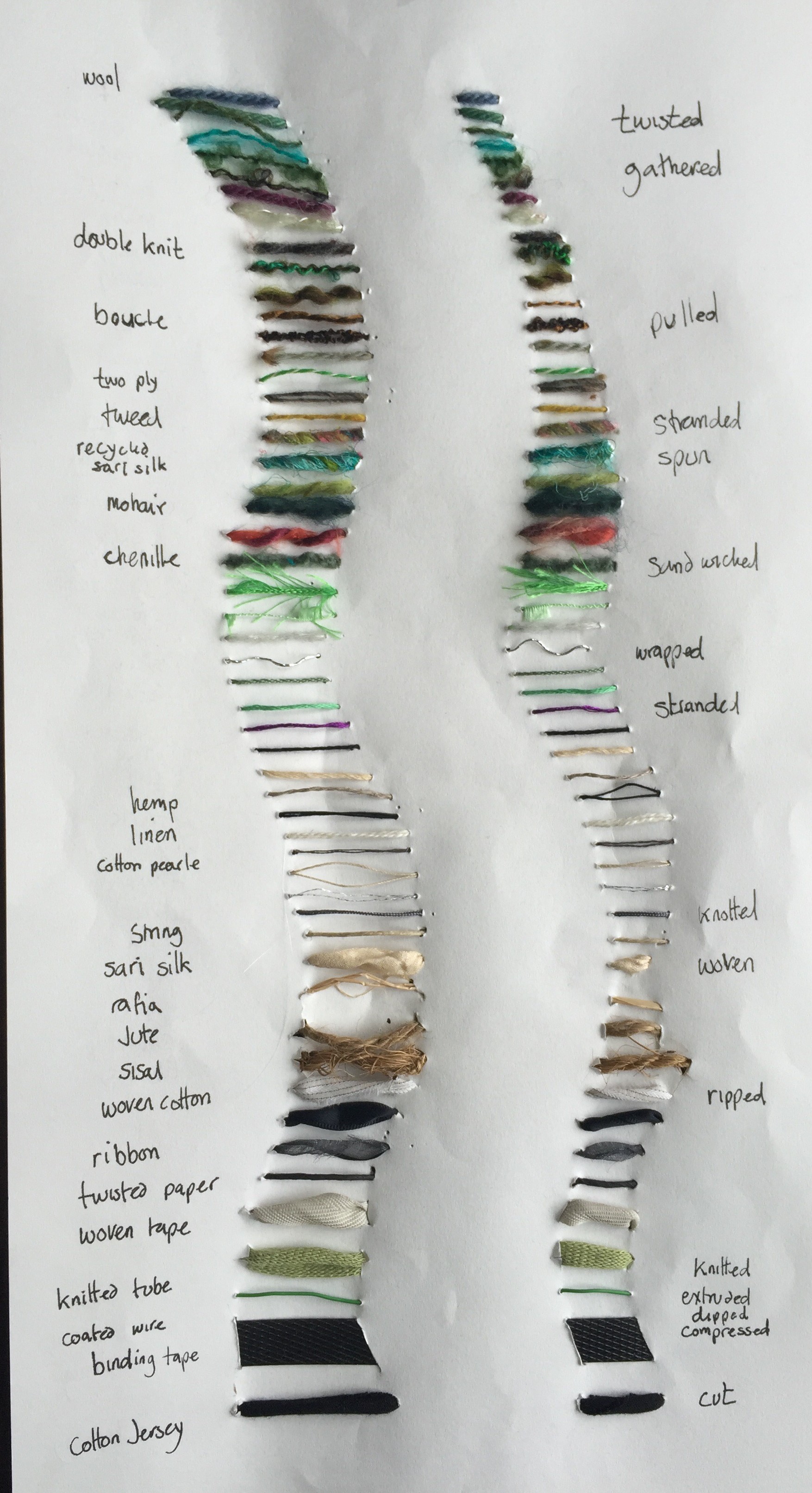
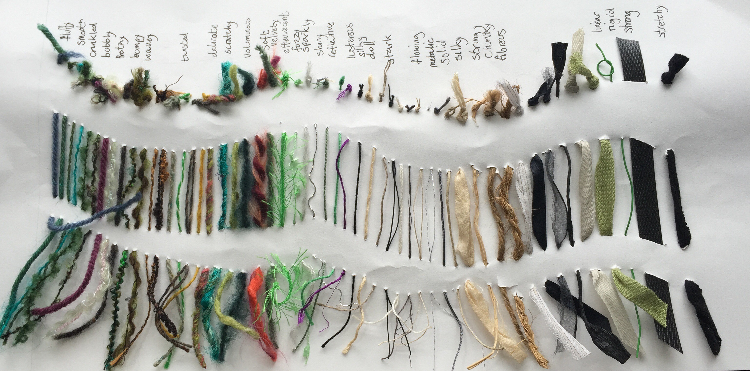
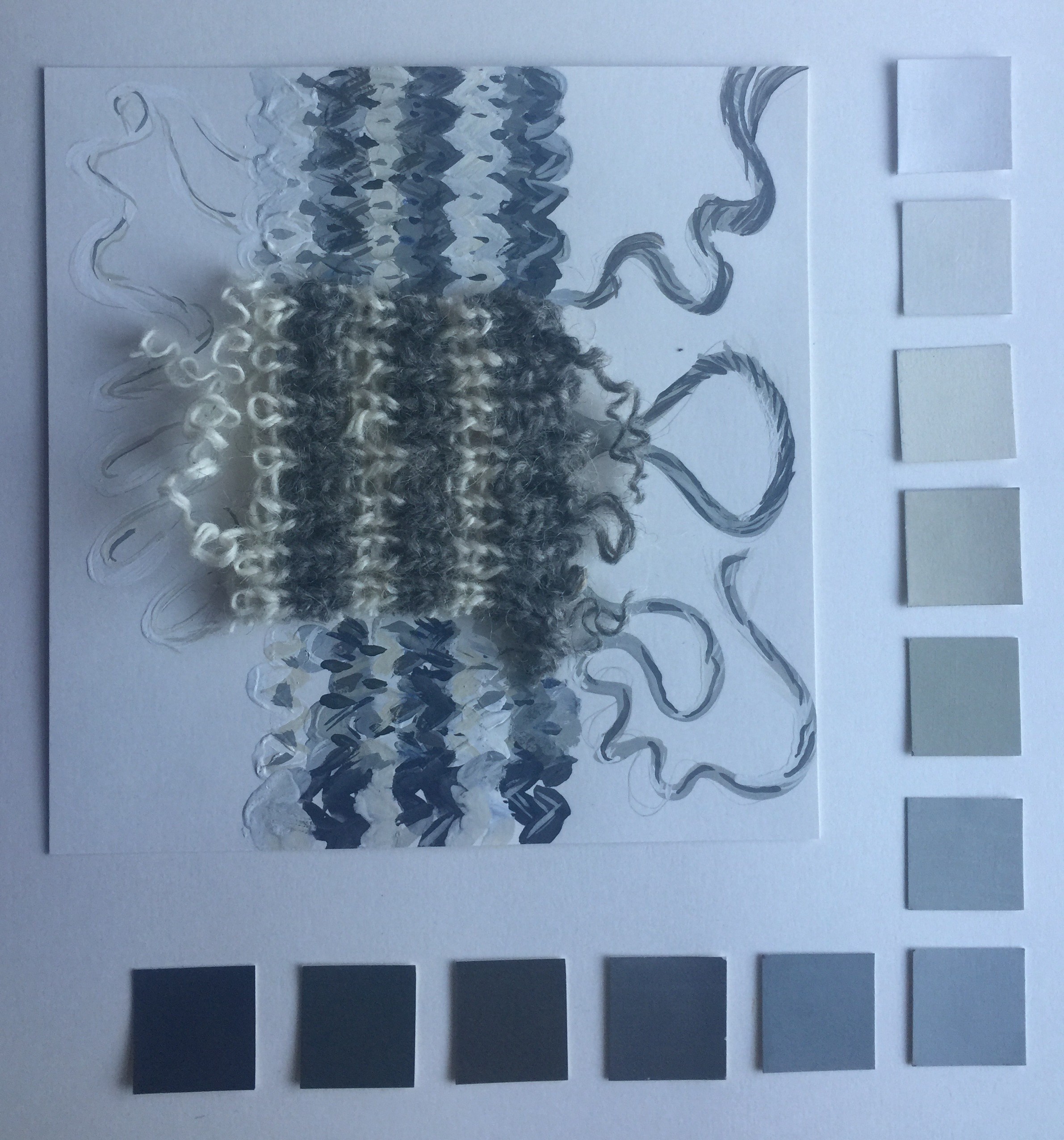
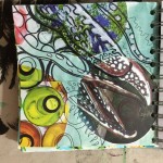
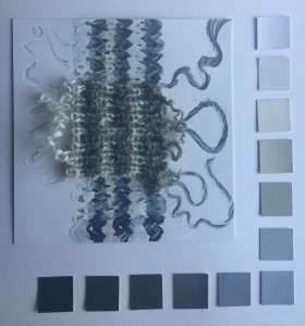
Rebecca was very kind about my work and presentation, some words I noted down were; coherent, sense of adventure,  good risk taking – this particularly about my wool colour analysis (Somehow she knew that I had second thoughts about how I approached the monochrome piece!)

img_4445.jpeg

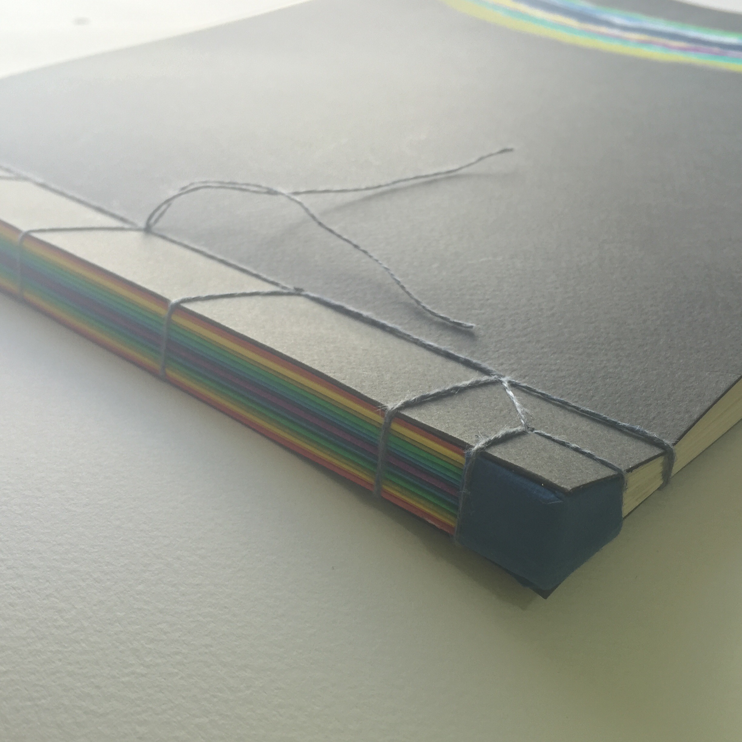
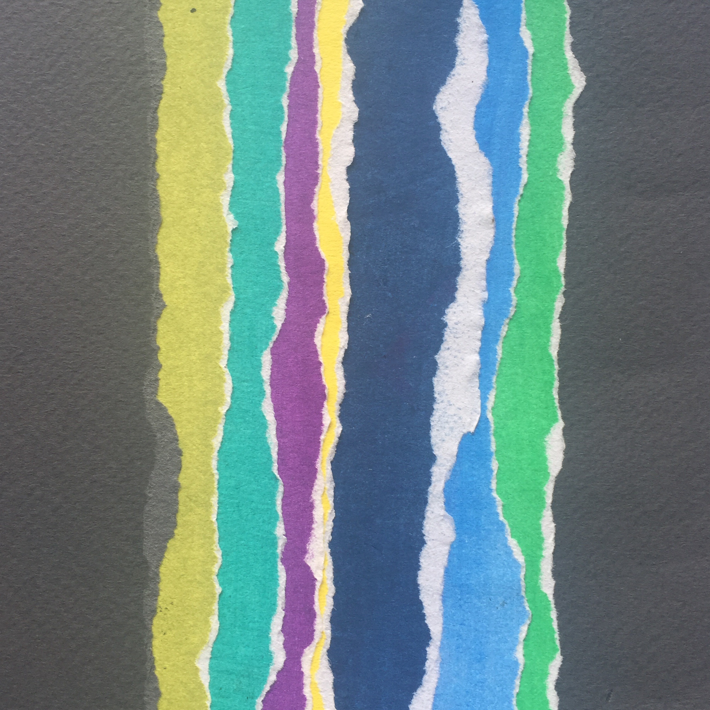
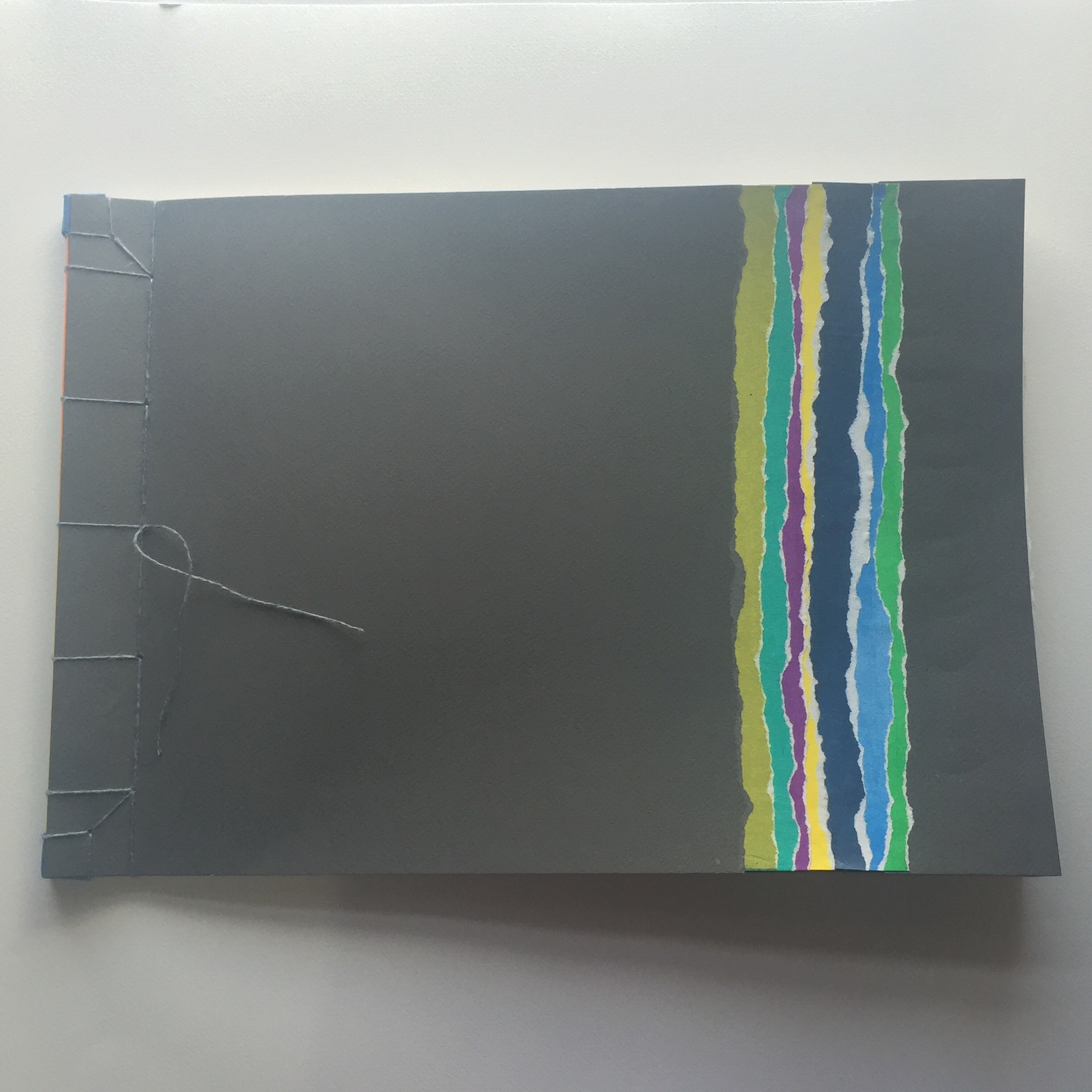
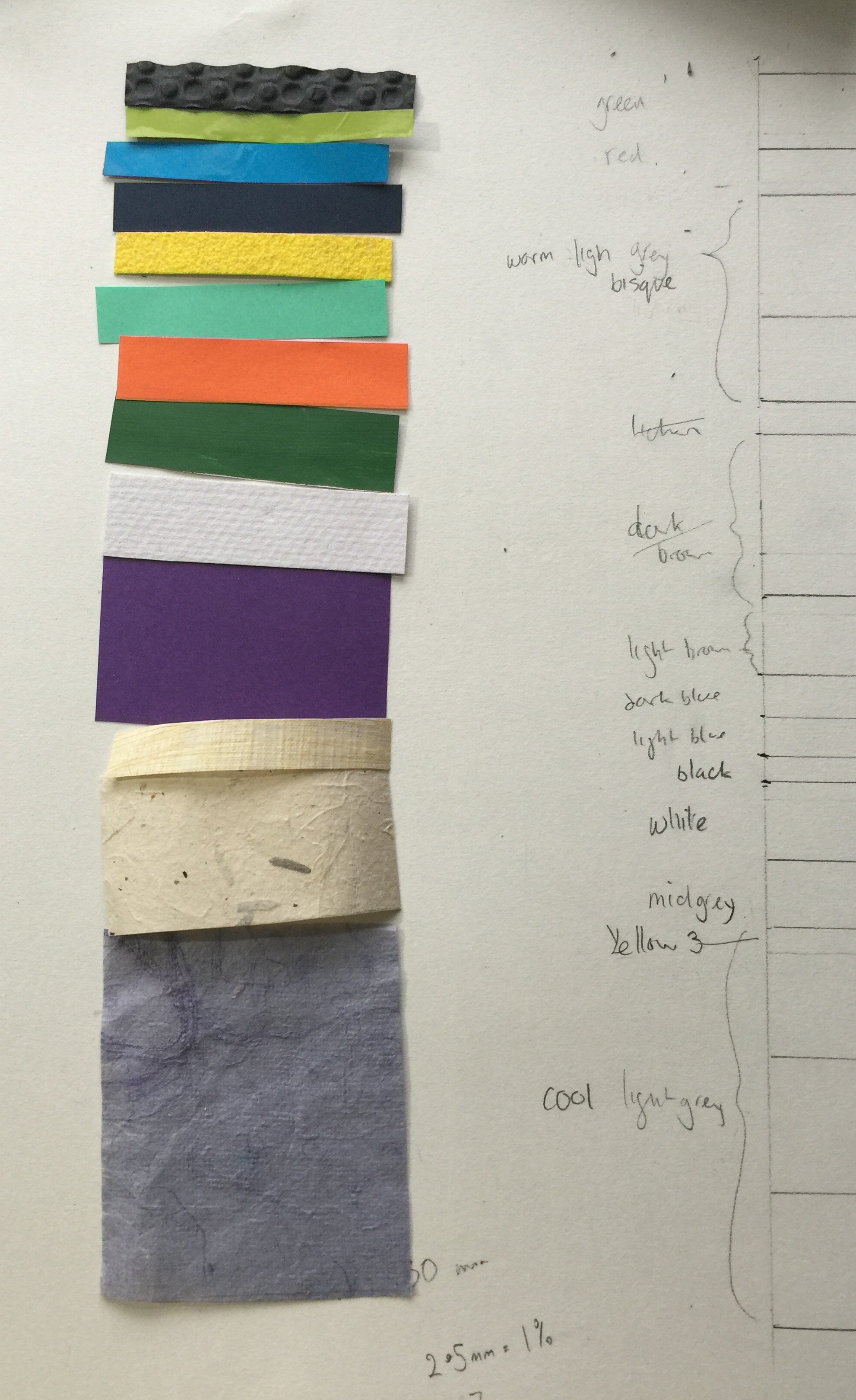
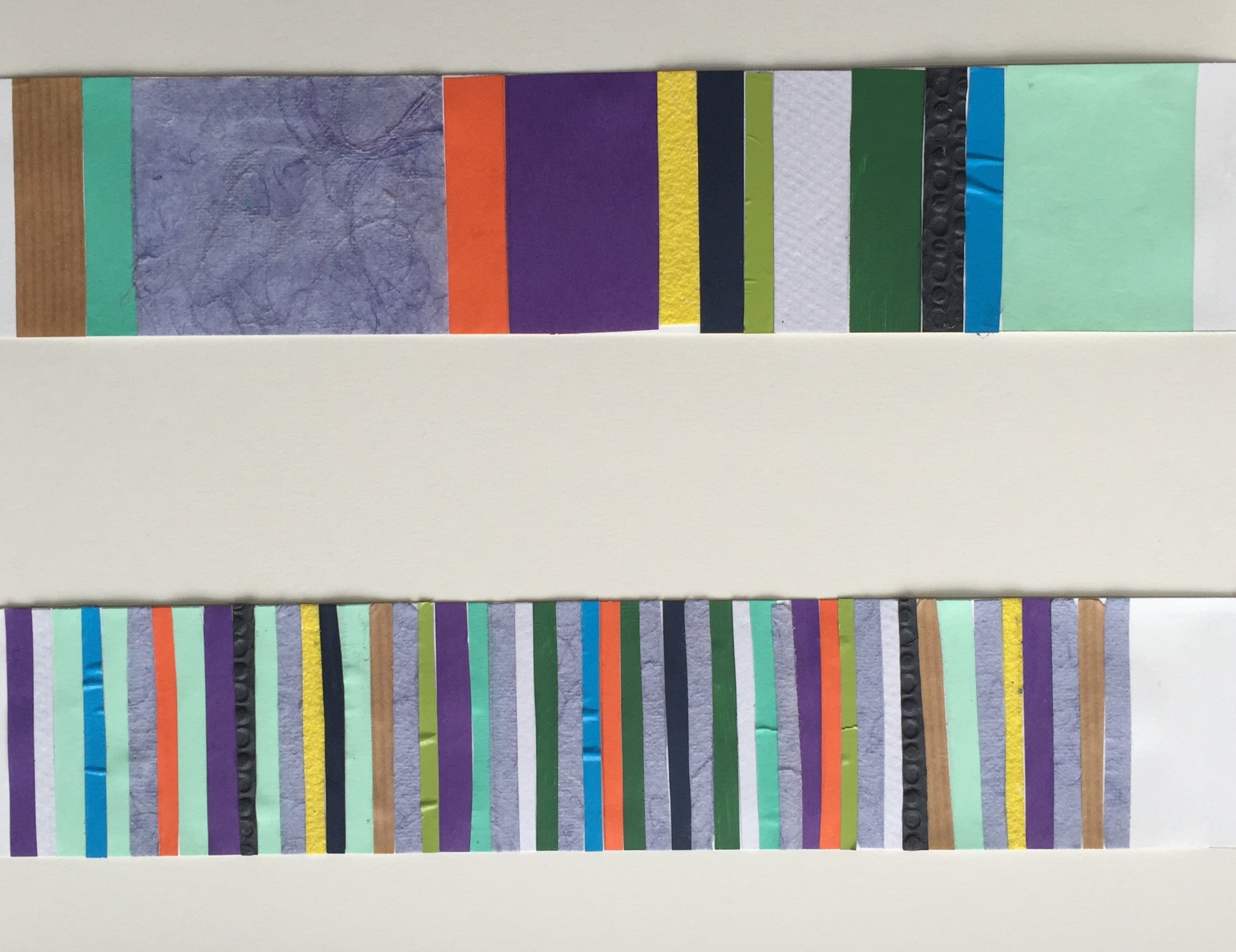
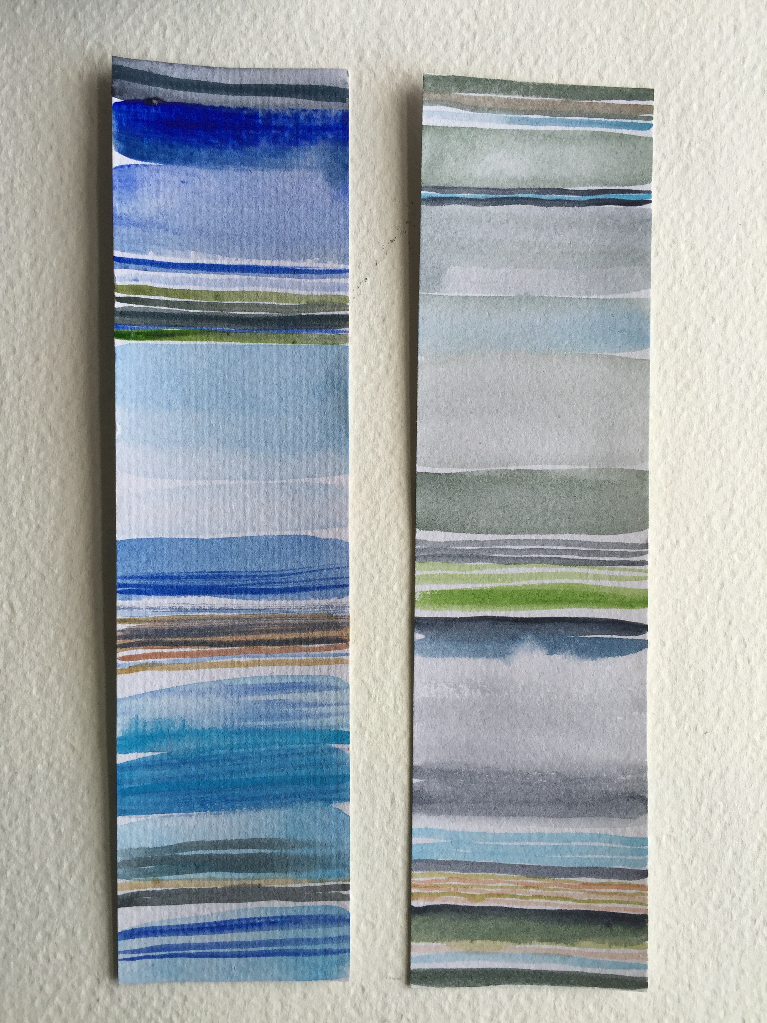
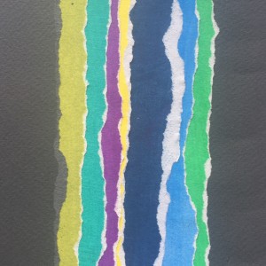
I used Inktense to colour paper for the stripes on the front of my book, choosing a rainbow theme but opting for slightly off primary and secondary colours. I used the whole selection to wrap the spine edges of the pages and chose the front colours with a nod to the idea of ‘unusual’ colour combinations.

img_4435.jpeg img_4436.jpeg

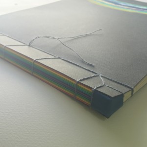
This was very much with the feeling of  “I must get this project in the post” and I did not explain or evidence my choice in my workbook or blog. This links really clearly to Rebecca’s main point for improvement. My blog (covered a little later…)

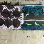
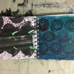
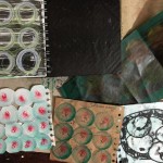
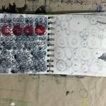
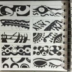
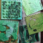
The workbook you produced for this assignment where you go through the projects set is a lovely working document of your thoughts and experiences as you progressed.  The layout and your use of annotation make this a useful record of your learning and demonstrates your skill in areas such as visual skills, quality of outcome and creativity.  I suggest you continue to work in this way developing and changing as you move through your studies.  Remember to either remove or fill the empty pages because they look a bit suspect at assessment.

Having made the Colour Book I think the best way forward with sketch books is to bind my own, It is quite quick to do and an enjoyable process, it will give a sense of coherence and will overcome the issue of empty pages, I will be able to change the paper I use according to content and I will no longer be intimidated by the new book syndrome!

It was interesting that Rebecca was more effusive about my work book than my colour book (though this got lovely feedback) the course emphasis at this stage is very much about the journey, things that I’m doing well are recording and annotating ideas and concepts in my work book, It isn’t a lovely sketch book of beautiful drawings but very much a recording of my work process that evidences thinking.

Research

Context, reflective thinking, critical thinking, analysis  

As I said you don’t need to work through the Critical Thinking Skills book I recommended. Dip into it every now and then, making notes in the margins and reflecting on what you learn in your learning log.  Continue to discuss the research material you find and its value to your studies.  Remember to elaborate on your on your thoughts, for example why you think something looks surreal.  Think about accumulating words and language that you can use to describe what you see, feel and learn from looking at someone else’s work.

Marginalia! Rebecca gave me this marvellous new word (annotations in the margin of a book) and the idea to then photograph the section of text for my blog, this can in turn be reflected on and explained more fully.

Using photographs of sketch books, gallery notes, mind maps etc will be an excellent way of more quickly recording information and thinking on my blog. Quite possibly the most useful part outcome of the Skype tutorial, and this way of enabling me to enhance quantity and quality of blog posts probably wouldn’t have come about without chatting.

Learning Logs or Blogs/Critical essays

Context, reflective thinking, critical thinking, analysis  

I suggest you spend some time during the next assignment developing your learning log.  Think about adding more information in the form of images and annotation much in the same way as your workbook.  Write freely and with expression, commenting on your experiences and thoughts.  Remember this is the academic side of your studies, where you can demonstrate your thinking skills – such as analysis and synthesis.  

My blog is currently a little thin on information. I now understand more of the importance of the learning log (blog) and what the assessors are going to be looking for. My research is evident in my work but not so in my blog. I have definitely been treating the blog wrongly, considering it as quite a formal communication, a pristine sort of document. I guess because of the open nature of it. It is quite a vulnerable feeling making my thinking public, but important that I embrace this. I was reminded that the Learning Log doesn’t have to be an electronic blog – it could be a paper based document but I will persevere with the blog as it is infinitely more searchable, I can hope that my typing improves and becomes less of a barrier to what I am trying to say. Rebecca gave me a lot of pointers about how my blog can be improved;

  • Using different types of writing – formal, streams of conciousness, bullet points, annotated drawings, photos of notes. Be more experimental with communication.
  • Develop an artistic thesaurus. Be creative with self expression.
  • Evidence thinking, annotate the annotations, refer to research – explain the impact of the research, argue with it and express my own opinions.
  • Reflect on reflections to give an extra layer of understanding.
  • Have discussions with myself about what I did, how I did it, why I did it that way.
  • Make connections with artists.
  • Explain how it fits in with the course.
  • What could happen next?
  • Think about thinking.
  • Interweave the blog with sketchbooks and note books – it is all one!

Thank you for the feedback Rebecca , I am really looking forward to moving on.

Pointers for the next assignment

  • Reflect on this feedback in your learning log
  • Maintain your excellent working practices
  • Develop your learning log
  • Continue to use your skill with colour throughout your studies


Please inform me of how you would like your feedback for the next assignment.   Written or video/audio


Well done Linda, I look forward to your next assignment.


Tutor name Rebecca Fairley
Date 17th March 2016
Next assignment due 25th April 2016


ATV3 – Colour Studies – Assignment three reflection.

 
Assignment three – Colour communication
Aims
Your aims in this assignment should be to:
•employ a process of evaluation and selection of your own work
•demonstrate effective design, layout and presentation skills in the visual communication and presentation of your work.
Brief
This assignment asks you to use the work from Projects 1 and 2 to develop and create a beautifully presented colour resource book.
Quality of outcome
– content, application of knowledge, presentation of work in a
coherent manner, discernment, conceptualisation of thoughts, communication of ideas
img_4438.jpeg img_4435.jpeg
I had a look at the assessment criteria in the back of the course notes for quality of outcome. I will do this at the start of the assignment next time.
Focussing on the positives, the presentation of my work is coherent  and I think professional. My  book looks great! The binding is carefully and precisely crafted, I worked through some different ideas and chose a stab binding method. This displays my work clearly in an interesting way. To avoid cluttering the pages with little bits of stuck on text I have a fold out contents page. The contents page has a photo reference with a summary of each exercise that is clearly visible as the pages are turned. The cover is attractive but simple, I used ripped paper in a stripe pattern, choosing unusual colours that work together in an interesting way. The papers were hand coloured using Inktense blocks to get bright, clean, flat colour. I used the same papers to wrap each page edge before I bound them to give some extra thickness to the spine, I think that this added strength and aids the opening of the pages. The book is stitched but would very easily come apart if I want to add more pages.
The contrast between the spine of the book and the stripe pattern on the front is quite interesting, I used exactly the same coloured pages but the taking away of the hot colours makes a huge difference to the mood. They do not sit together well at all.
To be honest there are not many of the exercises that I left out of the book. So I’m not sure how discerning I can consider myself to be. It felt incomplete without all the tasks in order, so my judgement was to use all the exercises, I very carefully considered page layouts though.  It is possible that I kept the pages too simple in some cases, they are certainly not over cluttered! My thought processes, tests and design work is in my sketchbook. The book does not perhaps get across my learning during the module, or get across a good sense of colour ideas. I did gain a deeper understanding of the use of colour, hopefully this will be reflected in future assignments.  I didn’t thoroughly explore the potential for expanding on the exercises, mainly due to time restraints. I had a fantastic week long break with only a couple of half days of chores and it was amazing to be able to really crack on and concentrate for extended periods. What a treat! Things that I considered including were, making yarn wraps for the gouache samples of collages, and colour chips for the collages. I could add these later. I have a spare page at the back just in case. I also have started gathering a broader range of textures including fabric strips for my yarn wraps.

ATV3 – Colour studies – research point 1 – contemporary designs

Cole and son wall coverings don’t inspire me on the whole, the colour palate could be described as subtle or sophisticated, I find it very bland. I was quite excited by their range of Natural wall coverings though, using sisal ,jute and woven paper in beautiful natural tones. I realise this is a little contradictory, I like the natural colours when they are natural, but not when they are interpretations of the subtle natural tones.

Peonie

This print is from the Fornasetti range, I’m not a fan of pinks at all but really like the clash with the red against the very neutral background.

The contemporary Restyled range also uses very safe neutral shades, but a couple of designs caught my eye, Wood and Pears uses some interesting simple marks to represent the bark.

Woods & Pears

Summer lily is quite surreal!Summer Lily


ATV3 – Materials and composition – collage studies part 2

Monochrome study

img_4419.jpeg

I have used black and white and also shades of cool and warm grey,. Some plain papers and some printed. I think I achieved quite a good balance. I kept pretty much the same format for the collage, of identifiable shapes. I wanted to really concentrate on achieving the same balance of light, shade and tone. I did simplify the composition slightly  to make it less busy, so easier to read. I kept this format with the three studies for part 2. I have looked at a wide range of collage types and enjoyed the process, but didn’t feel that it was appropriate to what I wanted to achieve to experiment with different forms here.


img_4414.jpeg

I did a “core sample ” to identfy the tones of the composition and this translated easily into the next study , using tones of one shade. I chose green, and did a few experiments in my sketchbook to decide what to choose. I painted some samples using sap green, viridian green with black and white added. I also looked at the mixes of cool and warm yellow with blue colourways. I took a monochrome photo and identified sap green as showing most contrast between tints and shades. I painted a load of swatches then worked my way through the light to dark list of collage components to work out which swatches to use. I took a monochrome photo of the completed collage and was really pleased with the level of accuracy that I achieved.

img_4415.jpeg

I spent a very pleasant time flicking through back issues of interior magazines for research point 2 and found loads of wallpaper and fabric designs. For the multicoloured study I decided to only use theses images, still with a focus on light and dark.Considering the riot of colour and patterns used i was really pleased that the collage still reads as identifiable objects. There is a swatch of each in my sketchbook with the designer identified for reference.

I had issues with type of glue to use, I tried a cellulose paste, glue stick, and settled on watered down PVA, all of my collages are slightly buckled, the first one I did on paper and it was very wobbly when dry so I swapped to a card base.

ATV3 – Materials and composition – collage studies part 1

I have explored the wide range of ways of creating a collage. I created a Pinterest page  to refer to,

I discovered that the history of collage seems to go back to early works by Picasso and Braque at the begining of the 20th century, a nice little history can be found here . Collage has been used extensively by renowned artists such as Matisse as a way of image making , it is currently a really popular contemporary art form in its own right. I feel that quilting and mosaic probably fall under the collage umbrella. The Chambers dictionary definition is

collage noun 1 a design or picture made up of pieces of paper, cloth, photographs, etc glued onto a background surface. 2 the art of producing such works. collagist noun.
ETYMOLOGY: 20c: French, meaning ‘pasting’ or ‘gluing’.

Collage 1- Simple colour

For the first collage exercise I needed to identify an area of clutter. One single area. Hilarious!!!! This was incredibly challenging. Most of our house is in complete chaos due to lots of renovation work. There are some really interesting juxtaposition of objects, but really, mostly just too much stuff, a tangle on the eyes and bewildering for the eyes. I took some photos around the house, trying to be aware of composition. Eventually I decided my desk area made most sense so i took photos from lots of  different angles and got scared of the number of elements so I tidied up!!! outrageous cheater! the photos of the clearer cluttered space were completely contrived , so I worked on something else and let things quietly take their place.

IMG_4343 IMG_4340 IMG_4339 IMG_4335

I still moved some bits out but this is my working composition.

image

I used Adobe colour CC to identify colours using programme settings and custom mode. The first collage was to be simple colours, using the programme helped to isolate flat colours from the shadows and highlights.

collage colour 1


I drew the main outlines on a black and white printout of my photo, used a window as a lightbox to make an outline drawing and then made a few copies to use as templates. I felt quite clever.

IMG_4397

I kept the collage quite simple and was really pleased with the outcome.

Collage 2 – unusual colour combinations

I don”t think that there are any.

I cannot abide generalisations, (they are all manner of dangerous) I do not understand ‘usual’, what is  usual? Usual implies that there are rigid rules and clearly these are for breaking. Could it be that usual is safe and dull?

On reflection some of the designers of fabric and wall coverings that I looked at for research point 2 used some very non challenging colour palettes, perhaps these are a good business model, catering for the masses to sell more stuff. The products that used exciting combinations had exotic names that suggest the unusual. So is usual non challenging?

I’m not suggesting that everything should be wildly clashing. There is some really interesting studies of colour combinations in  Colour – a workshop for artists and designers by David Horning. colour combinations can be; harmonious, unified, contrasting, analogous, symbolic, complimentary, monochromatic, triadic….

While looking at how artists and designers use colour I was drawn to the works of David Hockney. I walked past a shop in town that had a print of “Spring in the woods” in the window. Hockney had observed the tree trunks as purple, and I know from walking in the woods at dusk that this can be true. “Usually” trees are described as brown. I know that generally they are not.

For this piece I drew a 10×10 grid over an inked in photocopy so that I could count the squares taken by each colour and get a percentage for each colour. I used the percentages to make a stripe design of the correct proportions.

img_4426.jpeg

img_4429.jpeg

Collage 3 – complex colours

As if the first wasn’t complex – it took long enough! I decided to use the same format but work with colours taken from images in magazines, how pleased I felt that I have a huge stash of them…


IMG_4396

I got totally absorbed in matching colours and quite quickly got caught up in the idea of the image in the magazines being related to the object it portrayed. So the peace flags use grasses to represent cloth fibres, ceramics came from sand and rock, origami cranes were inspired by birds etc. The tea pot is made of hole punched paper dots, I didn’t have a large suitable swatch to use and thought it would be interesting to take a pointillist approach. The process was more fiddly than I imagined , so the shading isn’t as I planned. It sits quite well with the rest of the collage though.


ATV3- Materials and composition – Watercolour studies


The task is to use watercolours to create stripe patterns based on the observation of a collection of glass vessels.

IMG_4249 IMG_4248


Perhaps because of the lovely qualities of light in the glass, I found this task beautifully relaxing, like a genie I entered the watery world and searched for comparisons. Using a white paper back ground and base meant the for the first 3 examples I observed the subtleties of green and blue glass tints and how they changed due to thickness of glass or overlaps.Strip of stripes 1 and 2 – observing the obvious tones and aiming to record intensity and proportion.

img_4407.jpeg

Strip 3 looking even closer at the laying down bottle(whisky!) little reflections of the city scape are found hiding in the base.
I changed my perspective for strip 4 and 5 to investigate the reflected (refracted?) colours further.

My palette displayed the observed colours very well.

Sketch books course with Dionne Swift

I never seem to have enough time for my studies but felt that a dedicated timed  course could help kick start my sketch book use.

The course was really enjoyable and has certainly given me some ideas on how I can develop my sketch book usage. I was fun and achievable to create a full up book in a fortnight – Lots of experimentation with materials and processes and I even managed to produce some interesting images!

Most useful was the introduction to the one hole punch to add and move pages in a spiral bound sketch book. Very very handy.

ATV3- colour studies – research point 2 – digital resources for colourwork

I have had a little inspect of the suggested programmes to support colour work. The one I found immediately useful was   Adobe  colour CC . This programme is brilliant in some ways. I like that you can choose a theme for the colour selection; colourful, bright,muted, deep, dark or custom. I can see that it is useful to get an overall idea of the colour palette of an image. I may use it to help with the yarn wrap and collage exercises.

Screen Shot 2016-02-16 at 09.40.13

Mudcube

Colour halipixel

Colour hunter

CoIRD

All distracting to play with and hyperlinked so that I don’t forget them. I will revisit to update soon.