I have explored the wide range of ways of creating a collage. I created a Pinterest page to refer to,
I discovered that the history of collage seems to go back to early works by Picasso and Braque at the begining of the 20th century, a nice little history can be found here . Collage has been used extensively by renowned artists such as Matisse as a way of image making , it is currently a really popular contemporary art form in its own right. I feel that quilting and mosaic probably fall under the collage umbrella. The Chambers dictionary definition is
collage noun 1 a design or picture made up of pieces of paper, cloth, photographs, etc glued onto a background surface. 2 the art of producing such works. collagist noun.
ETYMOLOGY: 20c: French, meaning ‘pasting’ or ‘gluing’.
Collage 1- Simple colour
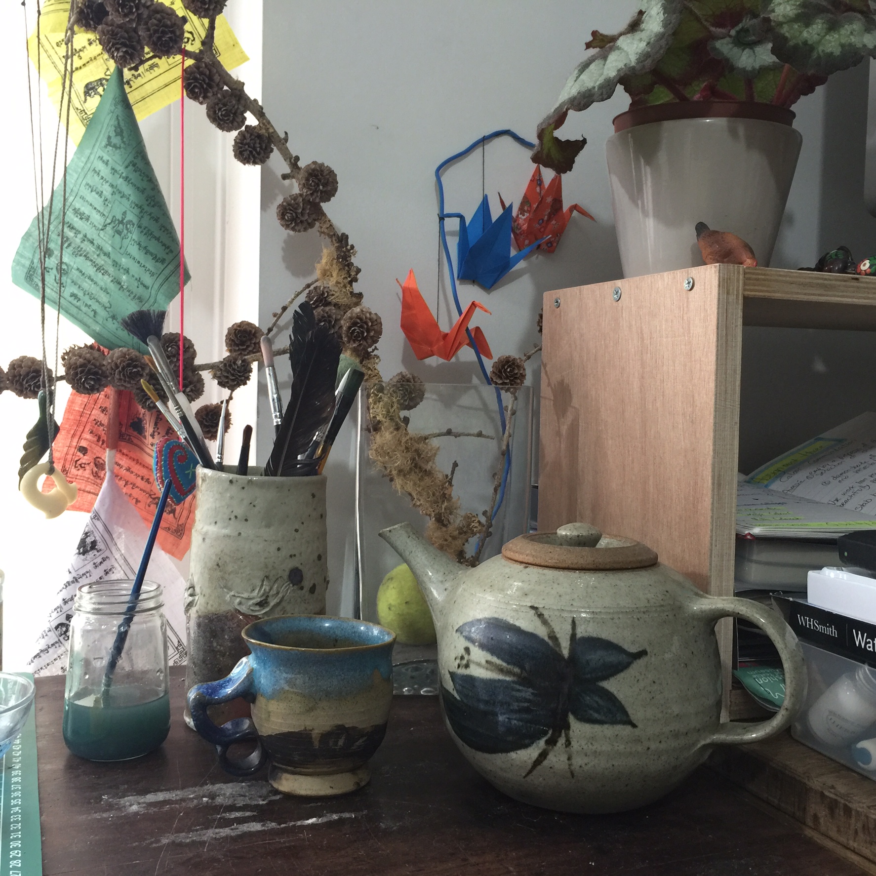
For the first collage exercise I needed to identify an area of clutter. One single area. Hilarious!!!! This was incredibly challenging. Most of our house is in complete chaos due to lots of renovation work. There are some really interesting juxtaposition of objects, but really, mostly just too much stuff, a tangle on the eyes and bewildering for the eyes. I took some photos around the house, trying to be aware of composition. Eventually I decided my desk area made most sense so i took photos from lots of different angles and got scared of the number of elements so I tidied up!!! outrageous cheater! the photos of the clearer cluttered space were completely contrived , so I worked on something else and let things quietly take their place.
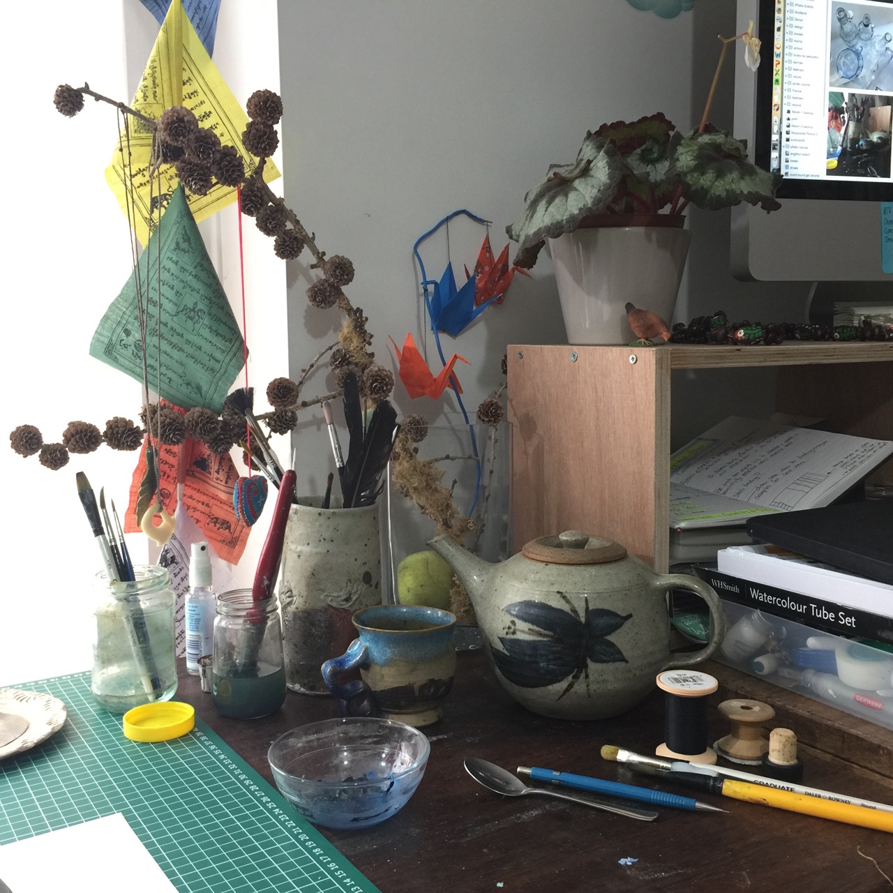
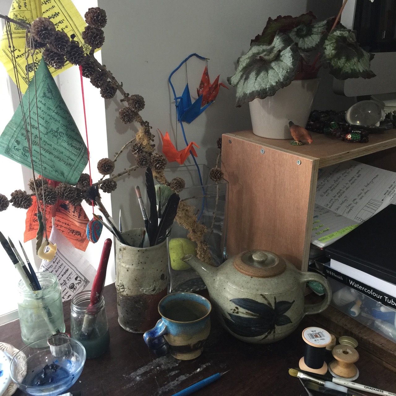
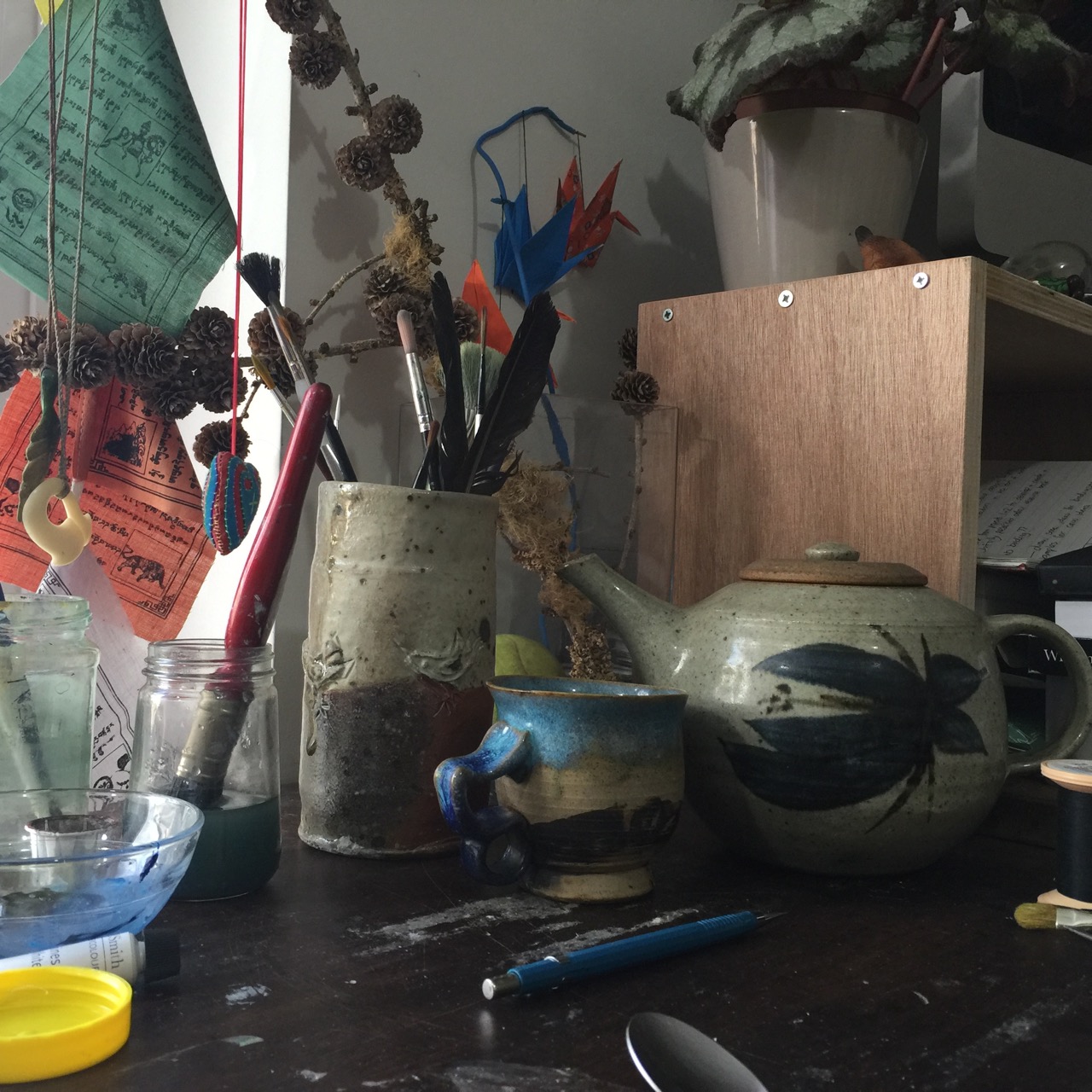

I still moved some bits out but this is my working composition.
I used Adobe colour CC to identify colours using programme settings and custom mode. The first collage was to be simple colours, using the programme helped to isolate flat colours from the shadows and highlights.
I drew the main outlines on a black and white printout of my photo, used a window as a lightbox to make an outline drawing and then made a few copies to use as templates. I felt quite clever.
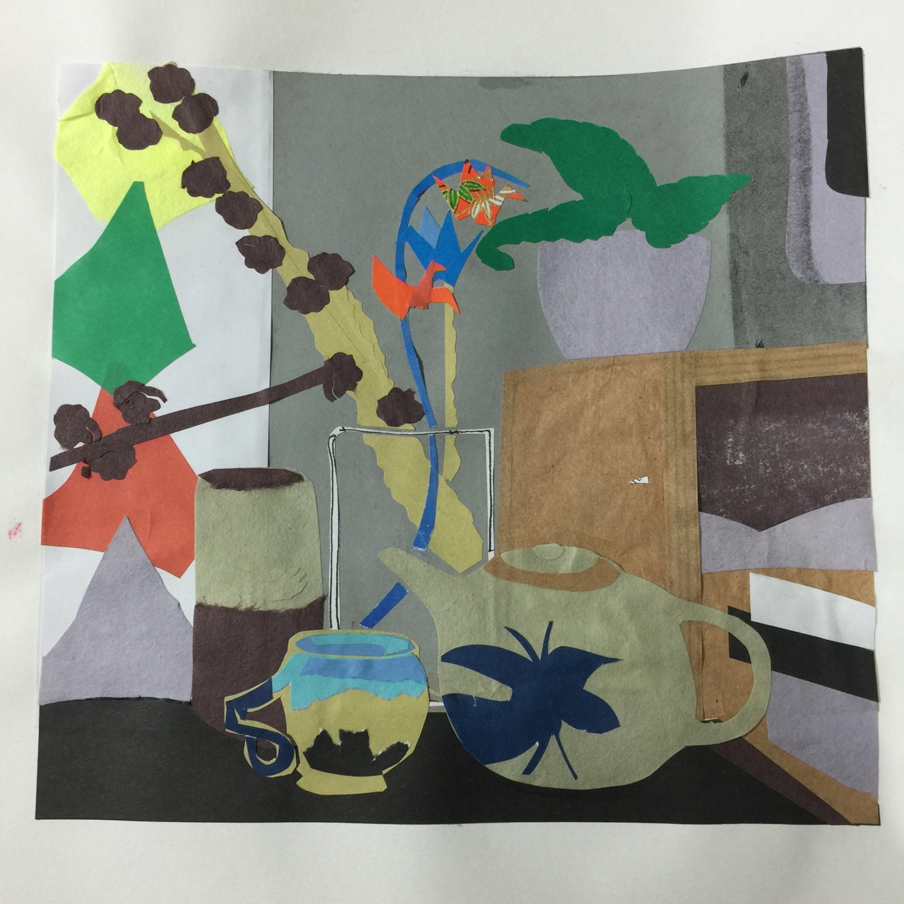
I kept the collage quite simple and was really pleased with the outcome.
Collage 2 – unusual colour combinations
I don”t think that there are any.
I cannot abide generalisations, (they are all manner of dangerous) I do not understand ‘usual’, what is usual? Usual implies that there are rigid rules and clearly these are for breaking. Could it be that usual is safe and dull?
On reflection some of the designers of fabric and wall coverings that I looked at for research point 2 used some very non challenging colour palettes, perhaps these are a good business model, catering for the masses to sell more stuff. The products that used exciting combinations had exotic names that suggest the unusual. So is usual non challenging?
I’m not suggesting that everything should be wildly clashing. There is some really interesting studies of colour combinations in Colour – a workshop for artists and designers by David Horning. colour combinations can be; harmonious, unified, contrasting, analogous, symbolic, complimentary, monochromatic, triadic….
While looking at how artists and designers use colour I was drawn to the works of David Hockney. I walked past a shop in town that had a print of “Spring in the woods” in the window. Hockney had observed the tree trunks as purple, and I know from walking in the woods at dusk that this can be true. “Usually” trees are described as brown. I know that generally they are not.
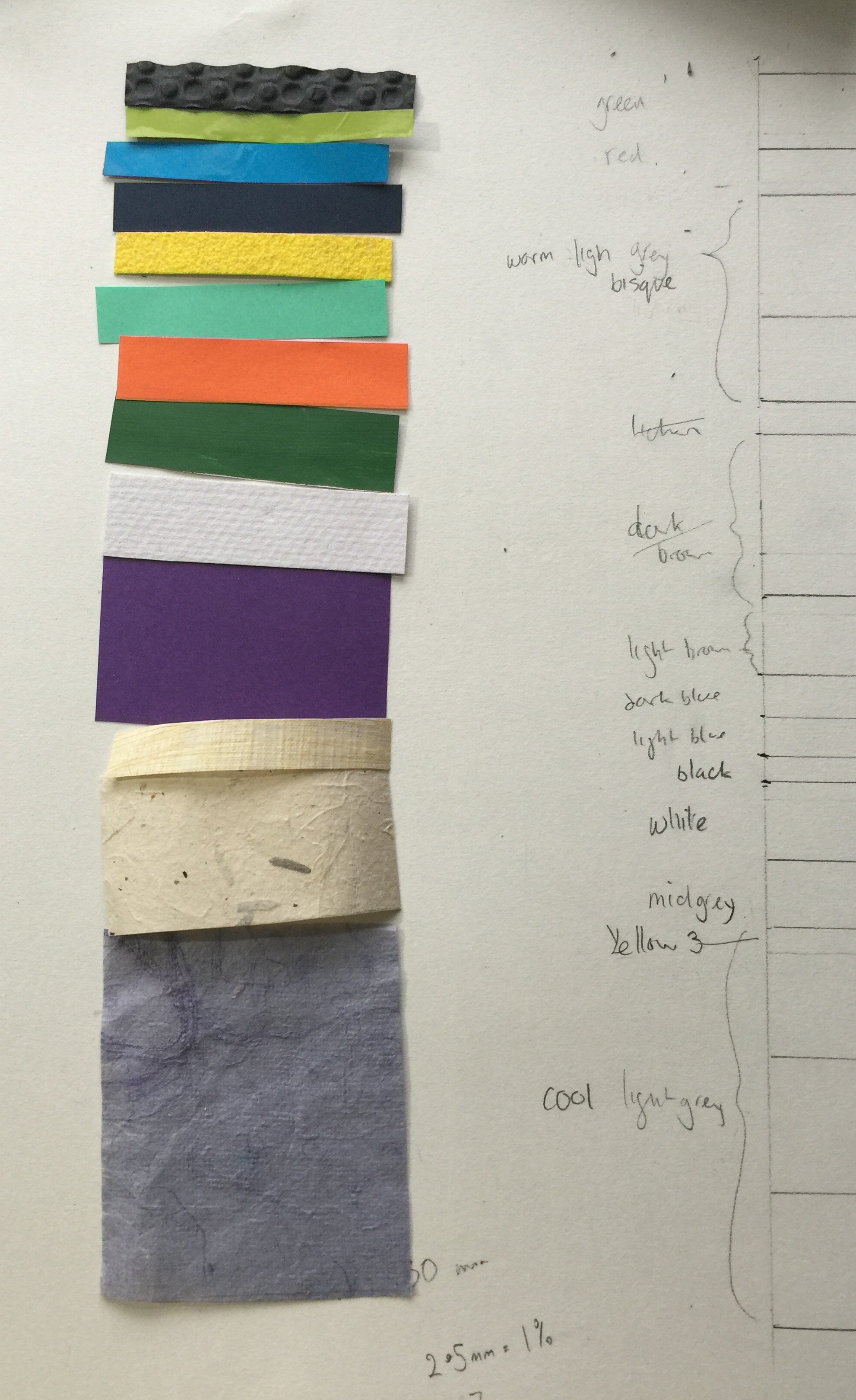
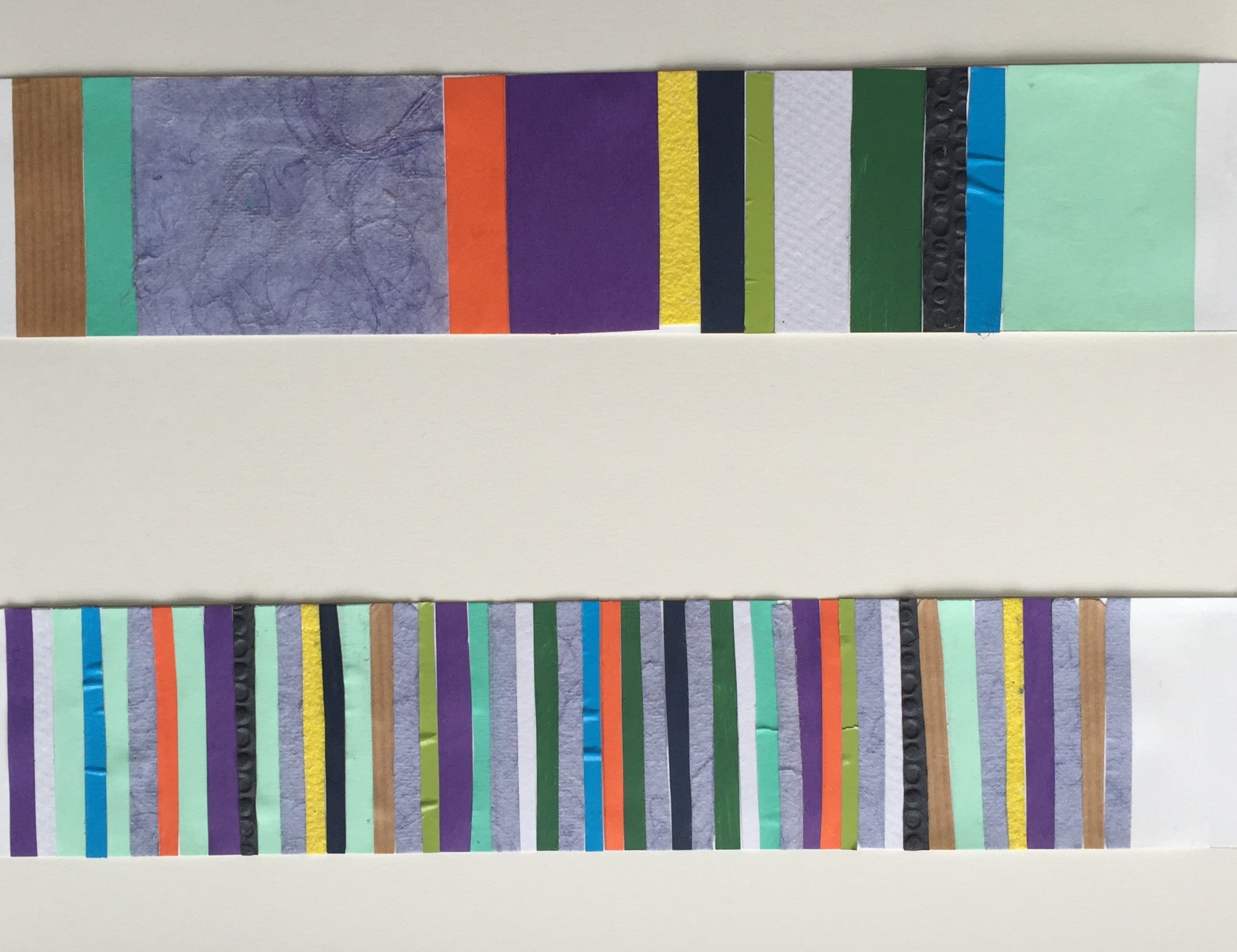
For this piece I drew a 10×10 grid over an inked in photocopy so that I could count the squares taken by each colour and get a percentage for each colour. I used the percentages to make a stripe design of the correct proportions.
Collage 3 – complex colours
As if the first wasn’t complex – it took long enough! I decided to use the same format but work with colours taken from images in magazines, how pleased I felt that I have a huge stash of them…

I got totally absorbed in matching colours and quite quickly got caught up in the idea of the image in the magazines being related to the object it portrayed. So the peace flags use grasses to represent cloth fibres, ceramics came from sand and rock, origami cranes were inspired by birds etc. The tea pot is made of hole punched paper dots, I didn’t have a large suitable swatch to use and thought it would be interesting to take a pointillist approach. The process was more fiddly than I imagined , so the shading isn’t as I planned. It sits quite well with the rest of the collage though.