Assignment three – Colour communication
Aims
Your aims in this assignment should be to:
•employ a process of evaluation and selection of your own work
•demonstrate effective design, layout and presentation skills in the visual communication and presentation of your work.
Brief
This assignment asks you to use the work from Projects 1 and 2 to develop and create a beautifully presented colour resource book.
I had a look at the assessment criteria in the back of the course notes for quality of outcome. I will do this at the start of the assignment next time.
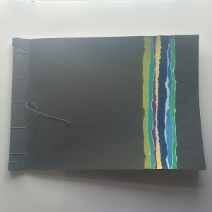
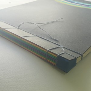
Focussing on the positives, the presentation of my work is coherent and I think professional. My book looks great! The binding is carefully and precisely crafted, I worked through some different ideas and chose a stab binding method. This displays my work clearly in an interesting way. To avoid cluttering the pages with little bits of stuck on text I have a fold out contents page. The contents page has a photo reference with a summary of each exercise that is clearly visible as the pages are turned. The cover is attractive but simple, I used ripped paper in a stripe pattern, choosing unusual colours that work together in an interesting way. The papers were hand coloured using Inktense blocks to get bright, clean, flat colour. I used the same papers to wrap each page edge before I bound them to give some extra thickness to the spine, I think that this added strength and aids the opening of the pages. The book is stitched but would very easily come apart if I want to add more pages.
The contrast between the spine of the book and the stripe pattern on the front is quite interesting, I used exactly the same coloured pages but the taking away of the hot colours makes a huge difference to the mood. They do not sit together well at all.
To be honest there are not many of the exercises that I left out of the book. So I’m not sure how discerning I can consider myself to be. It felt incomplete without all the tasks in order, so my judgement was to use all the exercises, I very carefully considered page layouts though. It is possible that I kept the pages too simple in some cases, they are certainly not over cluttered! My thought processes, tests and design work is in my sketchbook. The book does not perhaps get across my learning during the module, or get across a good sense of colour ideas. I did gain a deeper understanding of the use of colour, hopefully this will be reflected in future assignments. I didn’t thoroughly explore the potential for expanding on the exercises, mainly due to time restraints. I had a fantastic week long break with only a couple of half days of chores and it was amazing to be able to really crack on and concentrate for extended periods. What a treat! Things that I considered including were, making yarn wraps for the gouache samples of collages, and colour chips for the collages. I could add these later. I have a spare page at the back just in case. I also have started gathering a broader range of textures including fabric strips for my yarn wraps.

