I love mixing colours. It is meditative and absorbing, and mind bendingly problem solving. I took a very analytical approach and made some colour progressions using the three main primary triads, warm, cool and earth tones. I mixed them together and with each other, I made tints and hues. I used the book Colour – A Workshop for artists and designers by David Horning. It is full of exercises that I will continue to work through.
This became my resource to compare fabric colours to , I found it really useful to gauge which primaries to mix. this sort of became second nature after a while, but still useful to use a check.
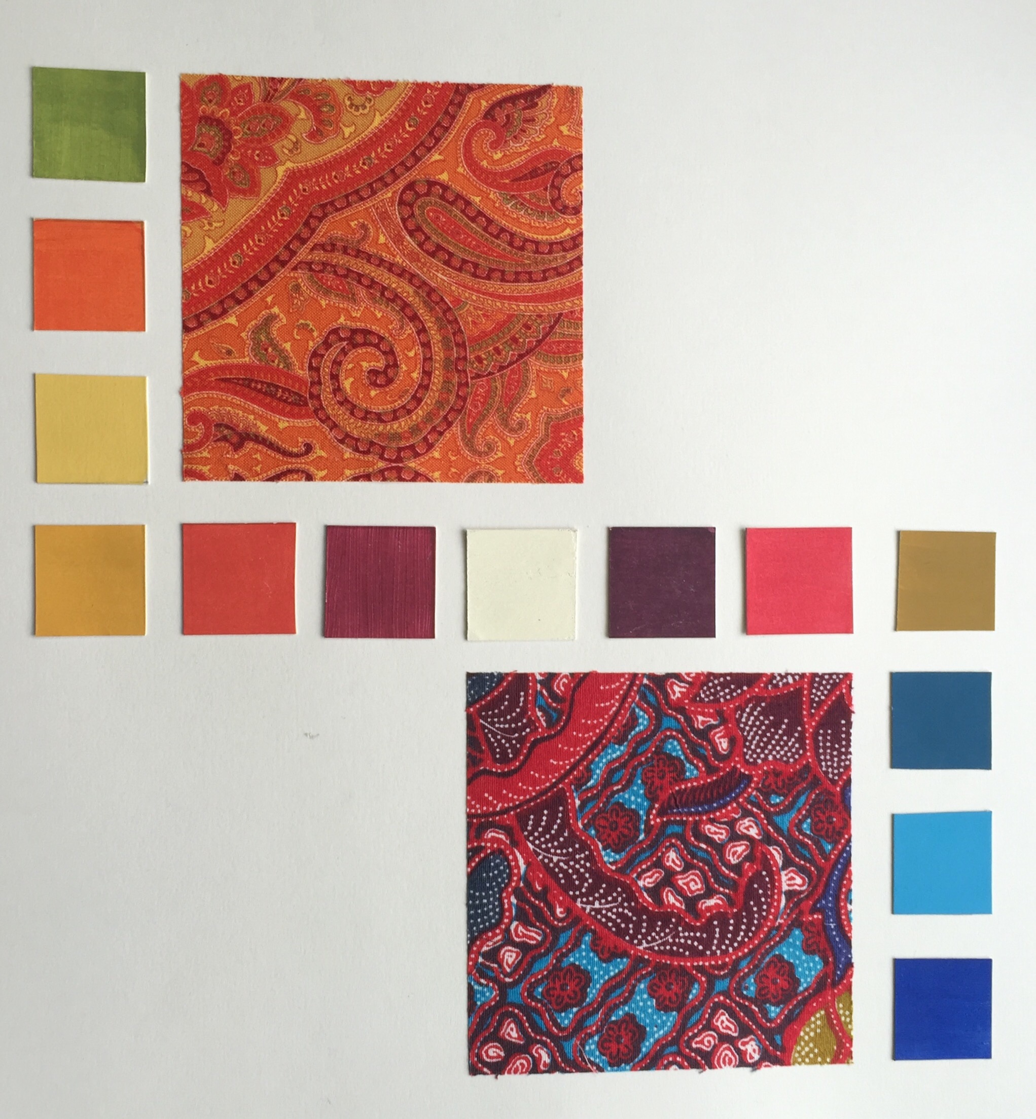
I mounted these fabrics together because they are from the same family , having cool, red, blue, yellow with paynes grey as a mix in common as predominant colours. They clearly have differences also! the orange fabric has some colours that use warm yellow. The red/blue fabric has warm blue. the trickiest colour was the dark yellow/brown in the red/blue fabric. It seemed to suffer most from drying a lighter shade. The mix I settled on for this was yellow ochre with lemon yellow.
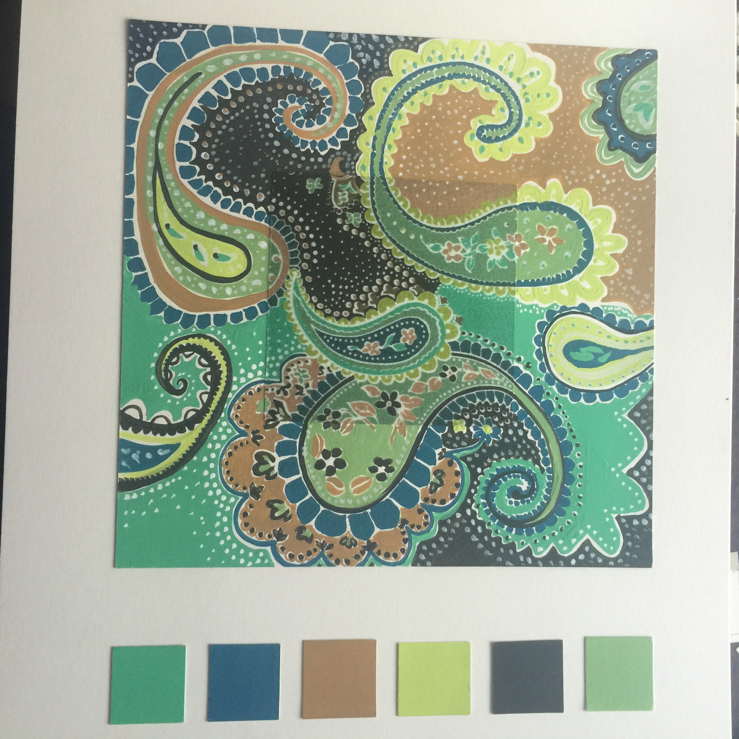
I spent a silly amount of time looking for a single photo to go on this board. The colours all my favourite landscapes ,bright skies and fresh leaves. When I practised mixing the freshest greens came from cool yellow, warm blue, this mix is dominant but there are some cool blues in the palette too.


This palette relies more on Paynes grey as a mixer, I think it is my new favourite paint. the colour quality seems somehow richer and less garish .
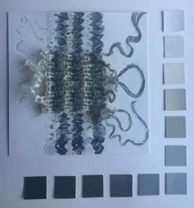
Well how much bother can a worn out grey and white sock cause? the answer is plenty!! This was by far the most complicated sample, I have honestly only touched on the range of tints and shades and tones in this little fragment. the wool is undyed and spun from sheep with many colours. The colours in the yarn are complex and then the shadows and highlights add their own nuances. I did fairly well to record a wide range but I just couldn’t work out how to portray the wonderful luminosity of the cream yarn.


