ARoS – Aahus museum of art vist.

Aahus museum, Denmark

A wonderful educational experience, a visit to Aahus museum encourages interaction and has free wifi and a free phone app with extra information about many of the art works. There are information boards around the galleries, with introductions to art movements and gallery themes that are informative, and not in the slightest bit condescending. The gallery walls have a changing colour palate with no fear of bold combinations.

IMG_3122 IMG_3123

IMG_3124


Not much textile work evident but some very thought provoking works. I particularly appreciated Botanical portrait by Richard Mortensen and Forest track by Edward Weie, I have been drawing plants for assignment two and these paintings really gave a fresh perspective on marks that represent plant forms.

IMG_3238IMG_3239


IMG_3240IMG_3241

There is a beautiful painting of Birch trees called Double Brown

IMG_3231 IMG_3229 IMG_3228

I love the patchwork of paint used to represent the tree bark and have all sorts of ideas about using paper collage, and fabric and stitches to make bark marks.

I was also delighted to find a whole gallery relating to colour.IMG_3177 IMG_3178

Olafur Eliasson  is a name that has cropped up several times in colour studies and experiencing his instalations was delightful.

IMG_3190

IMG_3187

IMG_3172

IMG_3266 IMG_3262

IMG_3174IMG_3175

I am working out how to make a flikr gallery to upload the rest of the ARoS photos as a future reference source I will put a link here when this is achieved!


ATV assignment two – Observing and capturing – David Hockney- research point 3

David Hockney ipad drawings

I can’t for the life of me put Hockney images on this page but the website links work well.

David Hockney wowed the art world when he first started showing his ipad paintings. He has really embraced the technology and apparently said if Picasso and Van Gogh had the technology they would use it to!

The works that I am already familiar with are his landscapes like this one on his website and on the Annely Juda Gallery website. This New York times article is quite interesting and has a good link to some other works, I did some searching and found some really lovely flower drawings like these. I love the marks, in the wild flower drawing, they really represent the scratchyness and wildness of the meadow

The video shows how the ipad has enabled Hockney to display work in an entirely new way. This looks like an almost cinematic experience, rather than walking around the gallery, images on the screen are constantly changing. I think that this is important for ipad drawings as they are created by light, they work better viewed this way rather than prints of the image.

David Hockney uses an app called Brushes that I have installed to experiment with. I am also using an app called Paper by 53, I received a 53 Pencil for my birthday- an electronic stylus that unlocks some interesting in app features. This is an early Linda Baker iPad drawing.


My attempt at drawing on my ipad using the paper app by 53

ATV Assignment one – Tutor feedback and response

Overall Comments

Linda you have made a really positive start to this new course with a rich body of work.  It demonstrates your skill in drawing and an ability to use mark making to explore texture, composition and form.   You have done some very interesting and relevant research during this assignment and used it appropriately to inspire your own creativity.  The written work in your learning log is articulate and reflective.

This is really reassuring to read. It was a big decision to change to the new course but this makes me feel that I am approaching it in the right way. I am very much enjoying the tasks and the way they are delivered, I think that I have felt more confident about my work and this has shown in my drawings.


Feedback on assignment

Demonstration of technical and Visual Skills, Quality of Outcome, Demonstration of Creativity

For this first assignment in A Textiles Vocabulary you have used the Style Lounge theme to develop a group of drawings.  You started this work really positively by creating mind maps of the different themes, organising your ideas so you could make a choice of which to use.  I like how you made Lounge Style personal, understanding that through this you would get more from the exercise.  Your initial drawing is nicely executed, then successfully going onto explore the items further in a range of mediums and on different surfaces.  This way of drawing and redrawing in different ways is an excellent process to go through.  It helps you to see what is there and focus on what excites you.  I particularly like they way you have done this with the necklace you drew – exploring the felt beads each with a different medium.  This has given you a range of results in one place, presenting you with the opportunity to compare and analyse the effect produced by each medium.  I also like the group of drawings of the cup, using print techniques to create surface texture, tone and imagery.  They have a nice loose exploratory style with an understanding of placement and composition.  I am pleased to see that you have included the plastic print surface you used.  These items are often very interesting and have a unique value that should be appreciated.  For me your strongest work is where you have used the sole of your shoe to create surface texture and meaning.  There is evidence here that you have also problem solved by transferring the texture of the sole to a printing foam in order to achieve more definition in the print.  The drawing that is most successful is where you have used added the chevron print and collage.  There is a balance to the composition with the positive and negative shoe prints and the enlarged chevron shape in both 2 and 3 dimensions.

I was really excited about my cup drawings – interestingly they were also some of the quickest drawings that I produced so I’m really pleased that they were highlighted, I am beginning to realise that ‘drawing’ is so much more than trying to create an exact image and I must try to keep this in mind. I wasn’t so confident about the shoe prints so this gives me the courage to experiment with ways of working, I do like adding 3D elements, the drawing with added print was a playful process. I now have license to play more!!


I suggest you continue to use drawing to explore the visual world using a range of techniques and media.  This will ensure you continue to build your skill base and the development of your own style.

I certainly will!


Learning Logs or Blogs/Critical essays

Context

You have made a good start to your learning log and well done for choosing an online platform.  You have included some interesting research material and responded to it well.  The research you collected whist in France is particularly interesting.  I can see how you have made links with your own work in the responses you have made.  This is excellent.  I suggest that you continue to respond to the work of others you have seen and enjoy.  This will help you to develop your own style and understanding of what you want to see in your own outcomes.  You have included a good number of photographs from this exhibition and added your own analysis of the work.

I am loving that my creative net is widening, and I’m trying to capture the tenuous links that I am making in my mind. Whilst wandering around I’m starting to have marvellous thoughts! It is clear to me that research isn’t research unless it is recorded so it is a priority for me to make more of an effort to record my findings and thinkings in a variety of ways.


You have included in your learning log a reflective commentary of your own work.  This is articulate and revealing of how you think and understand your own creative process.  It would be nice to see more of the photographs you describe in your learning log.  There is some interesting writing about how you worked through putting together your still life.  Changing it to create something useful and pleasing.  It would be helpful to see the process you went through including the arrangements you discarded.  This not only helps the assessors see what you have learnt but also makes it clear to you why some compositions work and others don’t.

This is my stumbling block- recording things. My tech capability doesn’t yet keep up with me. Practice, practice, practice….

Your learning log at present is a little difficult to navigate and may become more so as you add more work.  I suggest divide the work into assignments and label accordingly.  This will ensure that the assessors and myself will find each assignment quickly and simply.

I have struggled to set up the blog and have not yet developed a good working practice. I think at the moment my blog is a real bare bones sort of document. I have planned  to make it future proof by not  setting it up on the free wordpress site. Theoretically this will enable me to have more space for photos etc. I hope to make a clearer structure and also add links to my flikr and pintrest sites.


I suggest you continue to include research material from a wide range of places including exhibitions.  Writing about what you see and what this means to you.  Add more imagery of your own work to include the processes you go through in order to reveal your creative pathway to both your self and oca staff.  Continue to reflect on what you make and what you think about it.


Suggested reading/viewing

Context

I suggest you continue to use the recommended and further reading lists, along with the lists of journals and useful websites to expand your research.  Documenting what you find in your learning log.


To continue the development of your drawing I suggest you look at –

Maslen, M. & Southern, J. (2014) Drawing Projects:  an exploration of the language of drawing.  Published by Black Dog


Pointers for the next assignment

  • Maintain you excellent working practices.
  • Draw regularly in a range of mediums.
  • Organise your learning log a little better to enhance navigation.
  • Continue to research widely responding to what you see in your learning log.
  • Add more photographs of your work and how you work to your learning log, reflecting on the outcomes.

ATV assignment two – Observing and capturing – project 3 – portraying by drawing

Project 3 – Exercise 1.8 Portraying by drawing.

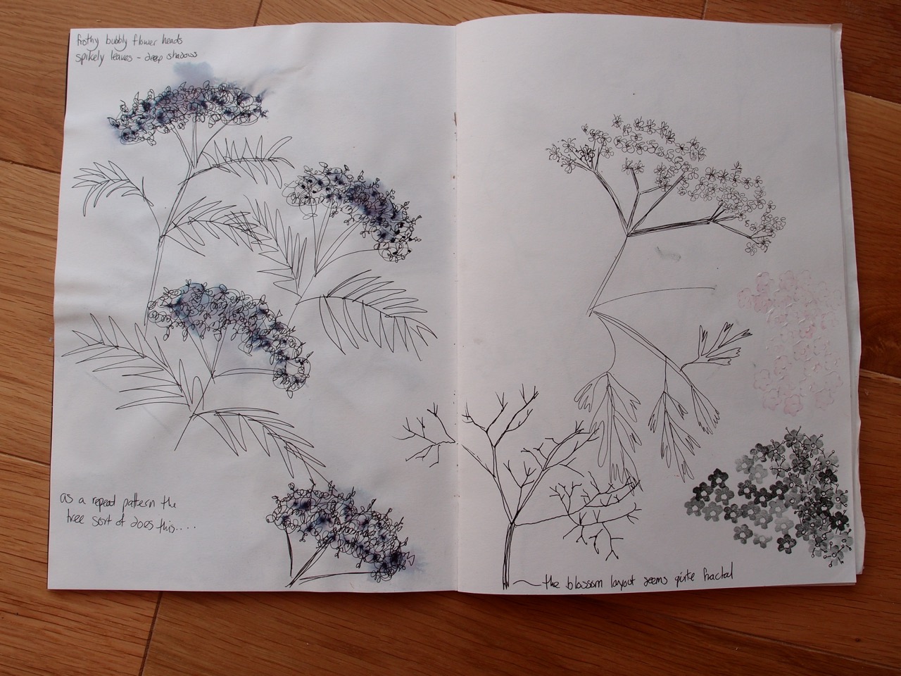
10 drawings of plants- considering, silhouette, tone, repetition, movement, construction, orientation, motifs, flow ,scale, pattern.

OLYMPUS DIGITAL CAMERA


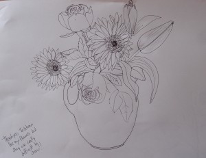
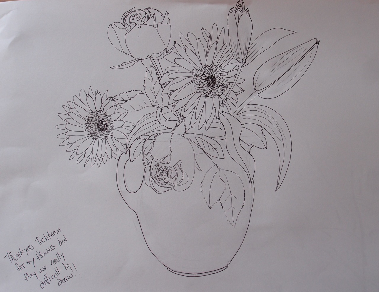
….So despite observing my tendency to try to be really representational I really tried to draw this vase of flowers, Its quite a good representation but I do not find it exciting.

OLYMPUS DIGITAL CAMERA

Water soluble pencil gives very delicate marks.


OLYMPUS DIGITAL CAMERA


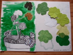
This was a quicker drawing where I experimented with different ways to draw geranium leaves and the soil using ink, I prefer the more illustrative style and feel that I came up with some really interesting patterns. I tried cutting leaves from paper and used different techniques such as creasing and embossing on the reverse with a biro to represent the leaf veins. I tried different weights of paper and also used the waste as a stencil to make leaf shaped marks.

OLYMPUS DIGITAL CAMERA

OLYMPUS DIGITAL CAMERA


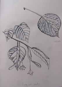
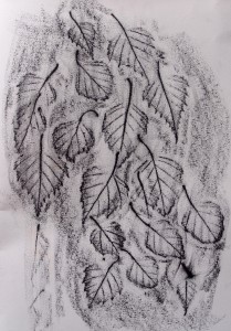
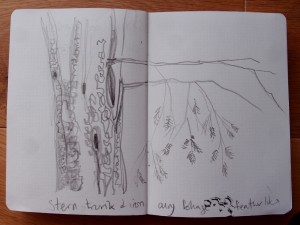
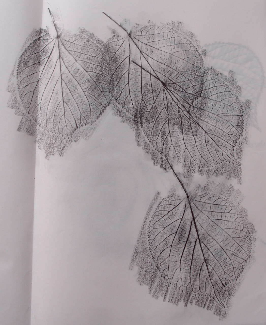
I picked some leaves on the way to work to draw in my lunch break. Pen and ink, and frottage work well, very delicate still…


IMG_1228 IMG_1212 IMG_1200 IMG_1139

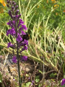
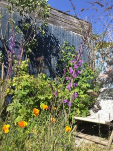
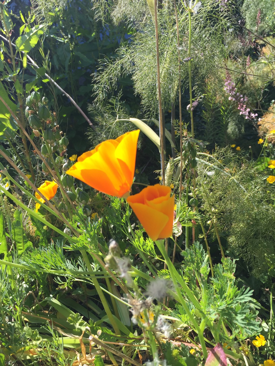
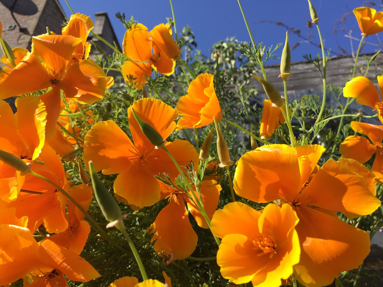
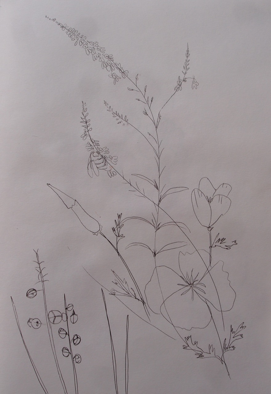
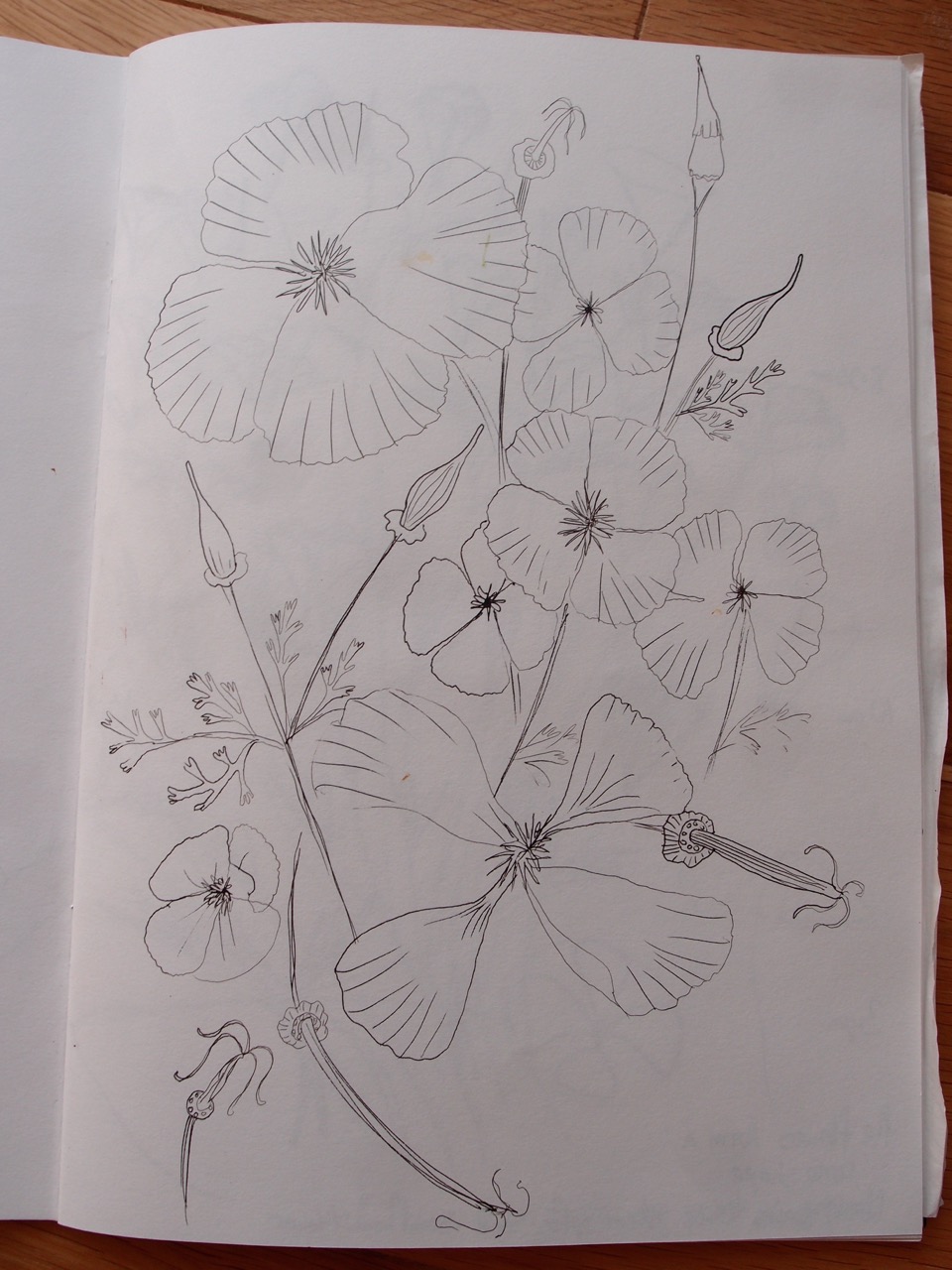
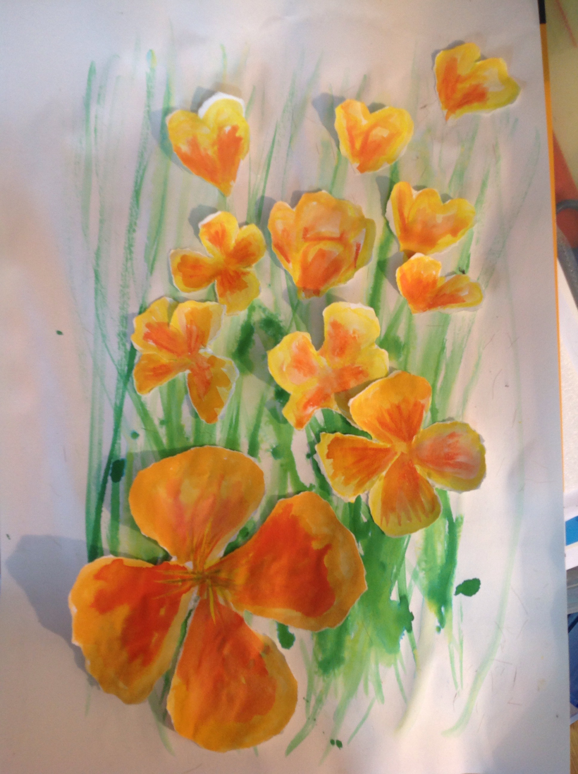
A rather wild affair, my garden.. I love the poppies and made these my first subject.

OLYMPUS DIGITAL CAMERA

OLYMPUS DIGITAL CAMERA

OLYMPUS DIGITAL CAMERA

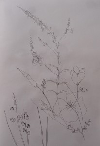
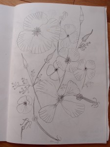
I started by looking at basic shapes, I can completely understand how drawing from life helps with capturing the essential details of a subject , but drawing plants is really hard!! The sun was either casting shadows of me on the paper or blinding me, and the breeze was not at all helpful, perhaps I will photocopy the line drawings and add colour to them.

OLYMPUS DIGITAL CAMERA

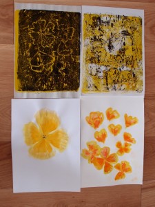
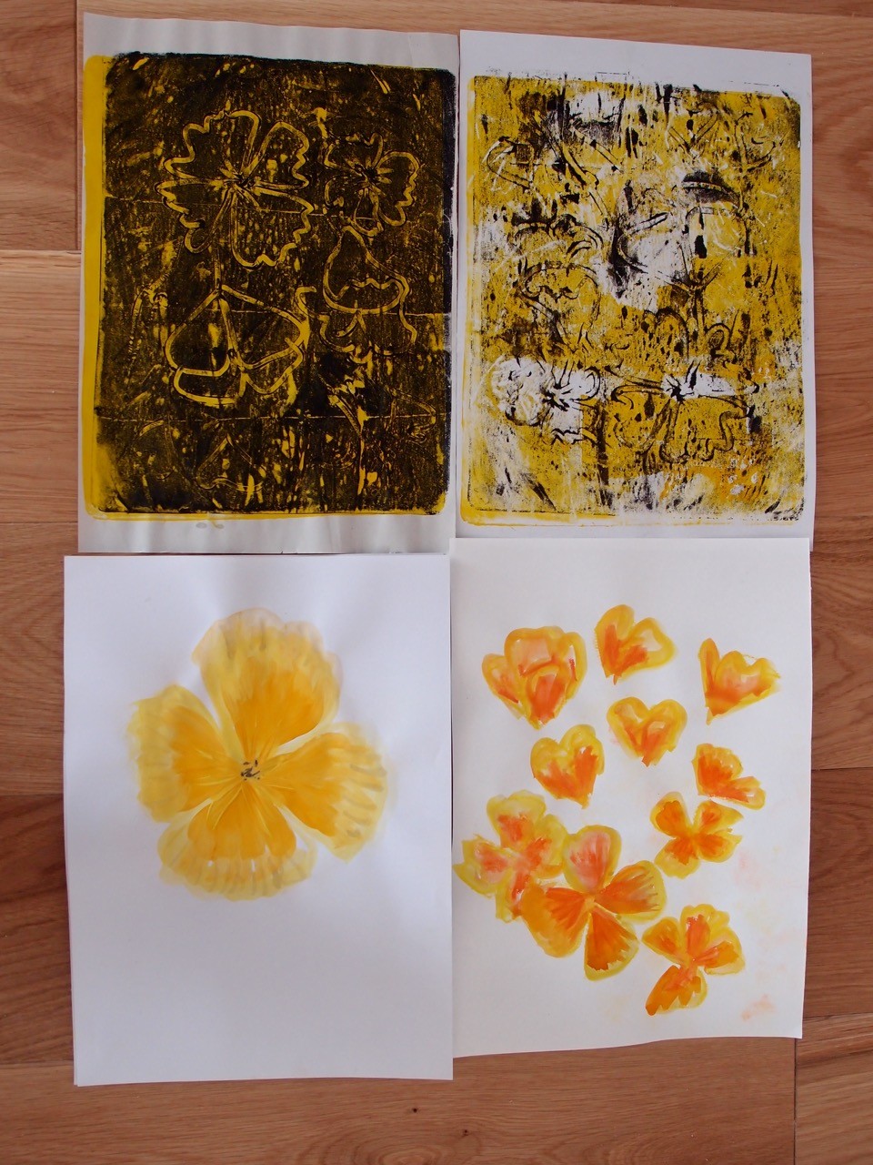
I applied yellow paint to the Gelli paint and tried to take a print of the poppies, it was very faint so I rolled black paint over the plate and drew the poppies into the wet surface. This technique doesn’t really suit the delicate nature of the plant at all. I used a watercolour , wasn’t really impressed with the result so cut out the individual flowers and collaged them onto a painted background, this improved the representation some what and enabled me to play a little more with the placement of the flowers.

IMG_0979.JPG

OLYMPUS DIGITAL CAMERA

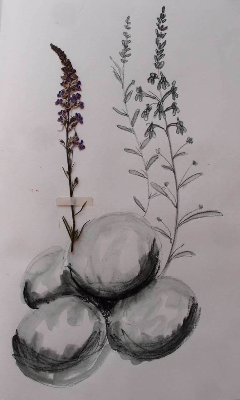
I like the spherical-ness of the rocks most in this drawing, with this plant. I much prefer the Gelli plate prints, and especially like the direct prints where used two colours.


OLYMPUS DIGITAL CAMERA

OLYMPUS DIGITAL CAMERA

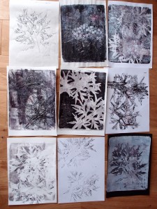
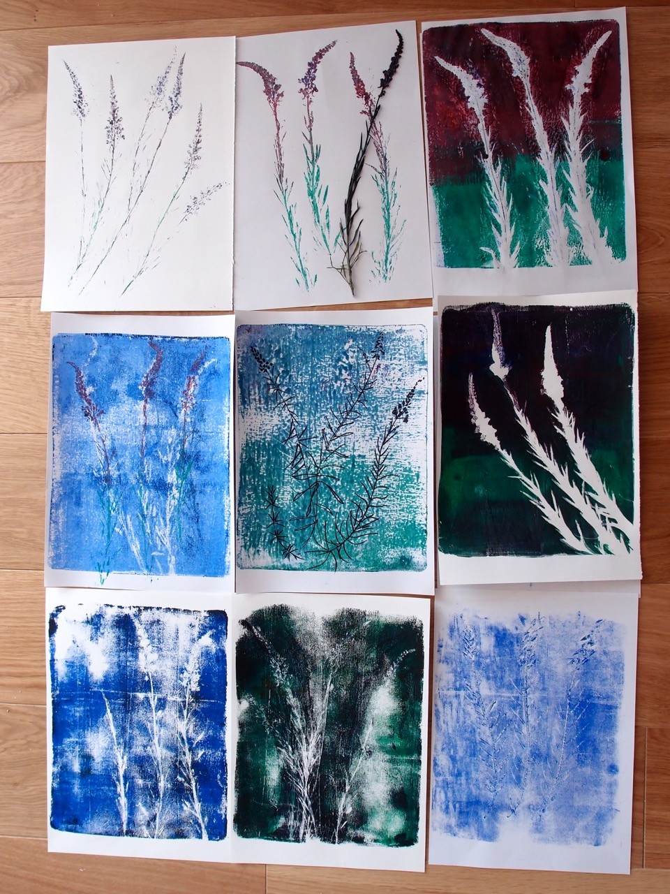
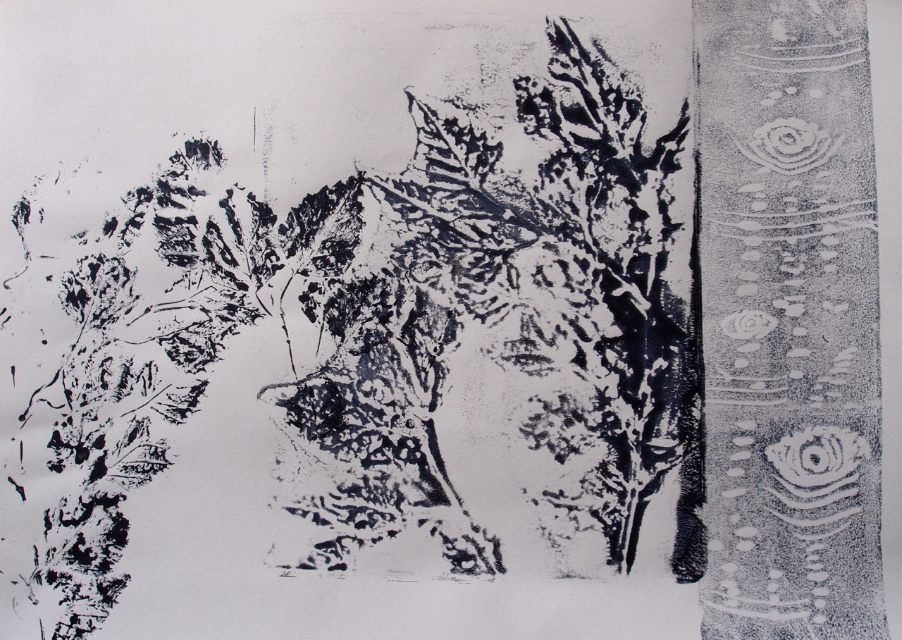
I used a Gelli plate to make marks directly from the plants in my garden, had lots of fun and got some interesting results.

IMG_1201

OLYMPUS DIGITAL CAMERA

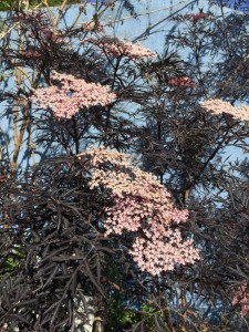
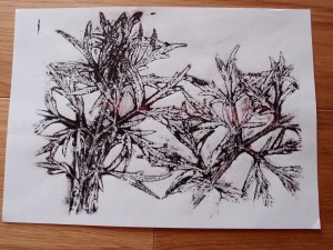
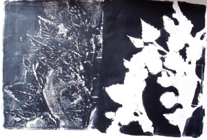
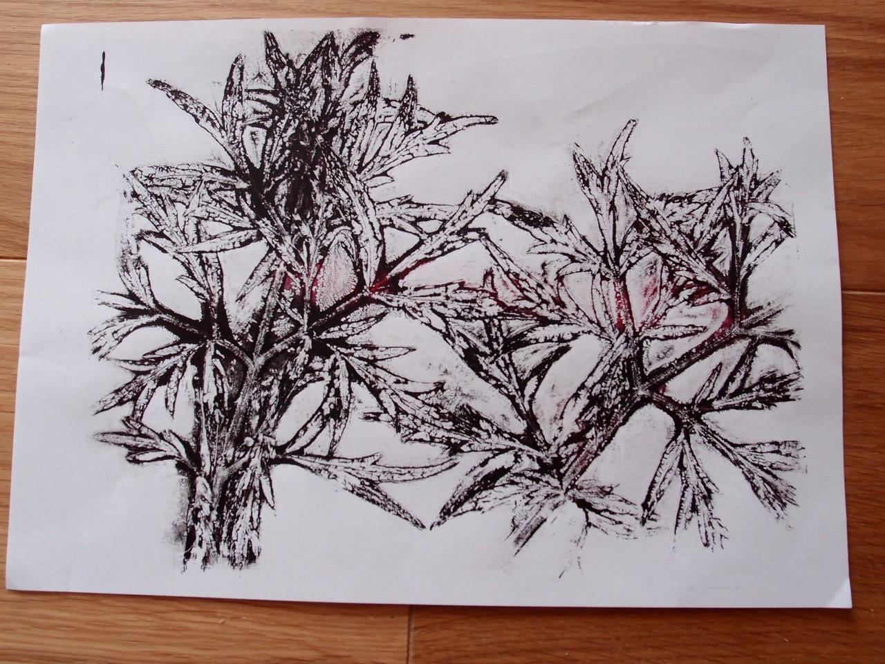
this is a direct print from the leaves of an ornamental elder type shrub in the garden. I placed it on the Gelli plate and rolled ink over the top, removed the leaves and printed them then took a print of the negative shapes left on the Gelli plate. I really like the marks here, it’s a strong image of a strong plant, I think gardeners would call it architectural. The drawing has a very strong structure, I used black and red acrylic paint, blending them with a roller on the gelli plate and this added a sense of depth, there are some really interesting negative shapes and lovely detail in the veins of the leaves. I think that this is drawing, yet it is an easily achieved representation compared to pen or pencil work, and more interesting than most of my drawings created by more conventional means.

OLYMPUS DIGITAL CAMERA

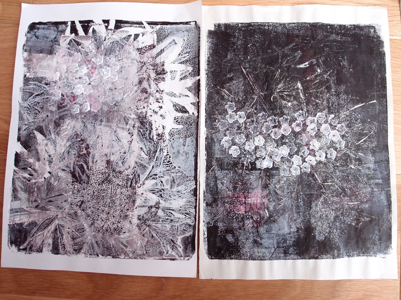
These are two multi layered prints, I rolled white acrylic over the ghost image on the plate and took the print on the left, this added more detail but left a confused image, the image on the right is similarly layered but was a clearer print. The blossom was added from a single floret stamp that I carved from an erasure. I used white acrylic with a smidge of red that was not completely mixed on my pallate, printing three or four times from each inking gave various densities of print , adding depth to the blossom head.

OLYMPUS DIGITAL CAMERA

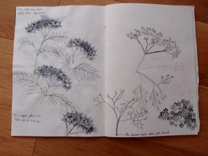
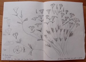
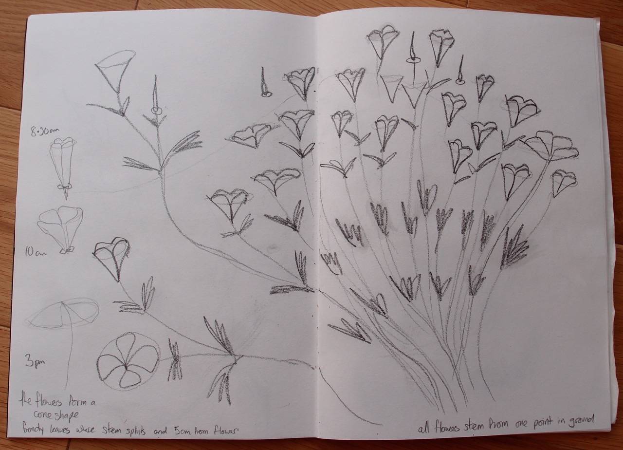
Looking  for pattern and repetition.

OLYMPUS DIGITAL CAMERA

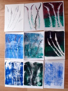
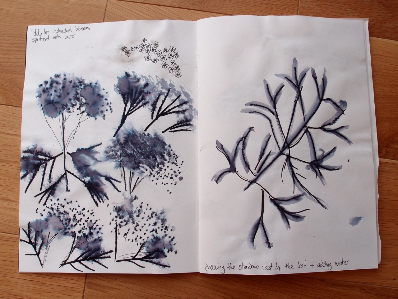
I really should experiment more with different media, I used an ink pen spritzed with water to disperse the pigment , the drawing on the left was made by casting a shadow on the page and drawing it before adding water, I really like the way water fairly randomly helps make my drawings more interesting, (clearly with an element of expecting that to happen!)

IMG_3024 IMG_3023 IMG_2741 IMG_2573 IMG_2562 IMG_2545 IMG_2046

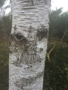
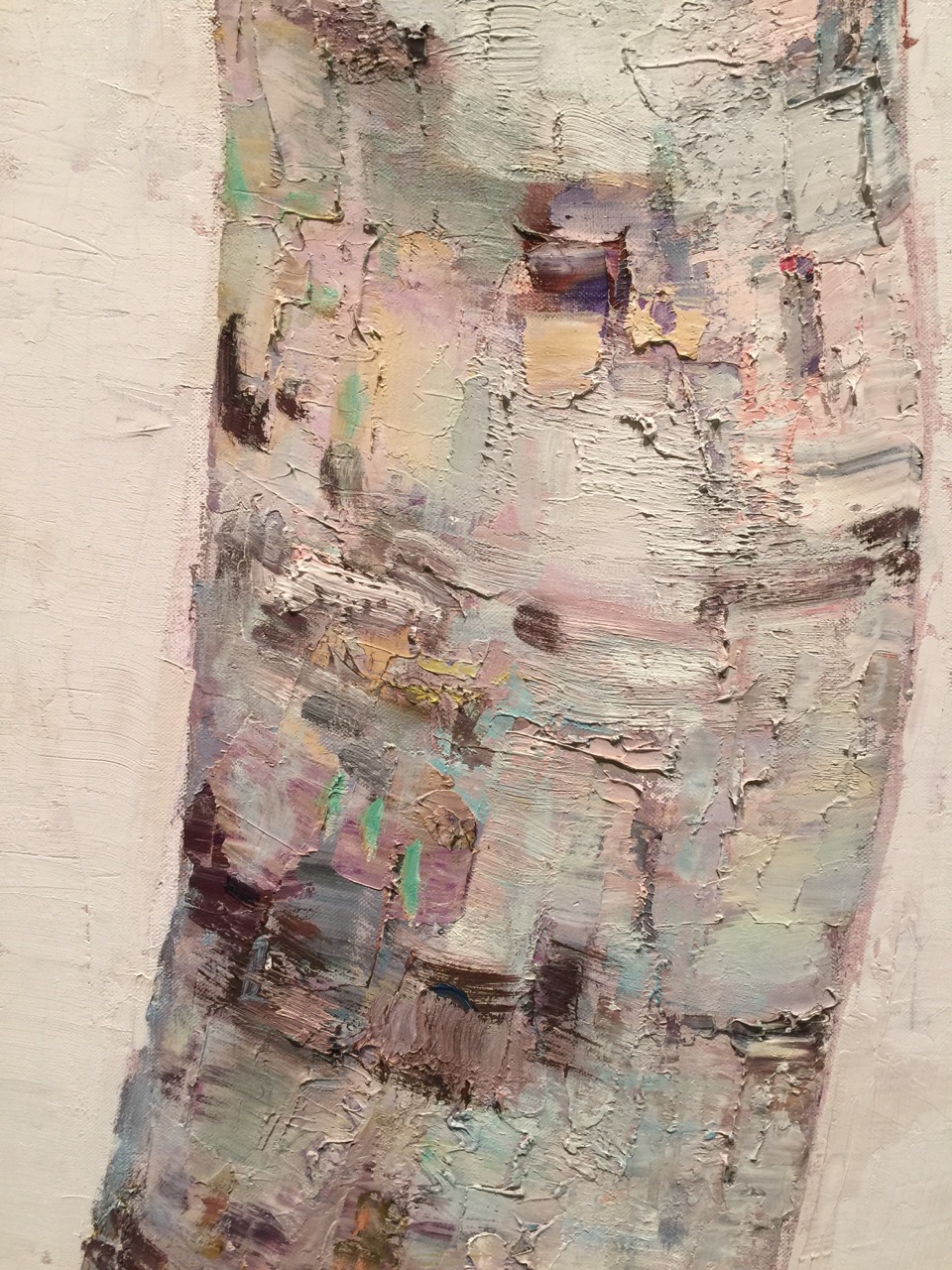
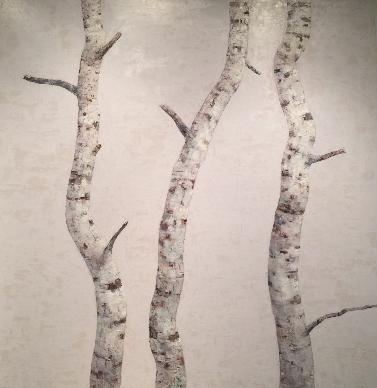
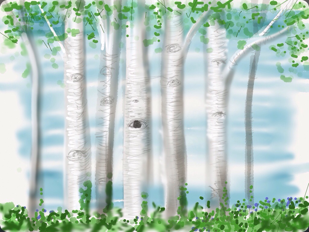
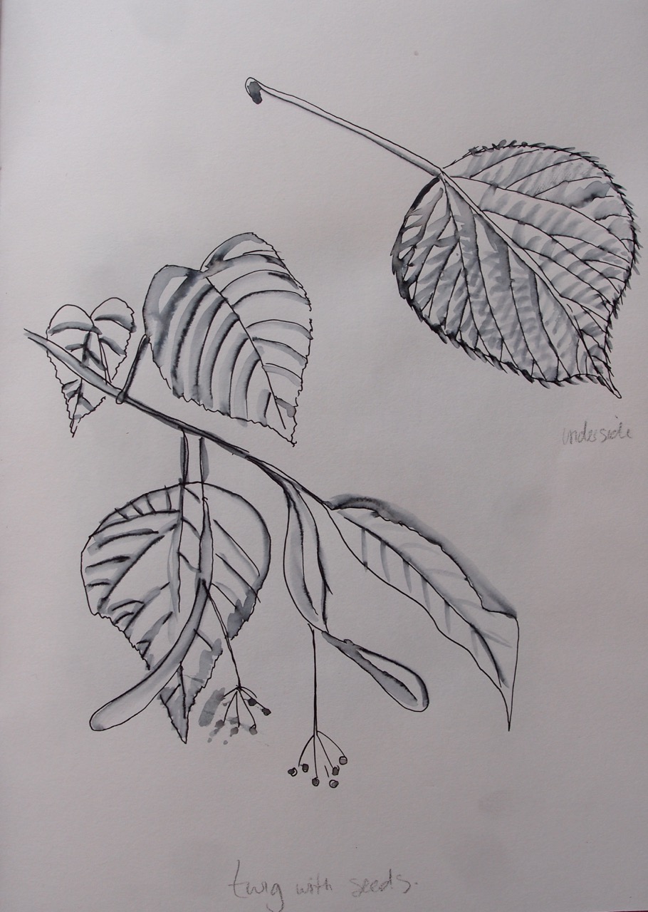
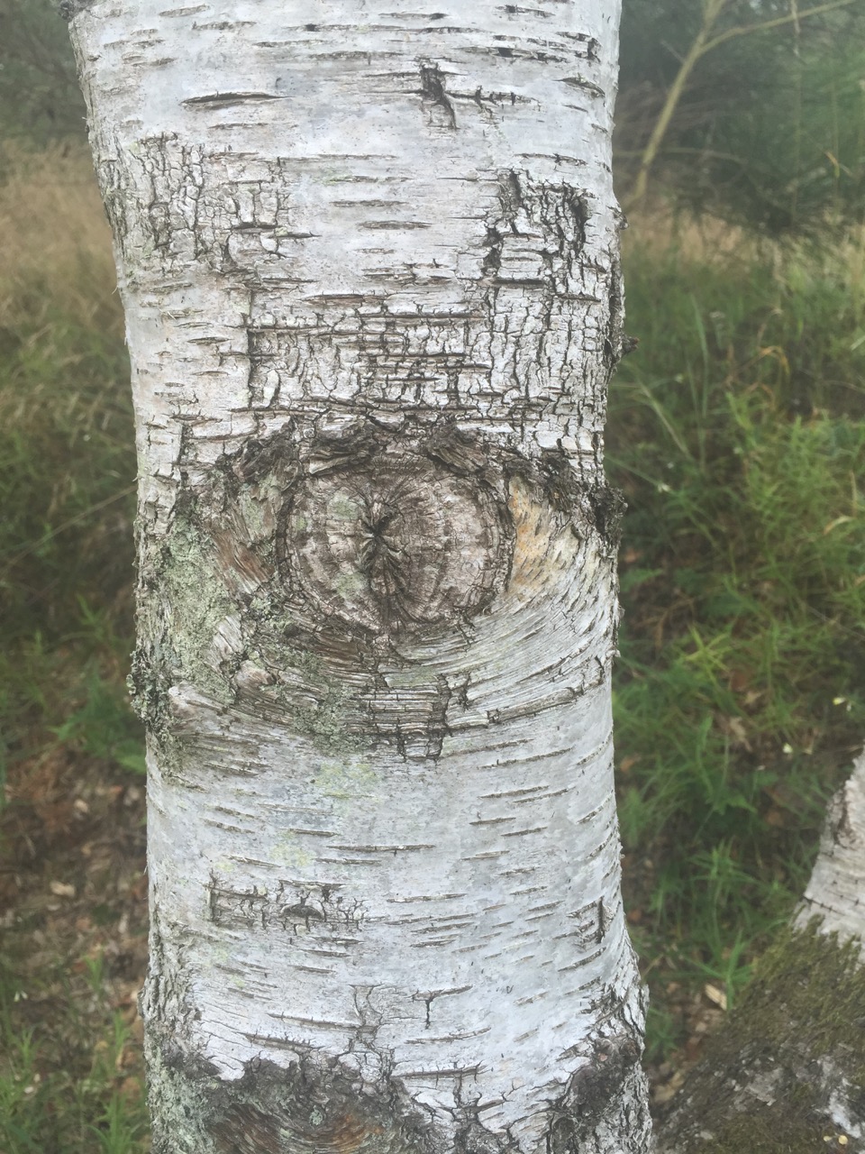
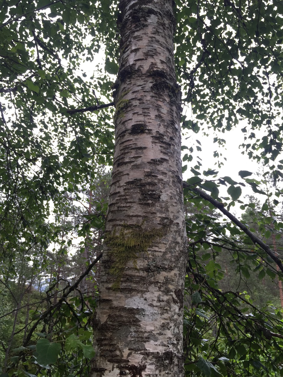
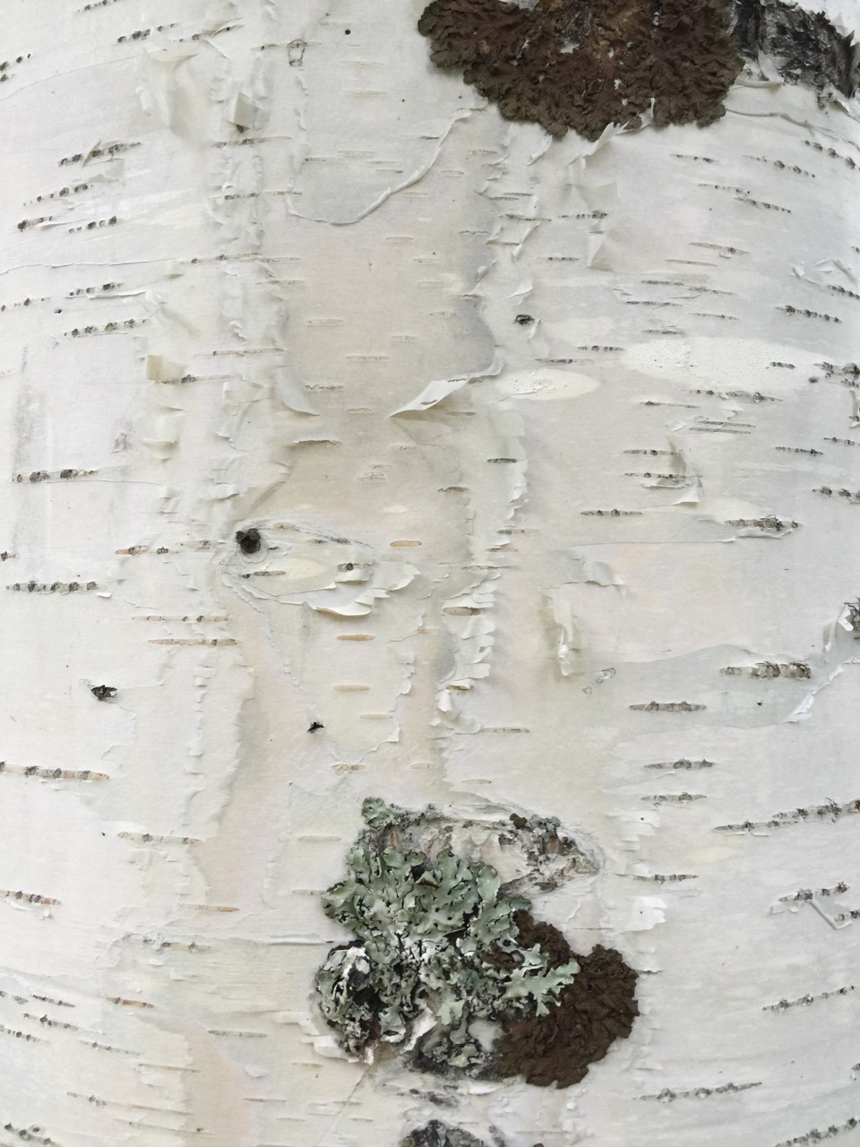
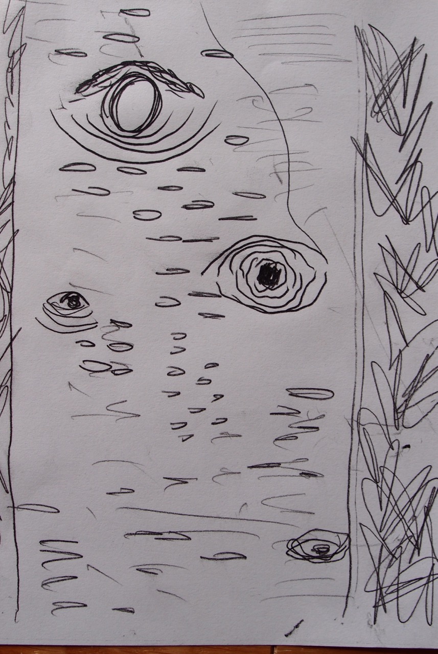
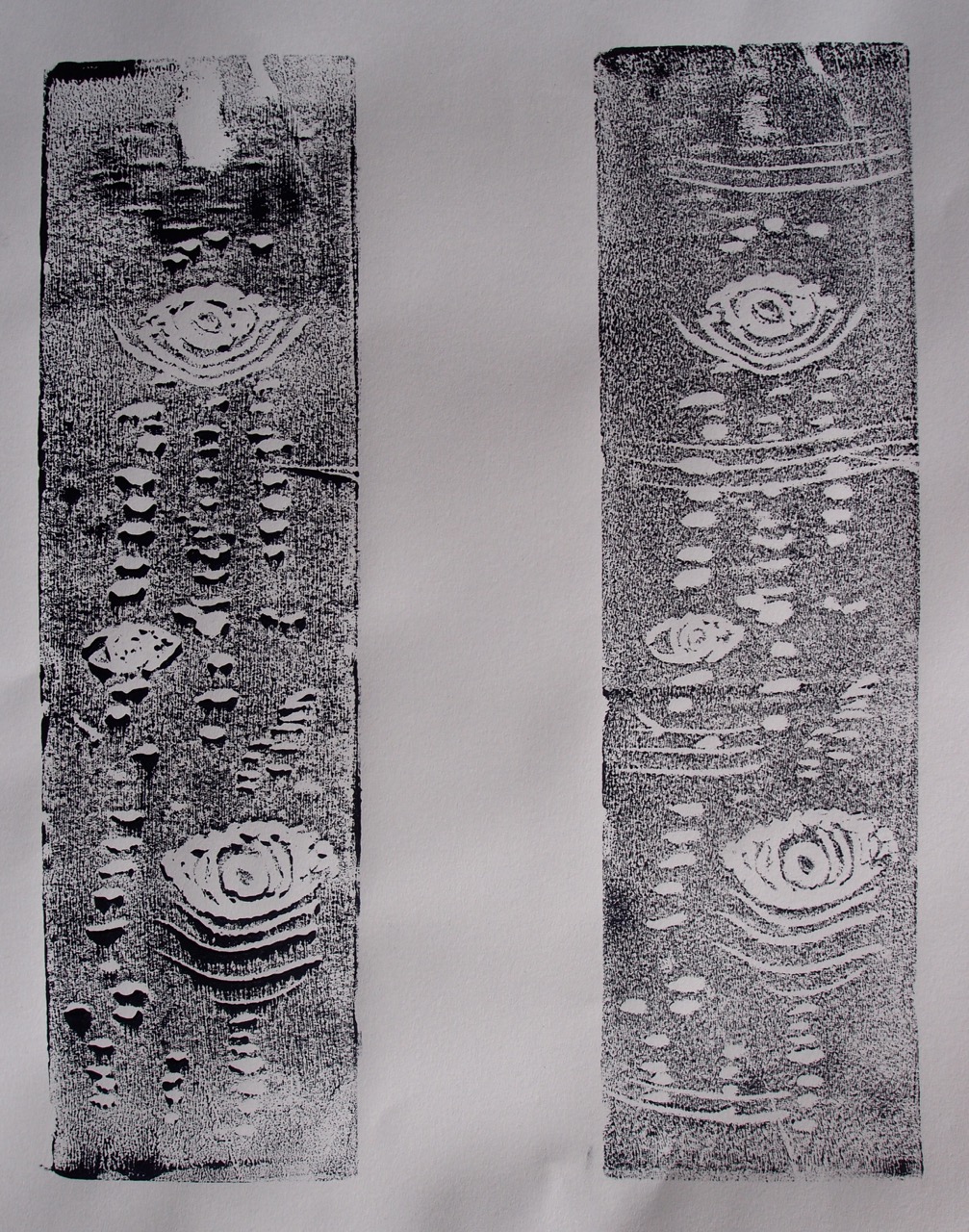
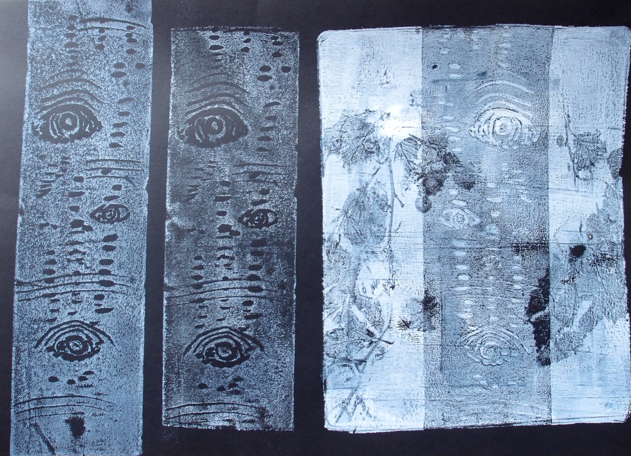
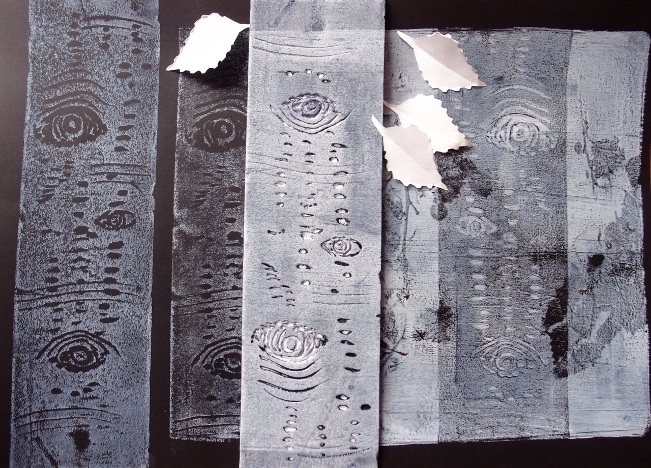
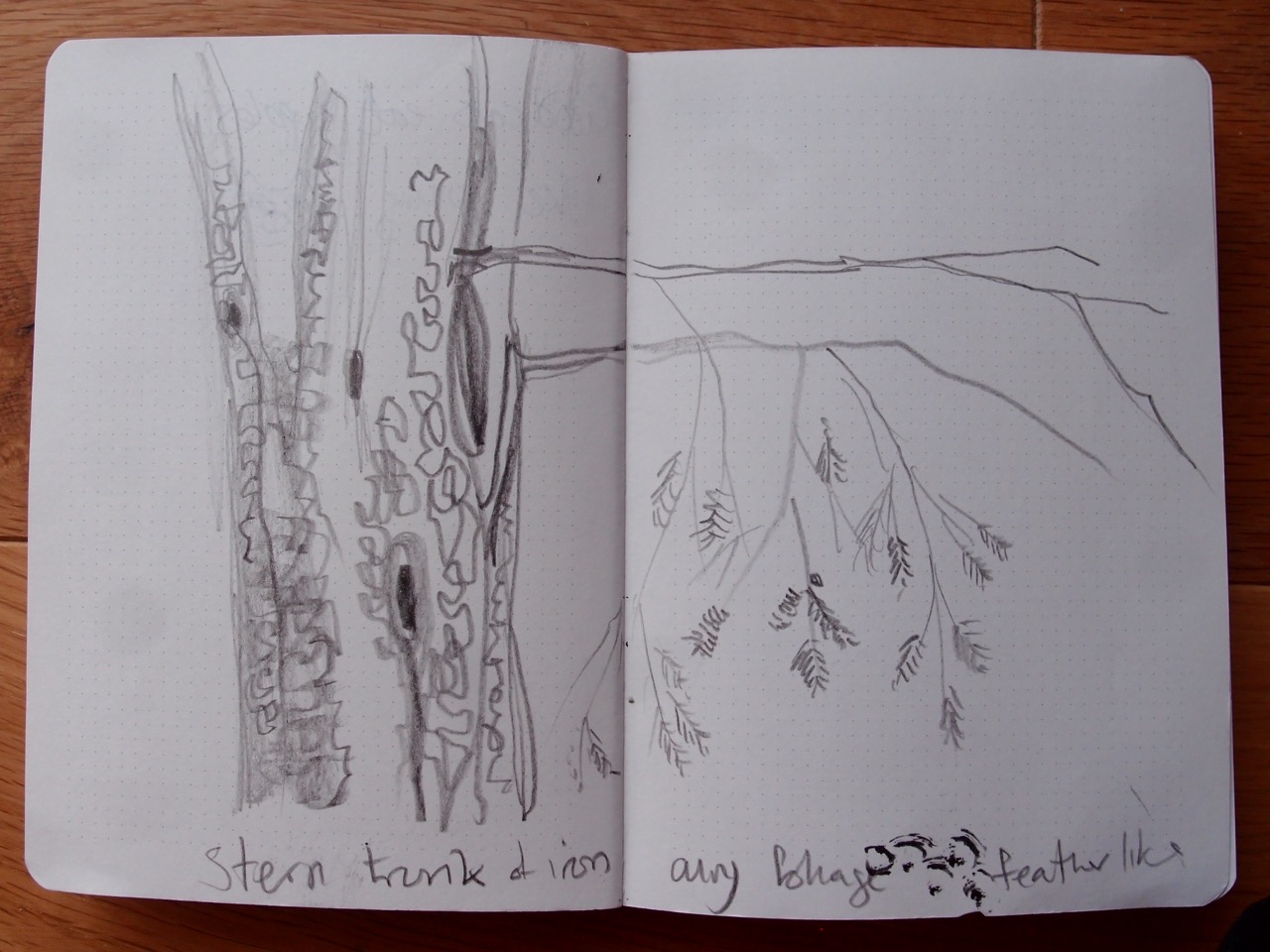
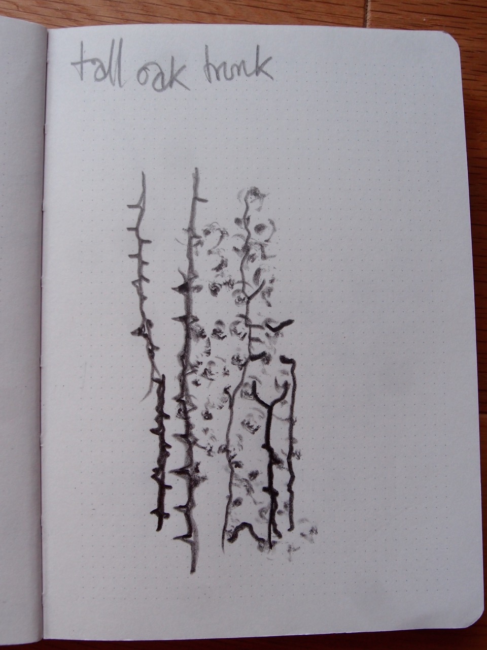
On my holiday to Scandinavia this summer I was beguiled by the beautiful birch…

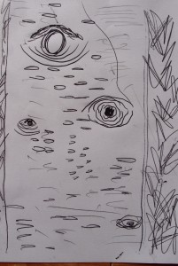
She became my inspiration and when I got back to rainy England I set out to capture her.

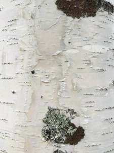
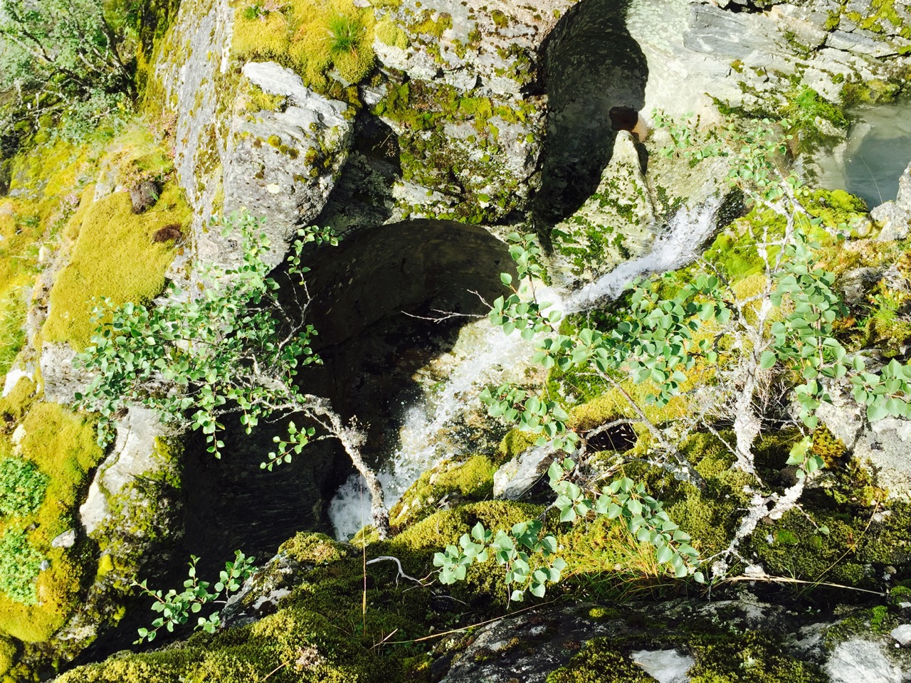
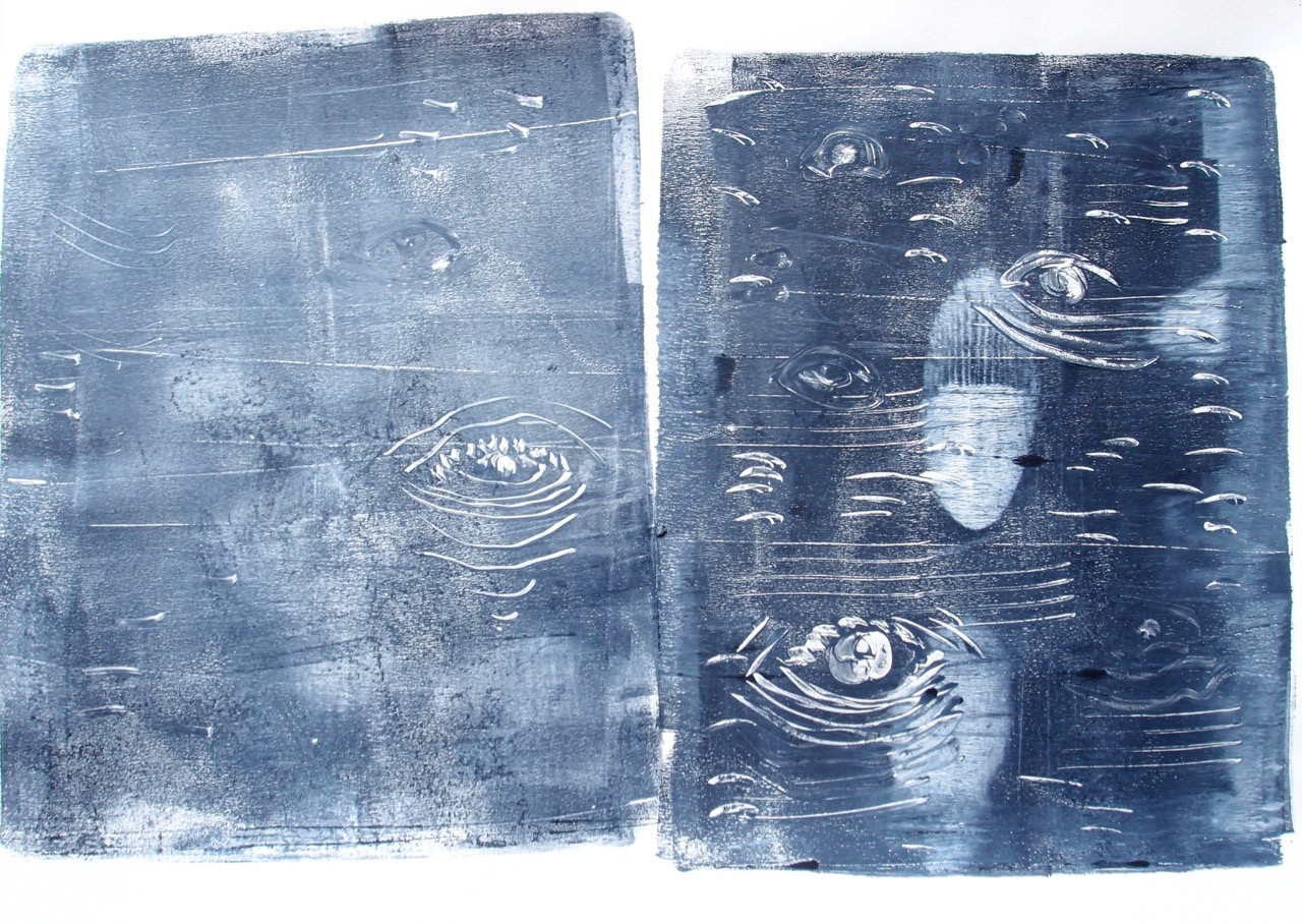
First to solve the tricksyness of drawing in the rain I sealed some carbon paper and paper in a zip lock bag.

OLYMPUS DIGITAL CAMERA

I was very pleased when I opened it up when I got back home from my walk. I also took a bit of polystyrene and made marks to print when I got back.

OLYMPUS DIGITAL CAMERA

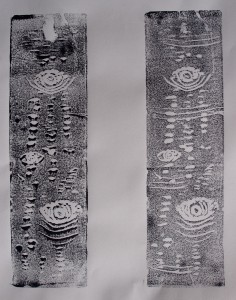
Direct print, acrylic paint on white paper

OLYMPUS DIGITAL CAMERA

Direct print and Gelli plate print on black paper.

OLYMPUS DIGITAL CAMERA

OLYMPUS DIGITAL CAMERA

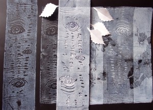
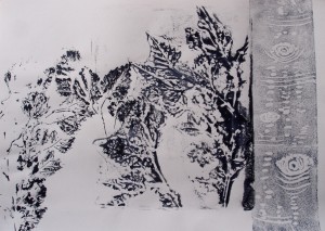
While the Gelli plate was out I copied some bark marks onto it and really like the subsequent prints. While I was all set up to print I also played with the leaves.

OLYMPUS DIGITAL CAMERA

OLYMPUS DIGITAL CAMERA


OLYMPUS DIGITAL CAMERA

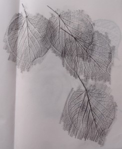
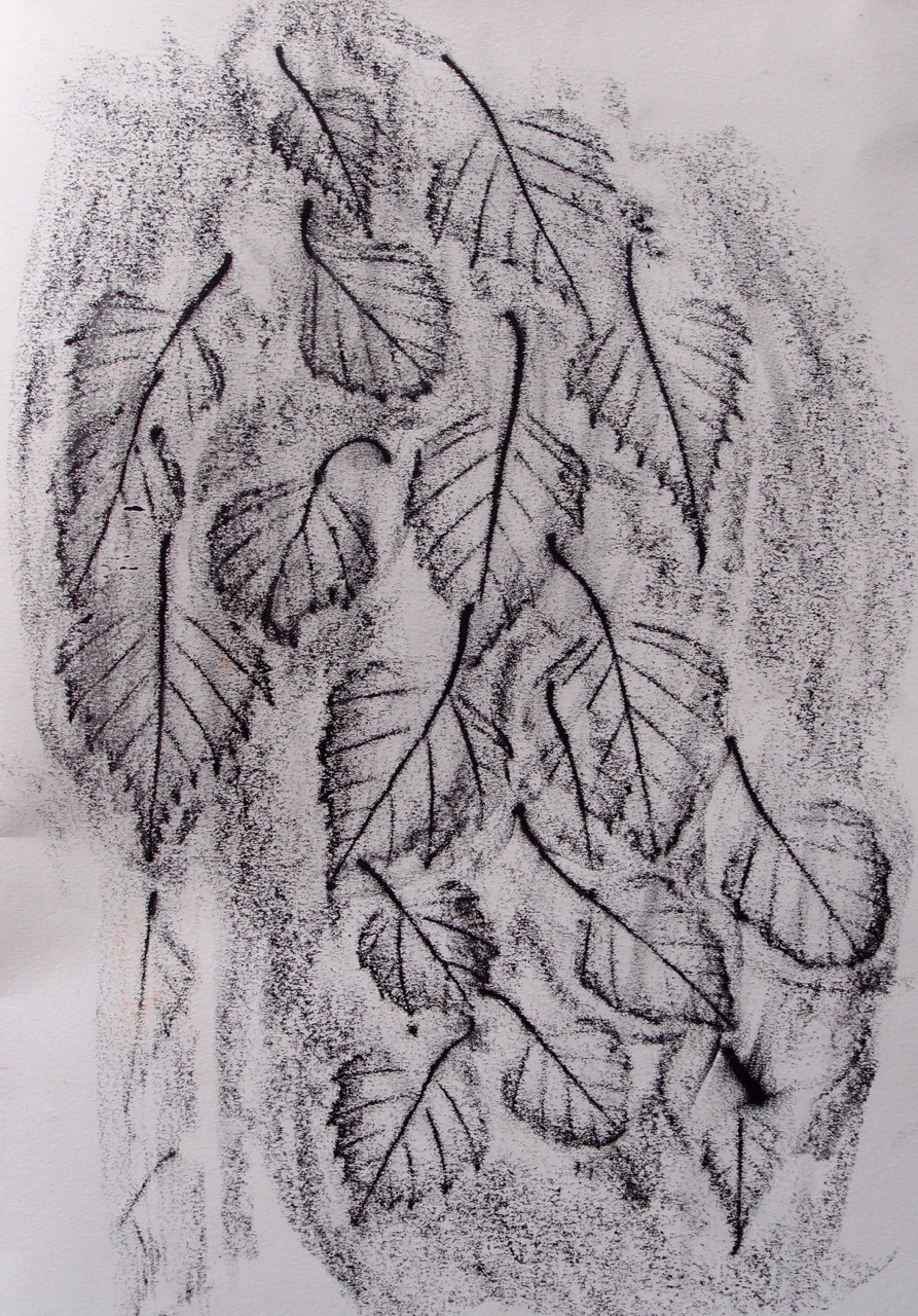
A frottage of falling leaves.

OLYMPUS DIGITAL CAMERA

OLYMPUS DIGITAL CAMERA

OLYMPUS DIGITAL CAMERA

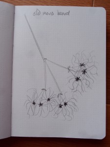
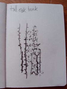
These very quick sketches are possibly my favourites, very textural and quite interesting.

I found that I quested to make ten good drawings and not know where to stop…

Clearly to me my mark making is improving, I become more observant and because of this I want to keep drawing plants until I am really pleased. However I must move on to the next stage. I will keep up my sketching and experimenting.


ATV assignment two – Observing and capturing – research point 2 – Fabric designs

Observing and capturing – research point 2 – Fabric designs

For this research point I have started a pintrest board of fabric images.

https://uk.pinterest.com/kelsingra/fabric/

Of the suggested artists, designers, companies I was particularly drawn to the almost folkloric designs of Timorous Beasties. It is immediately obvious that their work is influenced by William morris designs so it was no surprise to find that they have a range dedicated to him. I have sent for a couple of samples.

NB after visiting the New designers exhibition in London it is clear just how currently popular Timerous Beasties are, their influence was evident everywhere. An excellent example of the wheel of fashion turning.

I plan to work more in a sketch book for this task to experiment with ease of communicating my thoughts. I feel that it needs illustrating  but am worried about image coptright.


ATV assignment two – Observing and capturing – Picking and portraying

Observing and capturing project 3 – Picking and portraying

What is drawing?

This question is posed at the beginning of project 3. When I sat down to really think about what I consider a drawing  to be, I realised that what I think and what I try to do are entirely different!

I think that I have already observed in my blog when evaluating my work, that I tend to try to be too representational with the images I produce. I have endeavoured to make things look exactly like the subject I am looking at – or rather some idea of mine of what looks like a good drawing. I realise that this is an intellectually immature vision of what drawing is, it stems from some sort of indoctrinated response from school days, aiming to produce clever drawings to please people who have even less of an idea of drawing than I do!

The drawings that I have made where I have aimed for realism  are very dull and inexpressive pictures, they don’t really express much about the subject at all.

So what is a drawing? my current feeling is that a drawing is a series of marks that express or represent an aspect of a subject that is not necessarily  just visual. Drawing is about observing qualities and may represent , textures, pattern, light and shade, macro, micro aspects of a subject or be an emotional response, capturing the energy or emotional response, or tell of the journey of the subject. I think that any marks can be a drawing if they say something about a subject. I need to remember that the drawings I am making at this stage are not an end result but the start of a journey. I am using observation to visually capture an essence to be transformed at a future date. It is an exploration into the way I see things.

Drawing can be lines, collage, print in and medium and using any tools.

In this project I would like to explore a wider range of media, and be freer – more experimental, less judgemental.

I will produce some quick simple drawings, try some printing techniques as I like the marks I have made previously and would like to investigate colourgraphs more. I think also some collage or cut paper work.

I’ve been looking at some books to clarify my thoughts;

Design and Form – the basic course at the Bauhaus by Johannes Itten, I have book marked some pages of different approaches I would like to try, I may even do some morning meditations and warm ups, Bauhaus style.

Drawing projects by Mick Maslen and Jack Southern – this looks to be the art teacher I should have had..

ATV assignment two – Observing and capturing – Picking and portraying

Observing and capturing – project 3 – Picking and portraying

Exercise 1.7 sources and media

Nature chose me! I picked some leaves to draw and they really rapidly dried out! So to  follow the brief I have decided to draw what is in the garden, I like to describe it as a wildlife meadow, this is a vast over statement! I have tried to grow many things and discovered that I have a very similar taste in plants to slugs and snails … This year it has been neglected by me and nature has chosen what will thrive! A ready source of material. Full permission to raid !

ATV Assignment one reflection


I think that my selection of objects fits the brief well, I enjoyed drawing such a wide range of textures. It was really helpful to have a focus of objects to draw. I used pencil, charcoal, printing ink, soft and oil pastels, acrylic paint, fine line pens, erasure, and various tools to scratch surfaces with.

I could have carried on drawing the same objects over again with different techniques but needed to move on time wise . I will continue to fill this sketch book with different media and approaches. I have a long list of techniques still to try.

The strongest pieces of work are where I used bolder techniques, I have found I tend to want to be very accurate and record exact detail and this produces quite boring images, my favourite drawings are the scarf in charcoal on newspaper and the back drawing/mono print of my mug. I achieved some really representative marks of felt beads, it was enjoyable and effective to use a different technique for each one.

I have been exploring ideas for my archive drawings and am really excited about the subject matter, I will try and be bold and experimental with my marks.

ATV – Research references

I have started to look at the work of recommended artists and will continue to add to this post as I work through the course. Although it is overwhelming to discover the many many ways in which people produce drawings , clearly this is an excellent way of moving forward with finding ideas to experiment with new techniques and approaches. I will also use my general sense of inquisitiveness to develop my own ideas ( I wonder if I will find unique techniques? I suspect that I will “invent” new techniques only to discover that they have indeed been used before- ‘though never before with my eyes!)

Louise Bourgeois

www.moma.org/explore/collection/lb/index

I really like Bourgeois’ drawing style, I particularly liked looking at the themes section of the website, it is really interesting how she quite simply but effectively represents the form of trees with really quite few lines. The way some of her drawings are quite simple is really encouraging, to me this looks quite brave, I always want my drawings to be very representational, I realise this is not the only right way to draw but it seems a bit ingrained to try to make things look as realistic as possible. I will try to address this and experiment with capturing different more emotional aspects of objects. Looking at the techniques page I ws very attracted by the quality of line of the drypoint drawings/prints so will experiment with this process.

Alison Carlier

www.alisoncarlier.com

On Alison Carlier’s website I found a continuous line drawing of a plant in a pot called
An unknown word can be an object or a thing 2015 with the quote
“A while back I interpreted words I didn’t understand as drawings. But it occurred to me recently that unknown words could be objects or things in the world.”
How fabulous to be led to such profundity from a simple sketch! Is it the very different conection with your brain when drawing that can lead to such thoughts? I will draw aware.
Alex Chalmers
www.alexjameschalmers.com
A drawing called ‘Flying and falling’ caught my eye. I found Chalmer’s style very simple, almost naive looking in the same way as the Dani Karavan drawings in the  post Musee d’art Moderne de Ceret
http://exploring.textiling.uk/wp-admin/post.php?post=6&action=edit
Clearly however the marks and composition in both cases are carefully considered and skilfully made. I do seem to appreciate this style of work.
Hilary Ellis
www.hilaryellis.co.uk
The website has photos of beautiful textural images, some are labelled simply mixed media and it is difficult to work out how they were made. I was particularly drawn to the 2010 set and noticed that my favourite images used drypoint, like Louise Bourgeois, also a technique called chine colle, I must find out what that is.
www.michaelgriffithsfineart.com
www.debbie-smyth.com
www.katiesollohub.co.uk
www.roannawells.co.uk

ATV Assignment two – Observing and capturing research point 1 – Wabi Sabi

Observing and capturing research point 1

What do I understand about the term Wabi Sabi?

I love the concept of wabi-sabi,  I first came across the term quite a few years ago and my understanding, is that, in short, it is appreciating the beauty of imperfection.

This sits well with my general philosophy of things, and permeates through my daily life. I appreciate the beauty of imperfection a lot! To me a run in the glaze and slight unevenness of a hand made earthenware mug is way way preferable to mass produced fine china with a transfer design for example. I like to see an element of humanity in products, to sense a connection with the maker and materials. I feel uncomfortable with perfection (excepting particularly well designed, functional gadgets, and the correct pitching of tents- there is nothing wabi-sabi about a badly placed guy peg!) things that are perfect and clinical give me the shivers generally, I have an element of non conformist about me that embraces wabi-sabi. to be on the safe side ( how conventional) I have looked up the definition.

I don’t feel like I am far of the mark here, I can now add acceptance of transience, asperity, modesty, ingenious integrity.

I found a lot of reference to Leonard Koren, he seems to be accepted as the person to

I also discovered some more Japanese philosophy about making that pleased me and some that didn’t – like the new fondness for super sickly cute things , is a trend, with the name of Kawaii